Anatomy

- Illustration: The displayed SVG asset
Usage
Illustration can be used to emphasize messages.
Empty state illustration
Illustration can be added to an empty state using template message empty state. Empty state illustrations are useful in providing a visual balance to an empty section of a page. For more information on how an illustration can be used with an empty state component, see the usage guidelines for empty state.
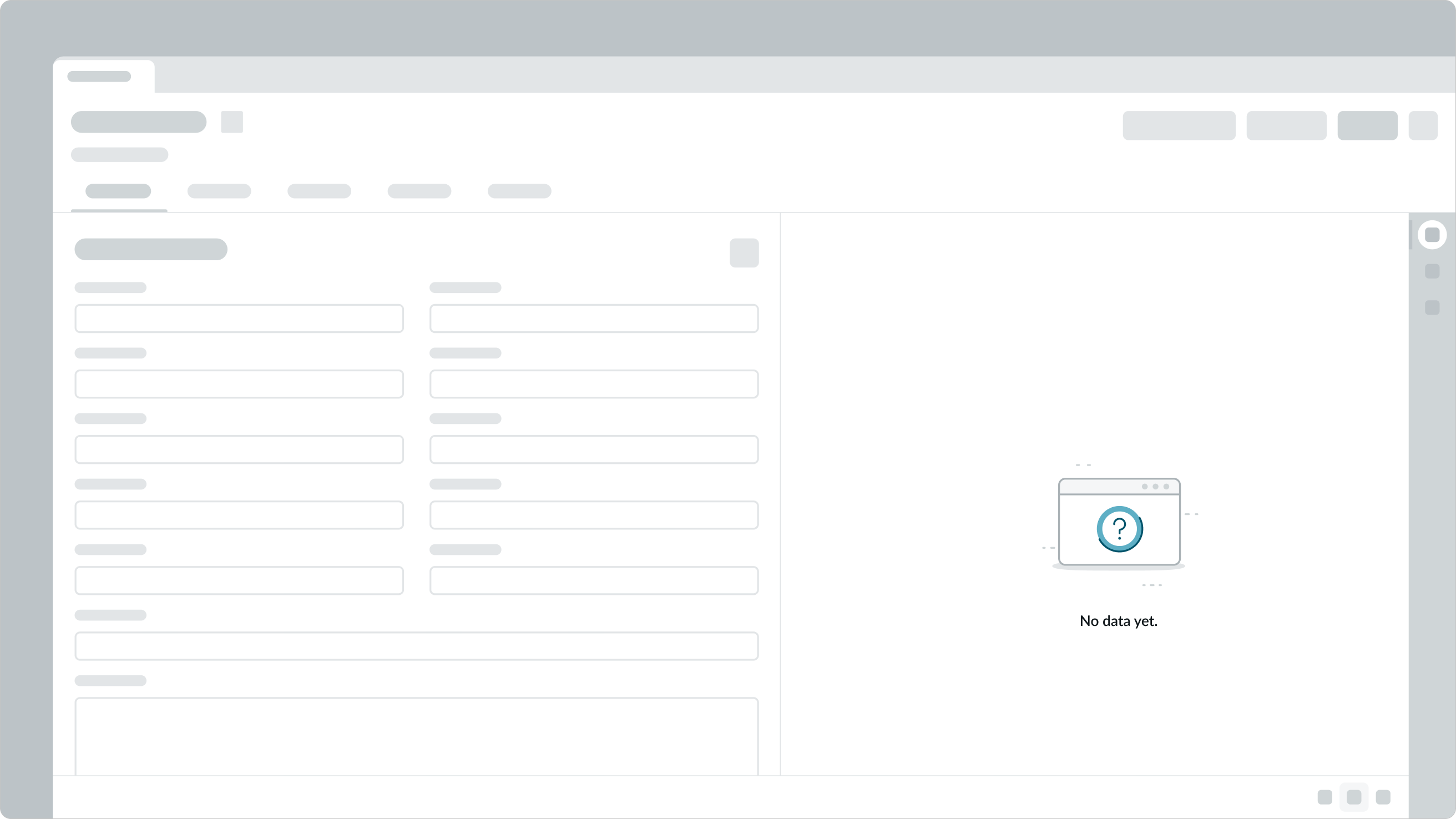
In this example, illustration is added to an empty state case using template message empty state, to represent that there is no initial data present.
Variants
Learn about illustration and find out how to use it in your design.
Types
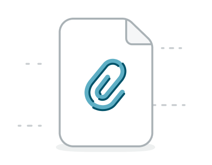
add-attachment
Sizes
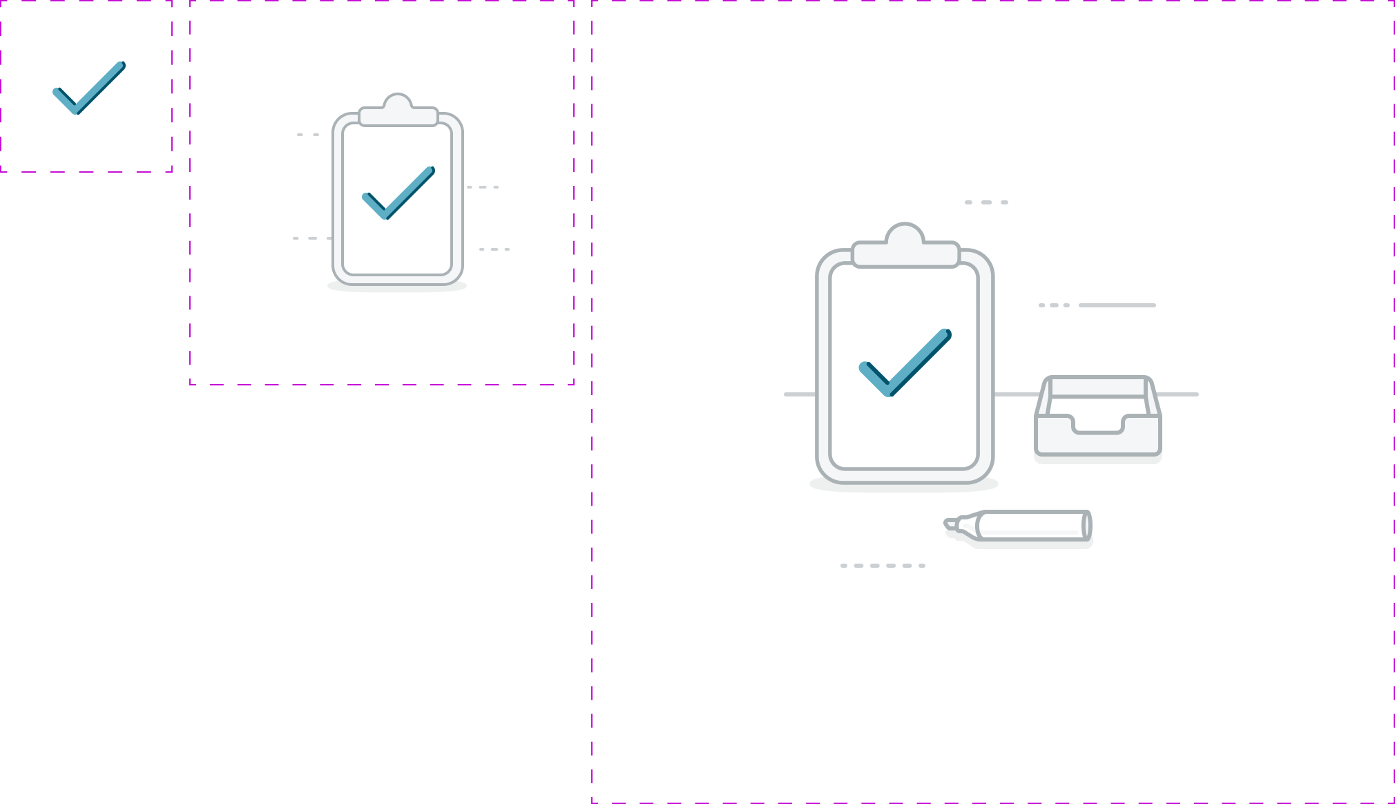
Illustration can have 3 sizes: small (sm), medium (md), and large (lg). Each illustration size has a fixed height and width. If 3 sizes are provided for a specific illustration, then auto-sizing can be configured.
| Size | Asset example |
|---|---|
| Small |  |
| Medium | 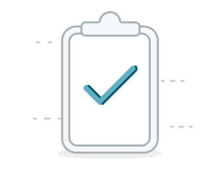 |
| Large | 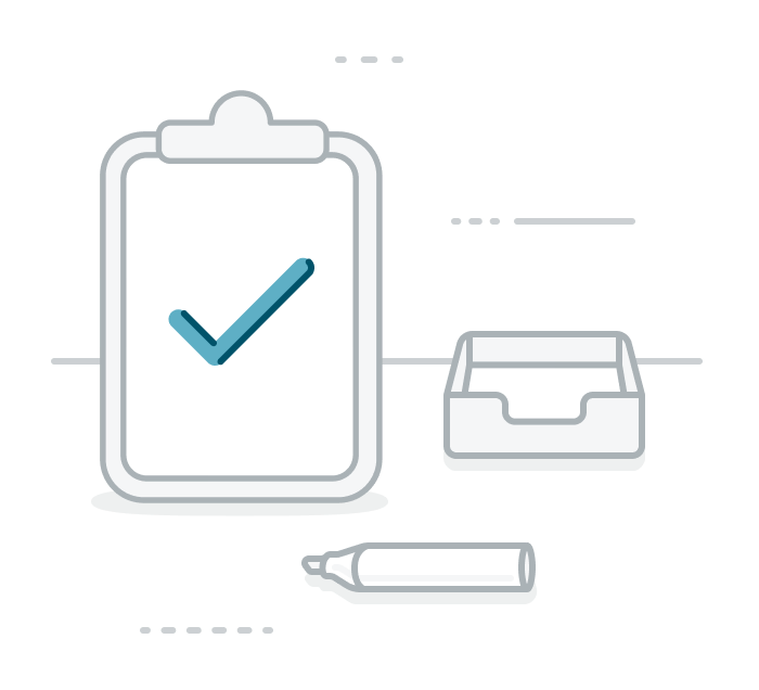 |
Design recommendations
Learn how to apply illustration in your design.
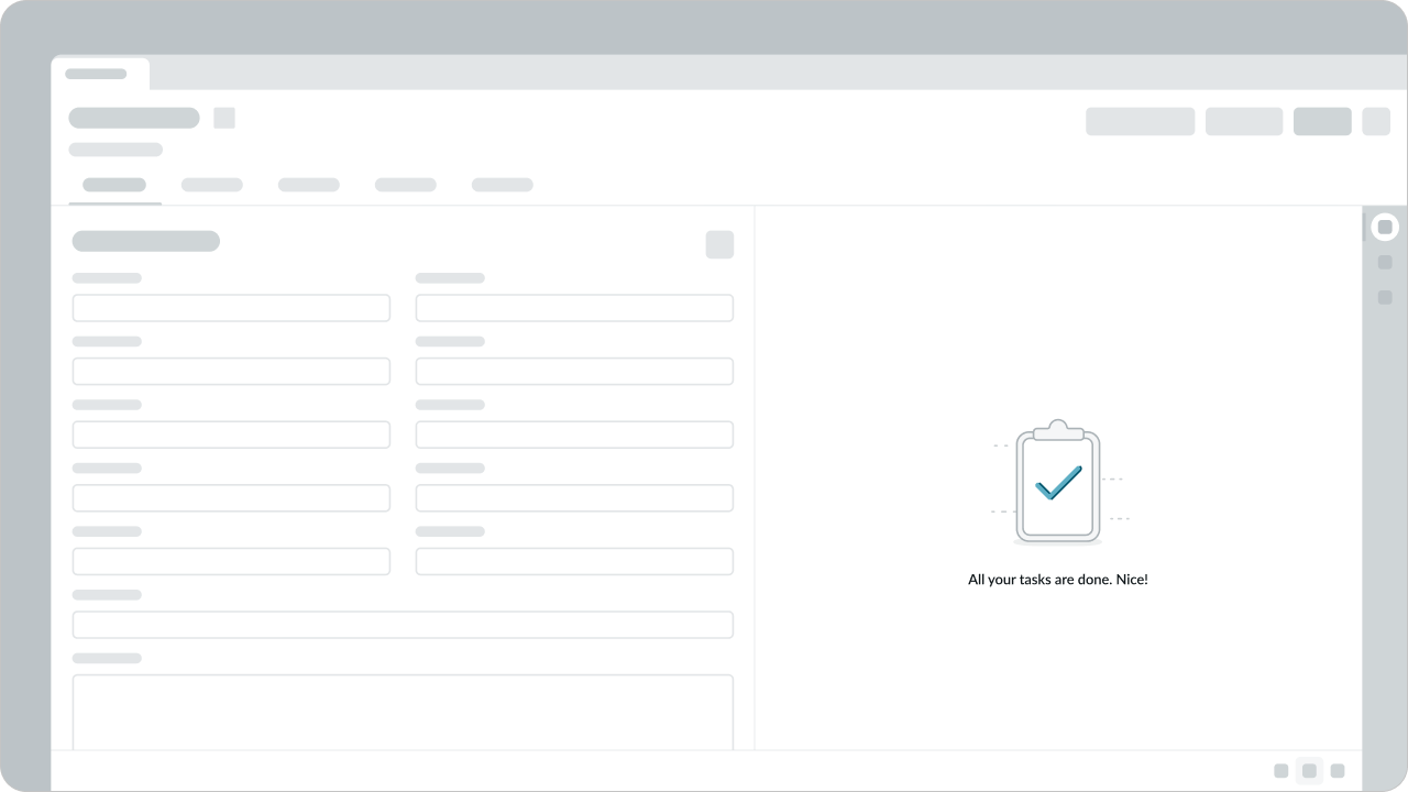
Do use illustrations thoughtfully and with intention. Each illustration should bring emphasize the content.
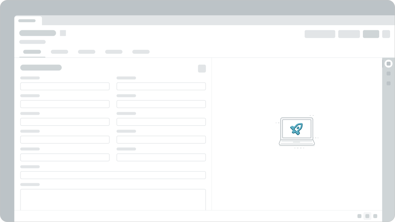
Don't use illustration without a clear purpose. Illustrations are decorative and must be used with text.

Use the correct sized illustration.
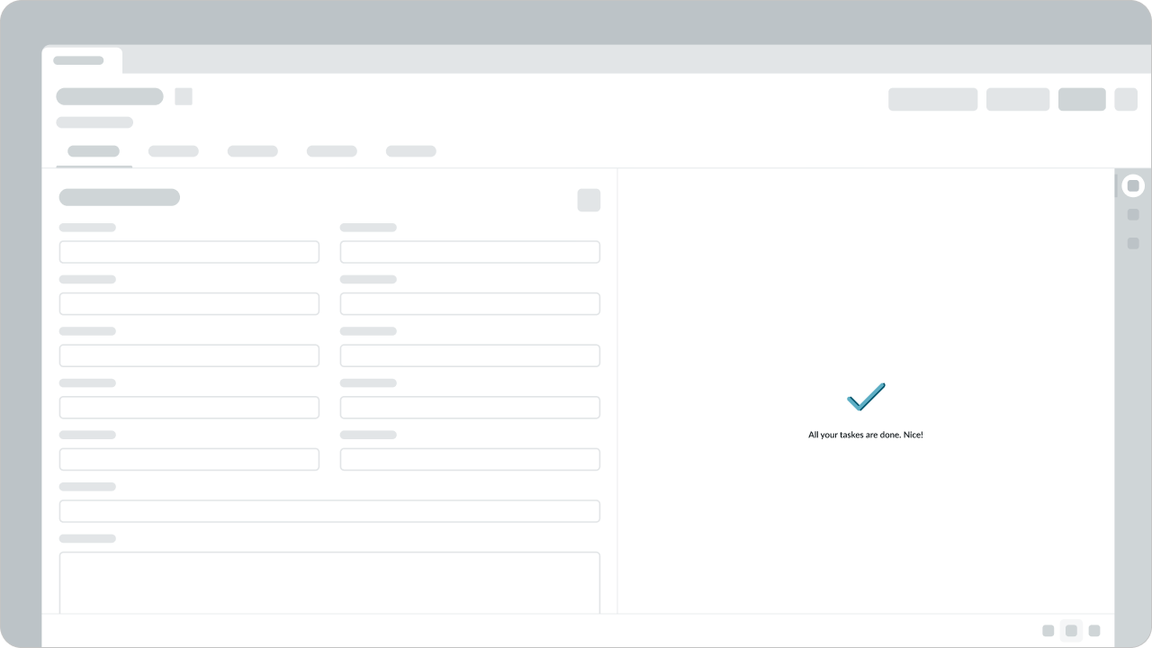
Don’t use a smaller sized illustration than is necessary the container.
UI text guidelines
These are some recommendations for using text with an illustration:
- If using an illustration in an empty state and depending on the scenario, the header can tell the person what happened, what to do, or give them information.
- For example, “No search results”
- The description in the empty state can add more information about the scenario and explain what they can do next to move forward
- For example, “Try searching for something else”
- The header or description in the empty state shouldn’t blame the person, but should be direct about what happened, what isn’t showing up, or what they need to do
- As you create the header and description in the empty state, consider the person’s context and how the person might feel. Then adjust the tone of your content accordingly.
Behavior
Illustration doesn't respond to external changes or to user interactions.
Responsive behaviors
Learn how illustration responds to changes in a container or display.
Auto-sizing
You can configure illustration to automatically resize the SVG asset by providing 3 sizes: small, medium, and large. The size of the image asset changes dynamically to fit the container. If only 2 sizes are provided, then the closest available size to fit the container is selected. If auto-sizing is turned off, a single sized asset is displayed regardless of the container size.
Usability
Illustration complies with all internationalization and accessibility requirements.
Internationalization
Illustration doesn't change for right-to-left (RTL) languages.
Accessibility
Illustration doesn’t have any specific accessibility interactions.


