Anatomy

- Icon: Symbol that represents an object or an item
Usage
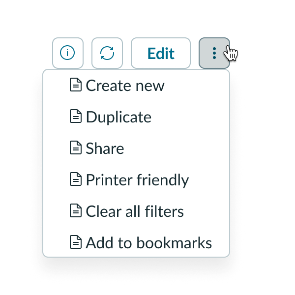
Use an icon as a graphic symbol of an object in your design. You can use an icon to decorate an associated visible label, or to inform the user when used alone to provide additional context or information.
Interactive elements
You can use icons with interactive elements to enhance user recognition and comprehension of the intended action.

Variants
Learn about the attributes of icon.
Sizes
Icons are available in 4 different sizes: small (sm), medium (md), large (lg), and extra large (xl). The icon size you use depends on the surrounding context and components. Icons maintain their form as they change size. However, certain details may disappear as icons get smaller in size. For example, the calendar icon has fewer details as it decreases in size.
Small

Medium

Large

Extra large

Configurations
Learn how to customize icon by configuring the available properties.
Icon style
Icons are available in 2 styles: outline and filled. Not all icons support a filled style.
Outline
Displays an outlined version of the icon. The stroke color is inherited from its container text color and the icon background is transparent. Outline is the default configuration for icons.

Filled
Displays a filled-in version of the icon. The stroke color is transparent and the icon background color is inherited from its container text color.

Custom icons
You can upload and use your own custom icons rather than use ones from the Now Design System library. When you select to add an icon, UI Builder determines the best storage location for the image on the instance. You can use an image with any standard image format. However, the image will be stored on the instance using the .img extension. The available size variants that apply to icons in the library also apply to custom icons. Save custom icons in a square format so they render correctly on the page.
Custom icons aren’t added to the library on the instance and aren’t cached.
Design recommendations
Learn how to apply icons in your design.
Icon functions
Icons have 2 functions: decorative and informative. Determining the proper function impacts how you manage the accessibility of the icon for users.
Decorative icons
Decorative icons are typically accompanied by text, so the icons don’t provide users with additional context or information.

In this example, the circle-check icon is used decoratively with the text “Success.”
Informative icons
Informative icons provide users with additional context or information required to understand the content.

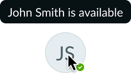
In this example, the circle-check icon is used informatively to convey the status of a user.

Do use consistent styles for icons when in a default state. Limit filled icons to indicate a pressed state.

For default states, don't mix filled icons with outlined icons.

Icons should add simplicity and clarity. In this example, the “Send” button uses a paper airplane icon.

Don't use icons that are irrelevant to the context. The icon should always use the correct context.
Usability
Icon complies with all internationalization and accessibility requirements.
Internationalization
When the display translates to a right-to-left (RTL) language, only icons that communicate direction (such as arrows) flip. All other icons can be configured to support RTL.
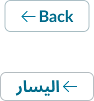
If you don't want directional icons to flip, use an icon that has the explicit direction you want it to face (e.g. a left arrow-left or a right chevron). These icons always point in the direction specified by the icon name.

This example has an explicit direction tied to the arrow icon so that it always points to the left and won't flip during translation.
Accessibility
The icon requires configuration of the aria-label attribute in the configAria property to be accessible using a screen reader.

