

Anatomy

- Header: Primary heading variant
Subcomponents
See usage guidance for tooltip
Usage
Use the header type for labeling sections in a display, and the title type for labeling content.
Variants
Heading has two different types, header and title. Each has their own variants.
Header
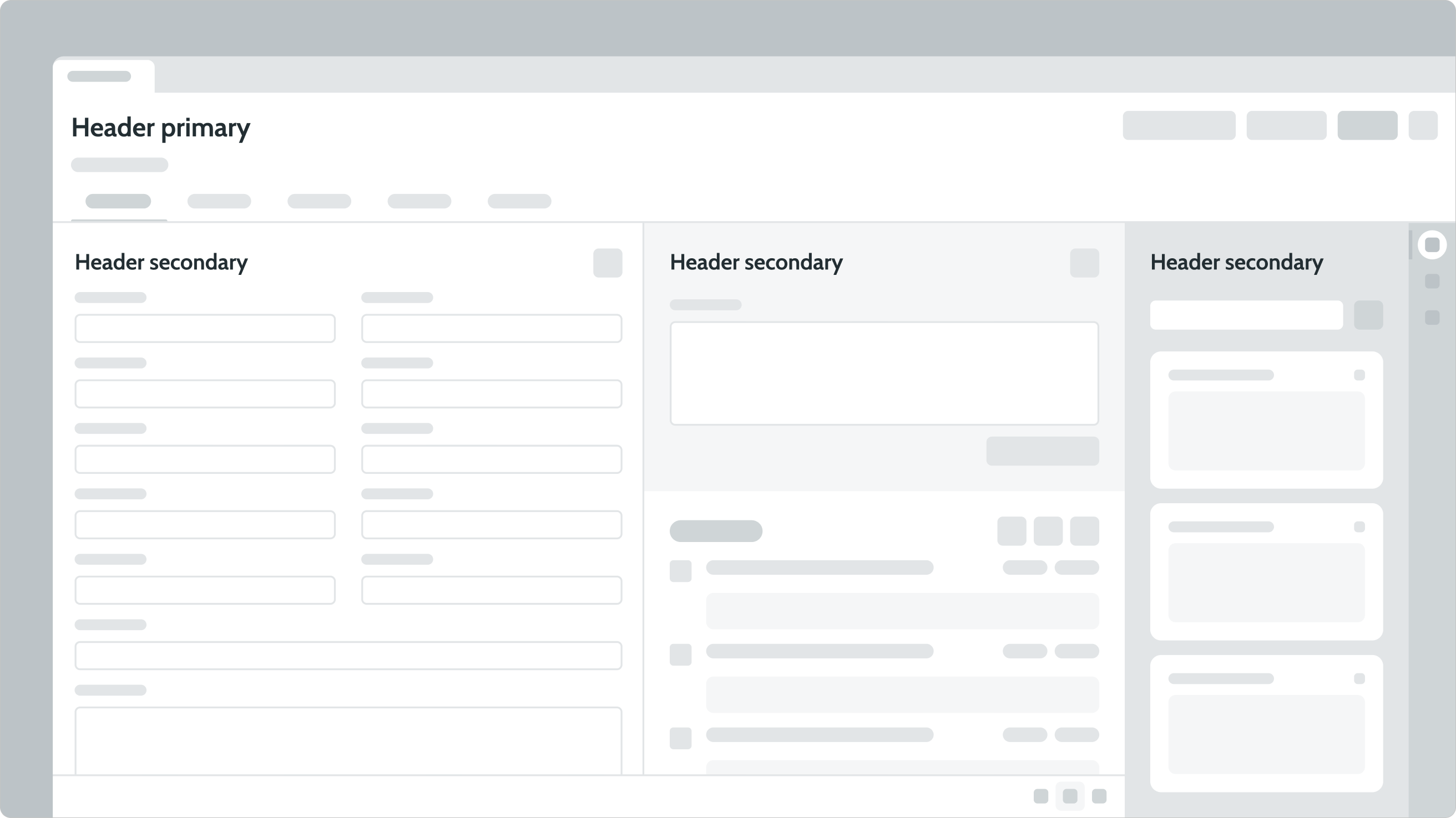
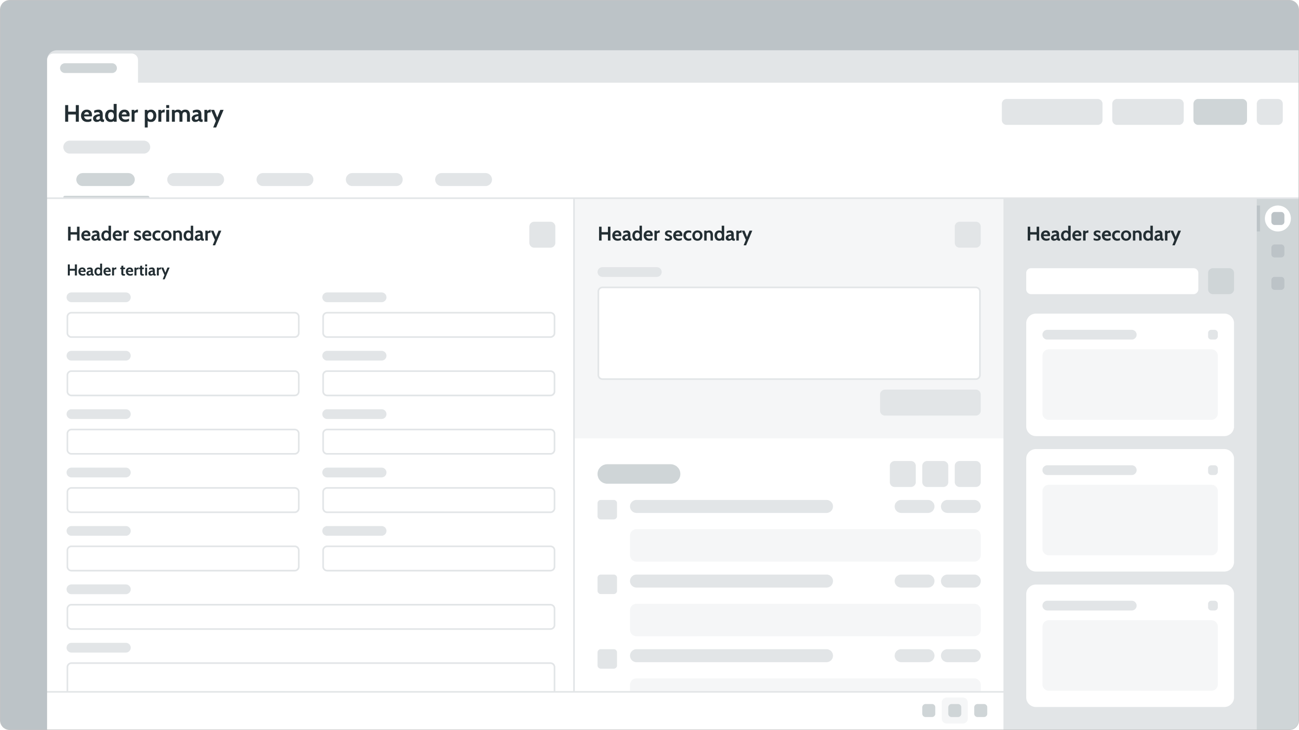
The following are the available header variants: hero, primary, secondary, and tertiary. The default sizes for the now-heading type hierarchy were reduced by one scale to improve data density in a Workspace. Use the hero font size when a larger heading is preferred.
Hero
Use the hero variant as an alternative for the primary variant to display a larger page title size. Page titles indicate the topic or theme of a specific page. Use only one title per page.
Primary
Use the primary variant for page titles. Page titles indicate the topic or theme of a specific page. Use only one title per page.
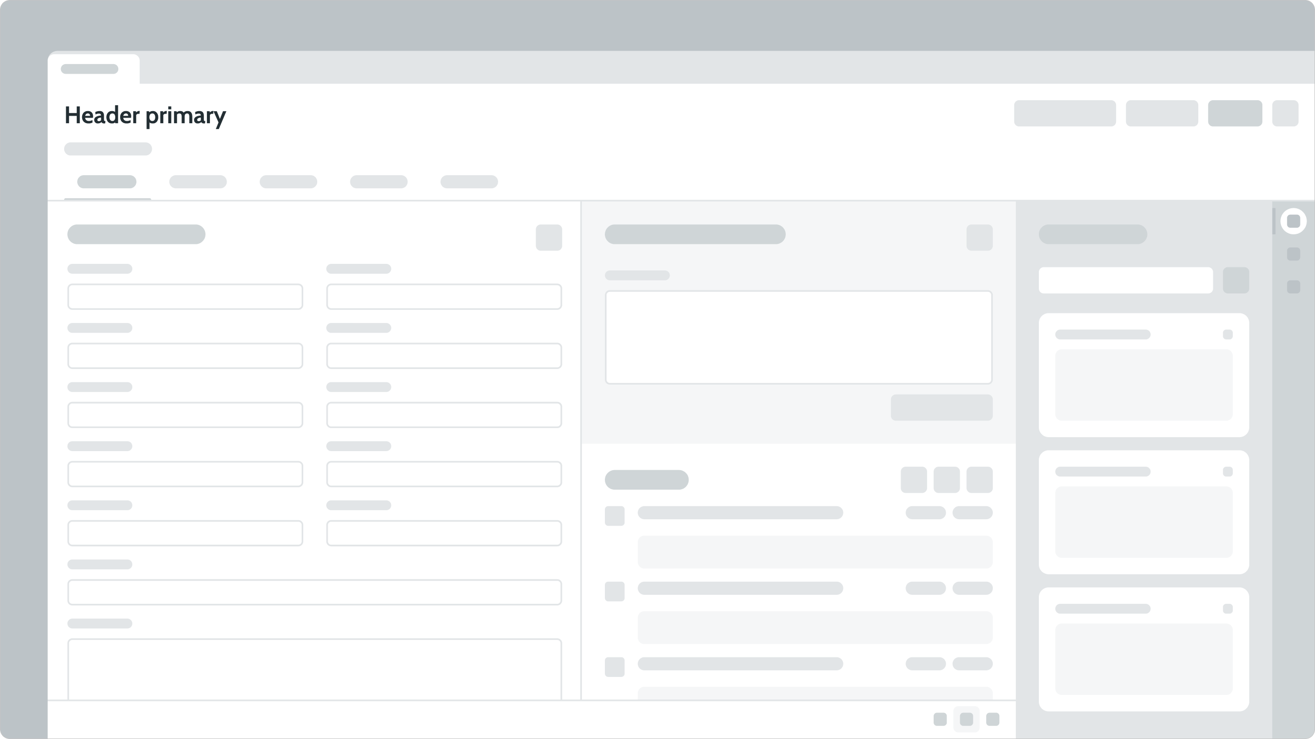
Secondary
Use the secondary variant for section headers. Section headers, also called "subtitles", complement the title of the page. Use section headers for content under the title.
Tertiary
Use the tertiary variant for subsection headers. Subsection headers group similar content to provide context.
Title
The following are the available title variants: primary, secondary, and tertiary. The size is the same for all title variants, however, the styling for each is different.
Primary
Use the primary variant to grab the user's attention and identify the main purpose content.
This card heading uses a primary title to identify and highlight primary content for the user.
Secondary
Use a secondary variant to create scannable titles that don't compete with the primary title. They're distinguishable within the hierarchy and help group content together.
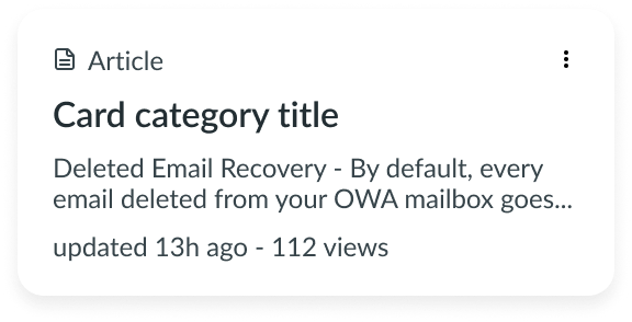
In this example, “Card Category” is a secondary variant of title.
Tertiary
Use a tertiary variant for titles and information that are less important, predictable, or predefined. If something doesn't need additional context, use a tertiary title.
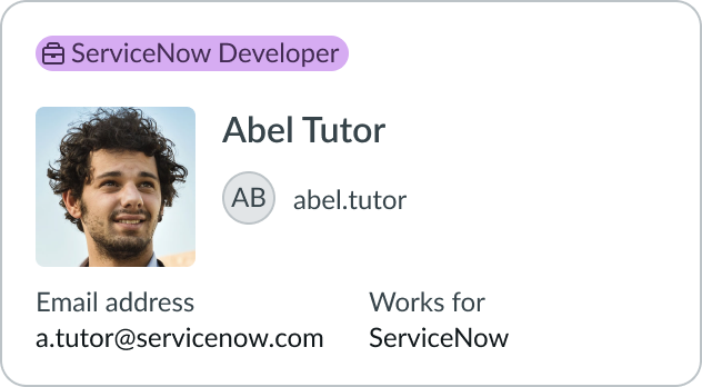
In this example, “Abel Tutor” is a tertiary variant of title.
Configurations
Learn how to customize heading by configuring the available properties.
Presets and controllers
This component has a preset configuration that sets properties and event handlers, making it ready for use. You can override preset values with a custom configuration if needed. Preset values won’t upgrade with updates. To avoid using presets, configure manually. One preset can apply to a single component instance. See presets for more info.
A preset is linked to a controller, which serves as a data resource. Controllers provide configuration data and event bindings for the component. Selecting a preset adds the required controller to the page, allowing new components to use its preset. For more on controllers, see controllers. For default presets, see view properties and events in the controller API.
Alignment
You can configure the alignment of the text. Options include: start, center, end, and justify. By default, this property is set to start.
Design recommendations
Learn how to apply heading in your design.
UI text guidelines
These are some recommendations for using heading:
- Use headings to describe the purpose or task to be done on a page, screen, or specific area
- Keep headings short to improve scanning
- As you arrange headings, consider the hierarchy on the page or screen and think about how everything is connected
- Adding a brief description underneath a heading can help explain the page or section in further detail
Behavior
Learn how heading behaves when the display changes or when a user interacts with the component.
Truncation
When the heading doesn't fit in a container, it truncates with an ellipsis. A tooltip appears on hover to show the full text.
Note: An option in the user Preferences menu on the OS sets a tab stop on non-interactive text that truncates in this component, such as a title or label, and makes that text a tooltip trigger. The user presses Enter or the spacebar to open the tooltip and view the entire content. To enable this feature, set the Enable keyboard focus on truncated text option to true in the Accessibility panel of the Preferences menu.
Usability
Heading complies with all internationalization and accessibility requirements.
Internationalization
When heading is used in a platform configured for a right-to-left (RTL) language, the text flips its orientation.