Anatomy
Learn about the individual parts of dropdown.
Dropdown list
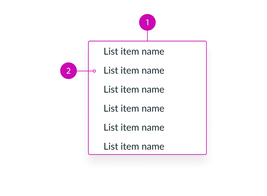
- Dropdown list container: Container that holds the dropdown list items; opens when a user selects the trigger in the dropdown component
- List item: An item in the dropdown list
List item
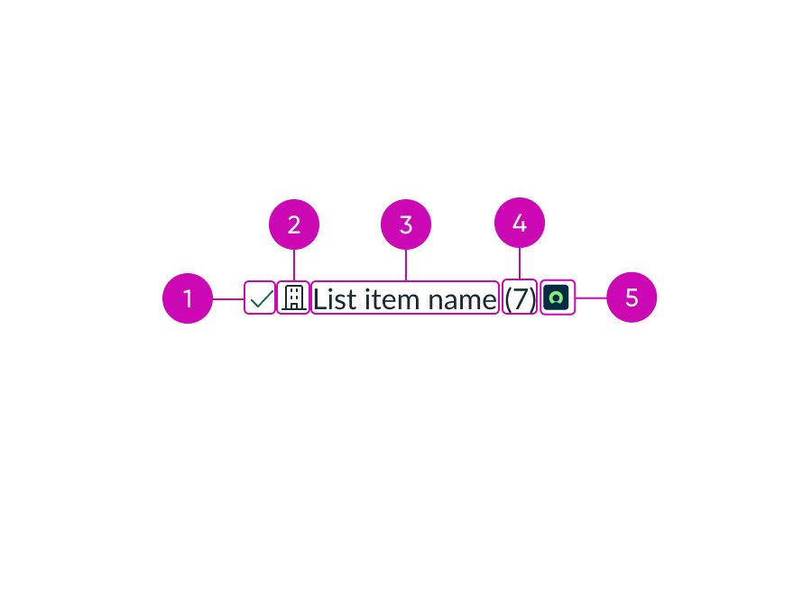
- Selected state icon: The selected state icon appears to the left of the option label when a user selects an option from a multiple-select list
- Beginning icon (optional): An icon can be used at the beginning of a list item to further illustrate the context and help distinguish between list items
- Label: Describes the item or action
- Data (optional): A value that follows a label
- Ending icon (optional): An icon can be used at the end of a list item to further illustrate the context and help distinguish between list items
Usage
Use dropdown list to add a list of selectable items to the dropdown component.
Variants
Learn about the attributes of dropdown.
Sizes
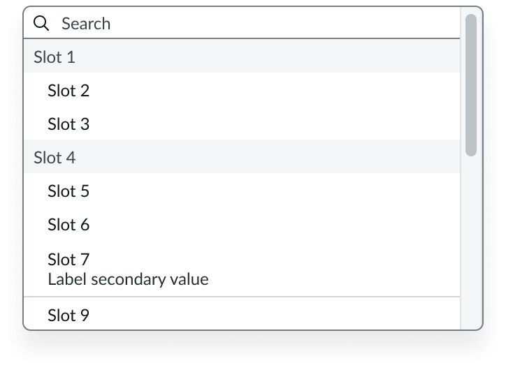
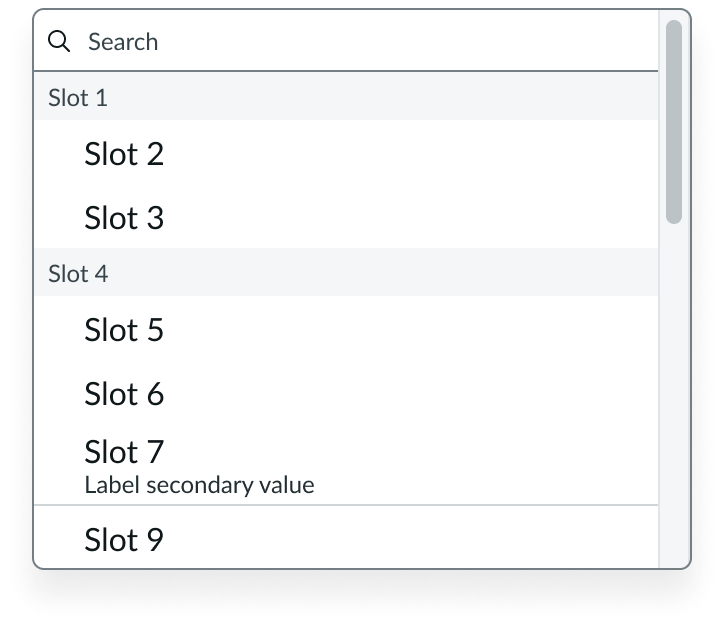
Dropdown list is available in 2 sizes: small (sm), medium (md). The default size is medium. Choose the size that matches the same size of surrounding components in the design. For example, use a small dropdown when it is positioned next to a small button.
Small
Medium
Mobile adaptive
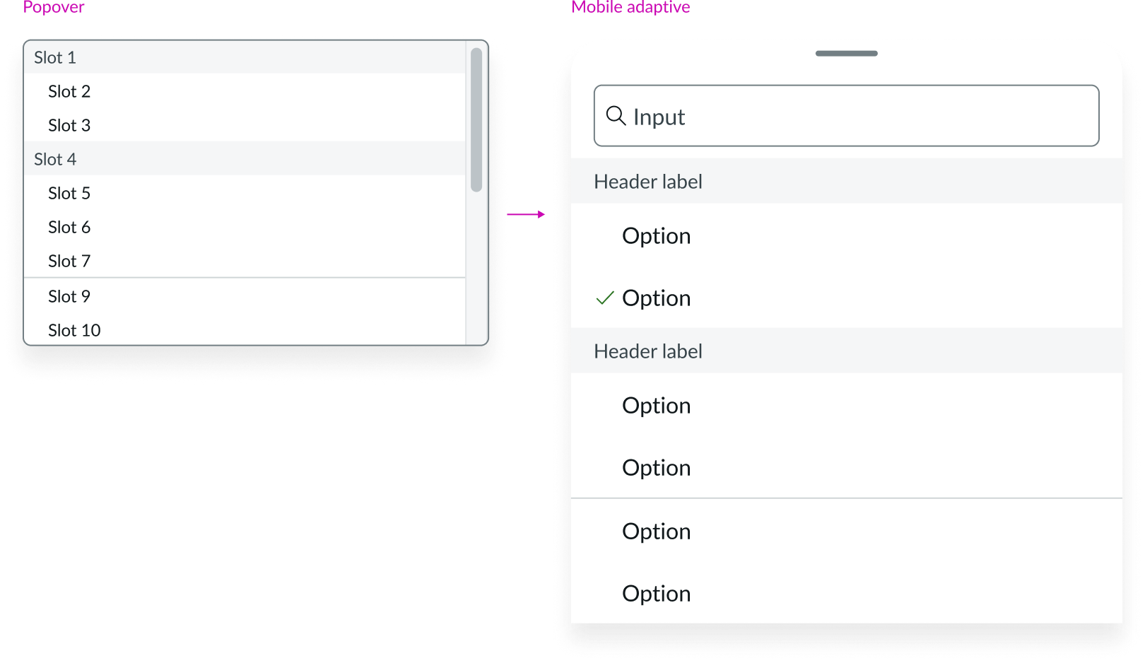
On mobile, dropdown list appears as a sheet instead of a popover. Small and medium sizes are supported.
See the usage guidance for the sheet component.
Small
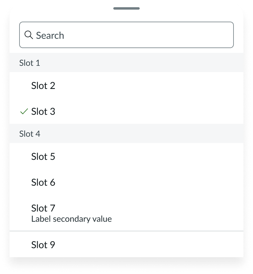
Mobile adaptive variant of dropdown list appearing as a sheet in size small
Medium
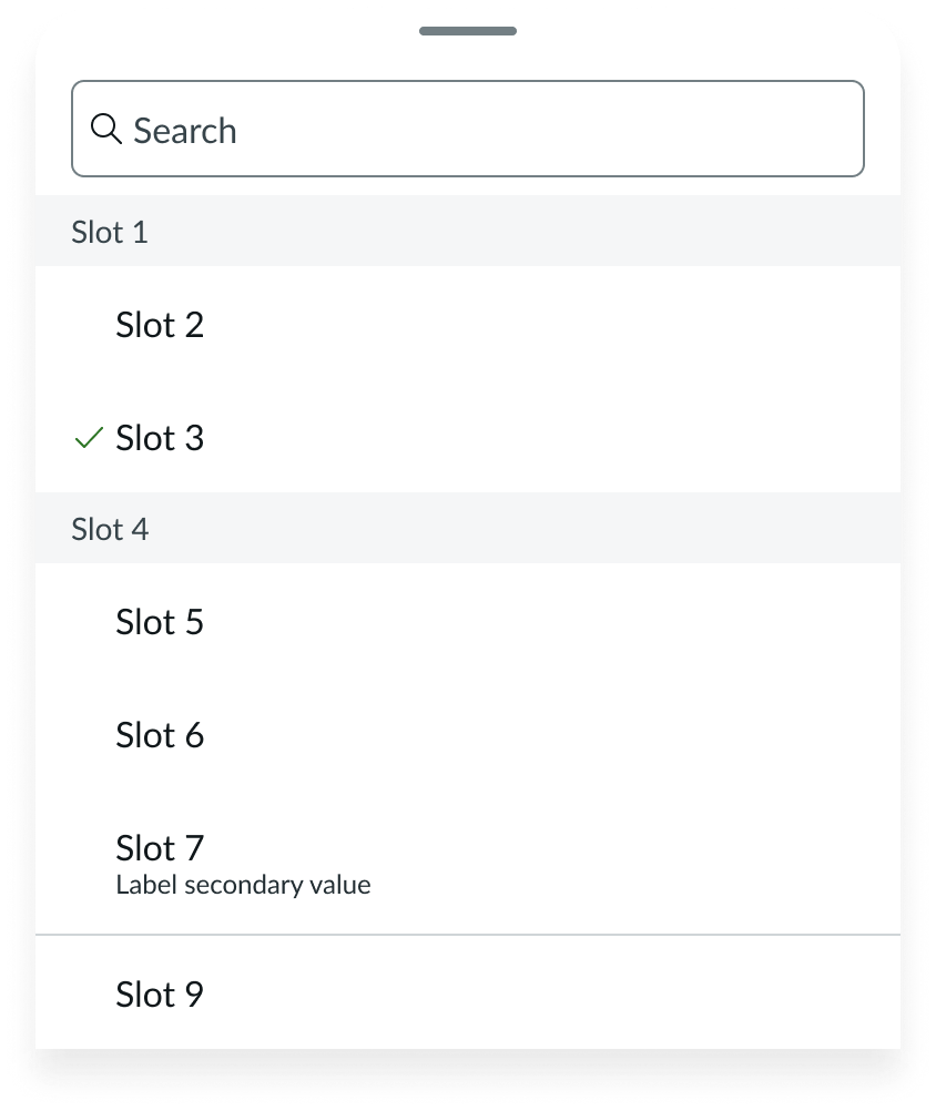
Mobile adaptive variant of dropdown list appearing as a sheet in size medium
Configurations
Learn how to customize dropdown list by configuring the available properties.
Items
You can configure this property to provide an array of items for your dropdown list. You can choose to display icons or images in your dropdown items.
Icon
You have the option to include an icon at the beginning, end, or at both ends of your dropdown list item.

Image (PNG)
You have the option to include an image at the beginning, end, or at both ends of your dropdown list item.

Selected items
You can configure this property to provide an array of IDs for each selected item. If the multi-select mode is not enabled, the ID of a previously selected item is cleared when the user selects a new item, and a new ID is added. If the multi-select mode is enabled, IDs can be added to or removed from the list.
Select
You can set this property to “single,” “multi,” or “none” to define what happens when the user selects a dropdown list item. By default, this property is set to “single.”
Search
Search enables users to manually filter or search for items as the user types outside of the dropdown list. Note that dropdown list itself does not display an internal search field.
Search term
You can configure this property to track the current value of the internal search field. Entering a search term will highlight and filter the search results within the dropdown list.
Active item
You can configure this property to track the ID of the next current active item in the dropdown list.
Size
The default size for dropdown list is medium (md), however you can change the size to small (sm).
Behavior
States
Dropdown list has the following states: default, hover, focus, selected, and disabled.
| State | Example |
|---|---|
| Default |  |
| Hover |  |
| Focus |  |
| Selected |  |
| Disabled |  |
Responsive behaviors
Learn how dropdown list responds to changes in a container or display.
Scroll bar
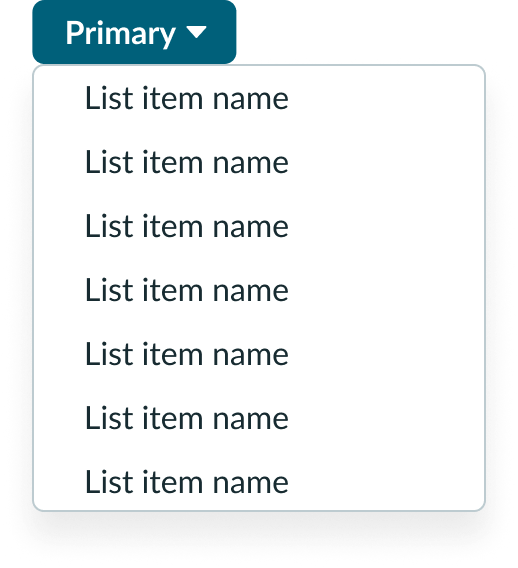
The width of the dropdown trigger determines the minimum width of the dropdown list. If needed, you can define the maximum width to be as wide as the longest list item. Otherwise, the list will adopt the default width. When the dropdown list reaches its maximum height, it adopts the overflow behavior. A scroll bar appears to let the user see all available options.
Text wrapping
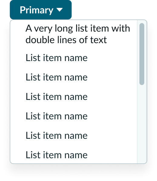
Dropdown list items does not truncate. When text exceeds the width of the list item, it'll wrap to the next line.
Display
In the mobile adaptive variant, dropdown list appears as a sheet instead of a popover.
Interactions
Select from the dropdown list
A user can select an item from the dropdown list. The list will update according to whether the selected items property is set to single, multi, or none. When a user selects an item, the component displays a brief animation to confirm the selection.
Single-select dropdown
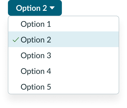
Use a single-select dropdown when the user should only select one item from the list. The selected option replaces the default text label in the dropdown trigger after it's selected.
Multi-select dropdown
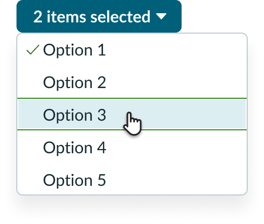
Use a multi-select dropdown when the user can make two or more selections from the list. The total number of selected items replaces the default text label in the dropdown trigger.
No selection dropdown
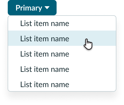
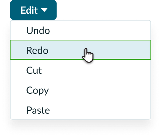
Use a no-select dropdown when the user can make a selection to trigger an action that does not persist. Whichever item the user selects won't replace the default text label in the dropdown trigger.
View selection
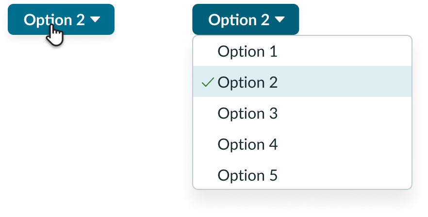
By selecting the dropdown trigger again, a user can view their selections in the dropdown list. A checkmark icon appears next to each selection. Whether the selection replaces the dropdown trigger label depends on the dropdown configuration you choose.
Usability
Dropdown complies with all internationalization and accessibility requirements.
Internationalization
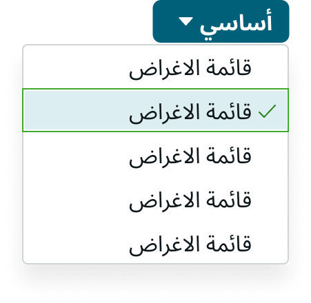
When the display translates to a right-to-left (RTL) language, the caret appears on the left side of the dropdown trigger. If the dropdown has text and an icon, the icon appears to the right of the text label.
If you use an icon in your dropdown label, remember to choose an icon that clearly identifies the dropdown's purpose. The icon should also follow existing web design patterns (e.g. a gear icon for "Settings"). This helps users determine the dropdown's purpose at a quick glance.
Accessibility
Learn how to access the actionable elements of dropdown through keyboard interactions and screen readers.
Keyboard interactions
- Enter or Space: Opens the list and places focus on the first list item
- Down arrow: Moves focus to the next non-disabled list item
- Up arrow: Moves focus to the previous non-disabled list item
- Home: Moves focus to the first non-disabled list item
- End: Moves focus to the last non-disabled list item
- Esc: Closes the dropdown list without making a selection

