Anatomy
Dropdown trigger
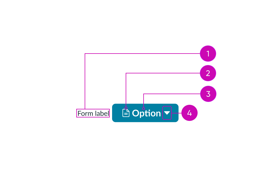
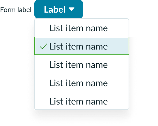
- Form label (optional): Text that provides a way to identify the dropdown as a form control. If the dropdown list does not contain selectable content, a form label should not be used.
- Icon (optional): A symbol or character that identifies what's available within the dropdown list; if the dropdown trigger has a label, the icon is optional
- Trigger label (optional): Text that explains the contents of the dropdown list; if the dropdown trigger has an icon, the trigger label is optional
- Caret (optional): Indicates the button contains a dropdown list and distinguishable a dropdown from a button
Dropdown list
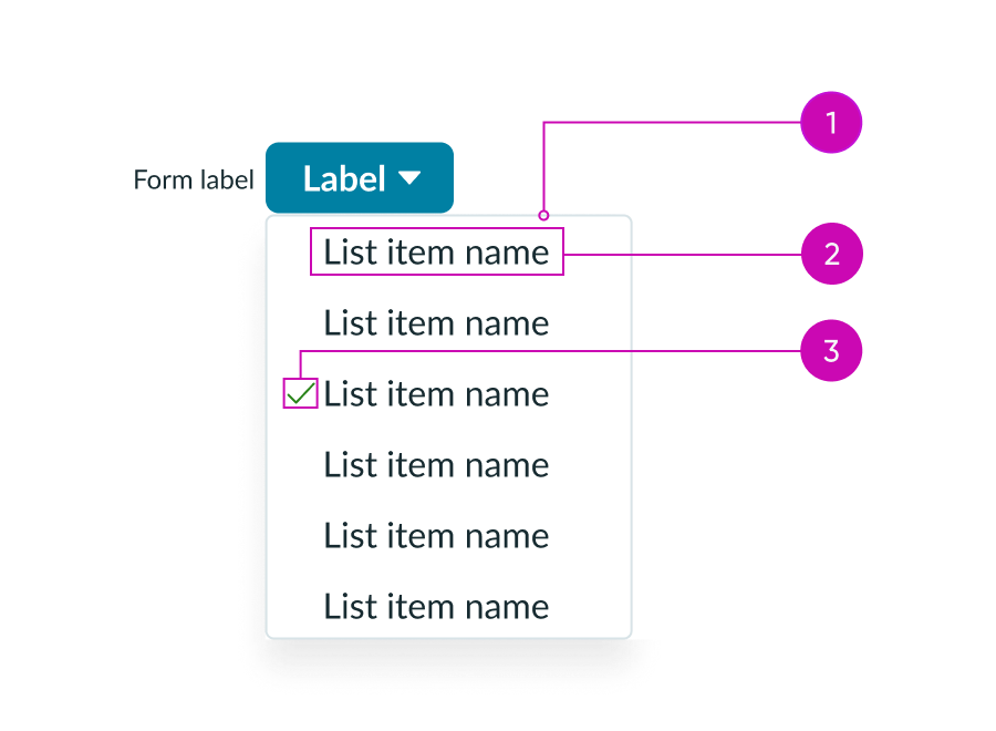
- Dropdown list: Displays a list of options
- List item: An item in the dropdown list
- Selected state icon: Indicates the selected option
Usage
Use a dropdown in a form, filter, or content area to help the user choose an item from a list. You can also use a dropdown to help a user take an action. Action dropdowns help the user choose from a similar set of actions. For example, a “Send” dropdown may contain different ways to send that content, like email or SMS. For short lists of mutually exclusive items, consider using radio buttons instead of a dropdown. This improves scannability and helps the user make a decision more quickly. The component you use in your design depends on your individual use case.
Dropdown should be used with the dropdown list component to display the list that opens when the user selects the dropdown trigger.
See usage guidelines for dropdown list
Variants
Learn about the variants of dropdown.
Types
Variants help distinguish the dropdown component from surrounding content and components by giving it a different appearance. The variant you use is determined by the dropdown trigger's prominence in the design. Use any of the bare variants when you want to include a dropdown inline with other text. You can also use this variant if you want the dropdown to be less visually prominent. Use any of the selected variants for select menus and not action menus. When a user makes a selection, the selected variant(s) replace the label in the dropdown trigger.
Primary
Use a primary dropdown for the main action in a workflow or a component. A primary dropdown has a stronger visual presence than other dropdown triggers. Because of this, it grabs a user's attention immediately. Be sure to only use one primary dropdown trigger in each stage in a workflow.

Primary (bare)
Use the bare variant of a primary dropdown when you want to add it inline with content or to match similar bare styles. This variant is useful for displaying content that you want to be visually prominent. This variant displays a background on hover.

Primary-selected
Use the primary-selected variant for selection menus of primary actions. This variant is similar to the primary variant.

Primary-selected (bare)
Use the bare variant of a primary dropdown when you want to add it inline with content or to match similar bare styles. This variant is useful for displaying content that you want to be visually prominent. This variant displays a background on hover.

Secondary
Use a secondary dropdown for general use-cases or non-primary actions. Pair this variant with other button types, or group it with other secondary components.

Secondary (bare)
Use the bare variant of a secondary dropdown when you want to add it inline with content or to match similar bare styles. This variant is useful for displaying content that doesn't need to be visually prominent. This variant displays a background on hover.

Secondary-selected
Use the secondary-selected variant for selection menus. Don't use this variant for a dropdown trigger that opens an action menu.

Secondary-selected (bare)
Use the bare version of the secondary-selected variant for selection menus. This variant behaves similarly to the secondary-selected variant, but it's better suited for inline content where it needs to be less visually prominent. This variant displays a background on hover.

Tertiary
Use the tertiary variant for optional actions or when you don't want a dropdown to visually compete with other components.

Tertiary (bare)
Use the bare variant of a tertiary dropdown for optional actions. This variant behaves similarly to the tertiary variant, but it's better suited for inline content where it needs to be less visually prominent. This variant displays a background on hover.

Tertiary-selected
Use the tertiary-selected variant when it is within a group of controls and requires less attention. Avoid using this variant for an action menu.

Tertiary-selected (bare)
This variant behaves similarly to the tertiary-selected variant, but is better suited for inline content where it needs to be less visually prominent. This variant displays a background on hover.

AI
Use the AI variant with updated color palettes for AI-driven workflows.

Primary AI, Secondary AI, and Tertiary AI variants
Sizes
Dropdowns are available in 3 sizes: small (sm), medium (md), and large (lg). The default dropdown size is medium. Choose the size that matches the same size of the surrounding components in the design. For example, use a small dropdown when it's positioned next to a small button.
Small

Medium

Large

Configurations
Learn how to customize dropdown by configuring the available properties.
Form label
The form label is text that provides a way to identify the dropdown as a form control. The form label can be placed at the start or at the top of the dropdown. The form label is required if the dropdown list items can be selected.
However, the form label should not be used if the dropdown list does not allow for any selection of its items.


Trigger label
There are 3 different ways you can label the trigger label of a dropdown: using text, text with icon, or just an icon. Use text or text with icon when the dropdown list provides multiple actions to choose from. For example, a dropdown trigger labeled "Settings" suggests additional actions related to settings to choose from.

Label wrapping
When the label is placed on top of the dropdown, the text wraps when it reaches the outer container width. The text appears left-aligned.
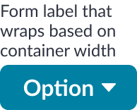
When the label is placed at the start of the dropdown, text overflow in the label wraps to the next line. The text appears right-aligned and is centered with the trigger.

Dropdown trigger configurations
There are different configurations for the dropdown trigger, but these don't affect the appearance of the dropdown panel.
Contained with caret
This configuration has a defined border and includes a caret to distinguish the dropdown from a button. Use this variation when a dropdown trigger is displayed with similar styled buttons to help distinguish which are plain UI actions and which will have a set of actions available through a dropdown menu. Also, this variation is more suitable if the dropdown label displays a selected choice.

Bare with caret
These dropdowns have a caret and label, but no border. Use this configuration when the dropdown contains supplementary actions.

Bare without caret
This dropdown has an icon, but no label or caret. Use this type when space is limited.
Be sure to choose an icon that clearly conveys the dropdown's purpose and nested options because the dropdown cannot include a text label. The icon you choose should also follow existing patterns, like a user icon to indicate "Profile" options.

The gear icon is universal for “Settings”, and the filter icon is universal for “Filtering options”.
Design recommendations

Use dropdowns sparingly in your design. Always ensure that they have a clear intent and purpose.

Avoid using too many dropdowns in one area. Doing so causes cognitive overload for users, making it difficult for them to make decisions or selections.

If using a single or multi-select dropdown, include a visible label.

Don’t omit a separate form label if dropdown is single or multi-select.

Choose a consistent position for all dropdown labels when there are multiple dropdowns inline.
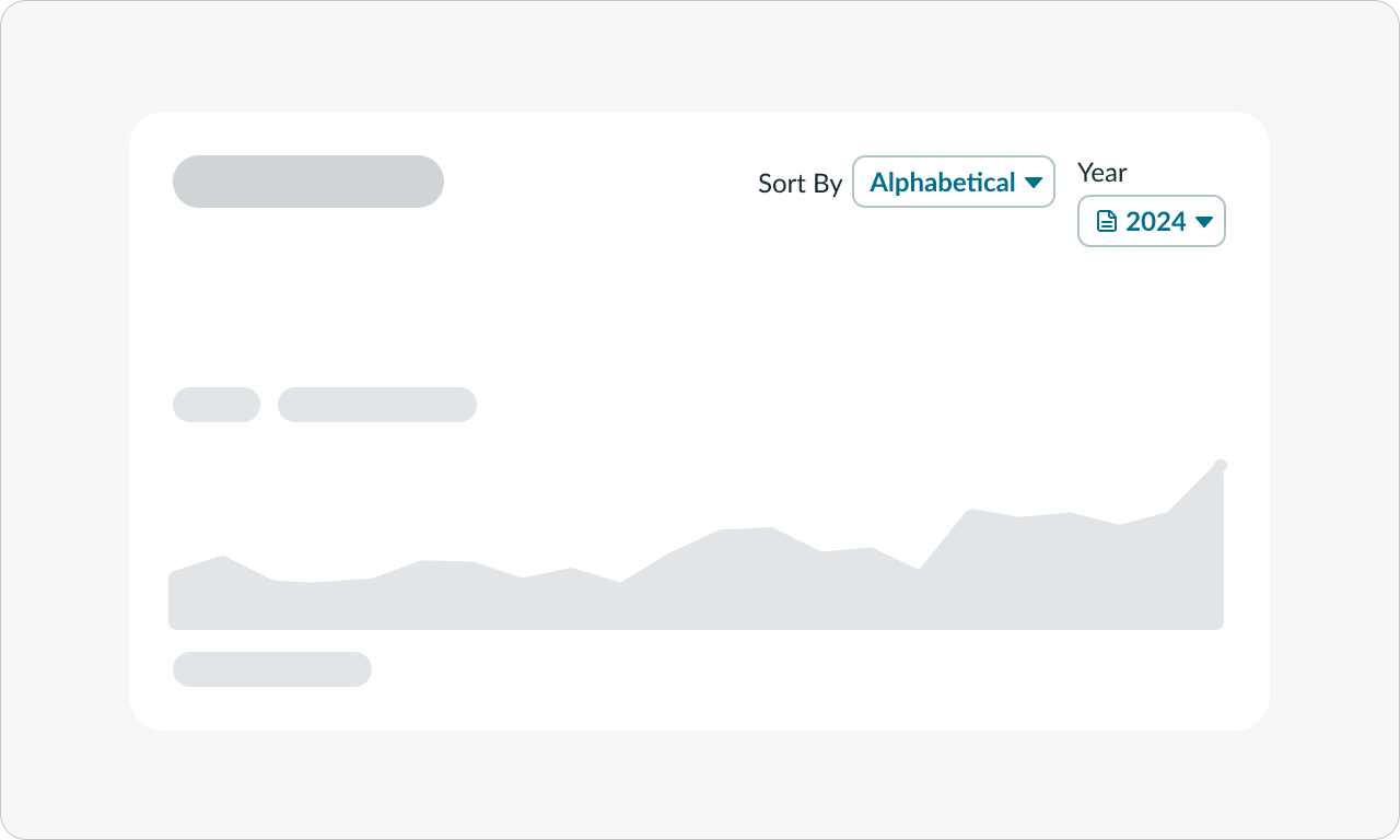
Avoid using inconsistent label positions when there are multiple dropdowns inline.

No form label is needed when a dropdown only contains actions and does not have any selectable items.

Avoid form labels when a dropdown only contains actions and does not have any selectable items.
UI text guidelines
These are some recommendations for using text within dropdown:
- For dropdown triggers, use a label that sets an expectation of what is contained in the dropdown
- For example, “More actions”
- If you’re showing a list of items, format them all similarly to stay consistent
- For example, the list of more actions could be “Edit,” “Share,” and “Delete”
- If you’re showing different filter options, use labels that clearly state how the system will organize things once the filter is applied
- For example, the options could be “Last opened,” “Last created,” and “Alphabetically”
- If you’re showing actions the person can take, use verbs. Add an object after the verb if it adds clarity.
- For example, “Create a task”
- If you’re using an icon with the label, it should relate to the label
Behavior
Learn how dropdown behaves when the display changes or a user interacts with the component.
States
Dropdown has the following states: default, hover, focus, active, and disabled. All variants have a drop shadow on hover.
| State | Primary | Primary selected | Secondary | Secondary selected | Tertiary | Tertiary selected |
|---|---|---|---|---|---|---|
| Default |  |
 |
 |
 |
 |
 |
| Hover |  |
 |
 |
 |
 |
 |
| Focus |  |
 |
 |
 |
 |
 |
| Active |  |
 |
 |
 |
 |
 |
| Disabled |  |
 |
 |
 |
 |
 |
Dropdown trigger state
When a user selects the dropdown trigger, it'll remain in the active state. The dropdown list will be dismissed when a user selects an option or interacts with elements outside. After this, the dropdown trigger will return to the default state.
Responsive behaviors
Learn how dropdown responds to changes in a container or display.
Dropdown trigger
The dropdown trigger's width depends on the length of the label or selected value.
Interactions
A user can perform three interactions with the dropdown component: open the panel, select a list item, and view their selection.
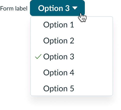
Open the dropdown list
A user can select the dropdown trigger to display the dropdown list.

On click, the dropdown state changes to active, and the list appears.
View selection
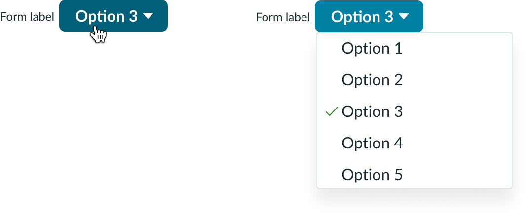
By selecting the dropdown trigger again, a user can view their selection(s) in the dropdown list. A checkmark icon appears next to each selection. Whether the selection replaces the dropdown trigger label depends on the dropdown configuration you choose.
Usability
Dropdown complies with all internationalization and accessibility requirements.
Internationalization
When the display translates to a right-to-left (RTL) languages, the caret appears on the left side of the dropdown trigger. If the dropdown has text and an icon, the icon appears to the right of the text label.
If you use an icon in your dropdown label, remember to choose an icon that clearly identifies the dropdown's purpose (e.g. a gear icon for "Settings"). This helps users determine the dropdown's purpose at a quick glance.

Accessibility
Learn how to access the actionable elements of dropdown through keyboard interactions and screen readers.
Keyboard interactions
With focus on the trigger:
- Enter or Space: Opens the panel and places focus on the first non-disabled menu item or currently selected item
- Down arrow: Opens the menu and moves focus to the first non-disabled item

