Anatomy
Learn about the individual parts of color selector.
Color selector without tabs
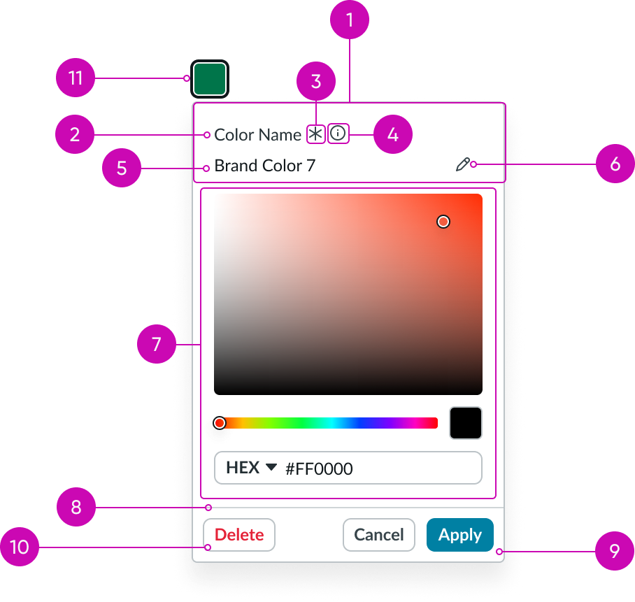
- Color name section (optional): Displays the color name information
- Form label: Text that identifies what the user should enter in a text input field; a label must be present for accessibility, either as the component's label element or external to the component
- Required indicator: Field decorator that indicates if a field is required
- Information icon (optional): Opens a popover on click and shows the field helper text
- Input url (custom): Space for user input and placeholder text
- Edit icon (optional): Enables user to edit the text in the input area
- Color selection: Contains the saturation-brightness area, color monocle, hue slider, preview swatch, and color variable reference
- Divider line: A line that separates the footer buttons from the color selector content
- Footer buttons: “Cancel” discards any choices made; “Apply” confirms any color changes to the color swatch
- Delete button: Removes the selected color from the library
- Trigger: Initiates opening and closing of the color selector
Color selection
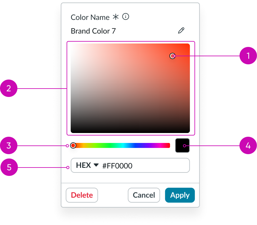
- Color monocle: Circle that indicates the selected color
- Saturation-brightness area: Displays the range of saturation and brightness of the hue selected
- Hue slider: Slider that impacts what color will display in the preview swatch and the saturation-brightness area
- Preview swatch: Showcases the color selected in the color monocle, which also matches the color variable reference in the input below
- Input: Input field with a dropdown for HEX, RGB, or HSL values
Custom colors tab
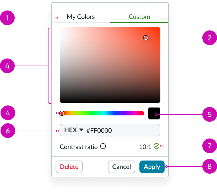
- Header: Title for your “Custom” tab
- Color monocle: Circle that indicates the selected color
- Saturation-brightness area: Displays the range of saturation and brightness of the hue selected
- Hue slider: Slider that impacts what color displays in the preview swatch and the saturation-brightness area
- Preview swatch: Showcases the color selected in the color monocle, which also matches the color variable reference in the input below
- Input: Input field with a dropdown for HEX, RGB, or HSL values
- Accessibility tools (optional): Shows user the contrast ratio of the selected color against a configurable color
- Footer buttons: “Cancel” disregards any choices made; “Apply” confirms any color changes to the color swatch that launched the color selector
My colors tab - grid view
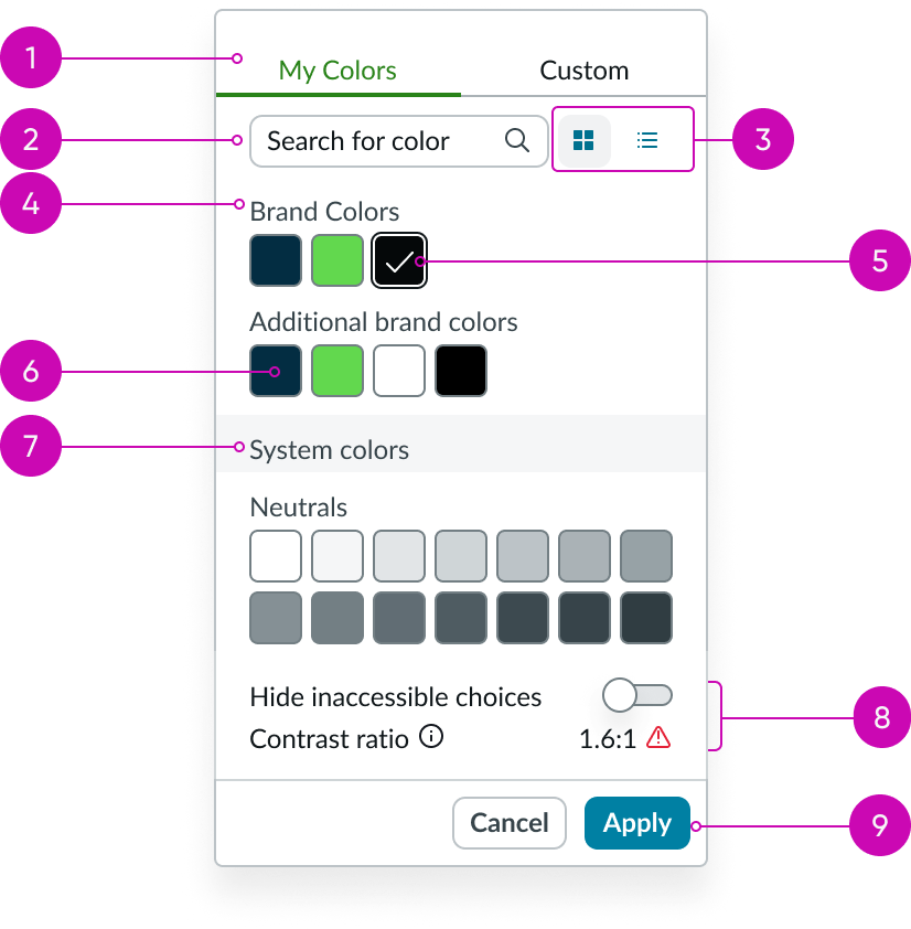
- Tabs: Separates “My Colors” and “Custom” content in pop-up modal
- Search: Text field to search globally for colors in the theme
- Stateful buttons: Toggle between grid view and list view
- Swatch group label: Label used to name a group of color swatches
- Selected color swatch: Color swatch with a check-mark to indicate it is selected
- Color swatch: Square element that displays color
- Color section header: Header that displays additional information about the color swatch groups
- Accessibility tools (optional): Displays contrast ratio of the selected color against another configurable color; shows or hides colors that have insufficient contrast
- Footer buttons: “Cancel” disregards any choices made, “Apply” confirms any color changes to the color swatch that launched the color selector
My colors tab - list view
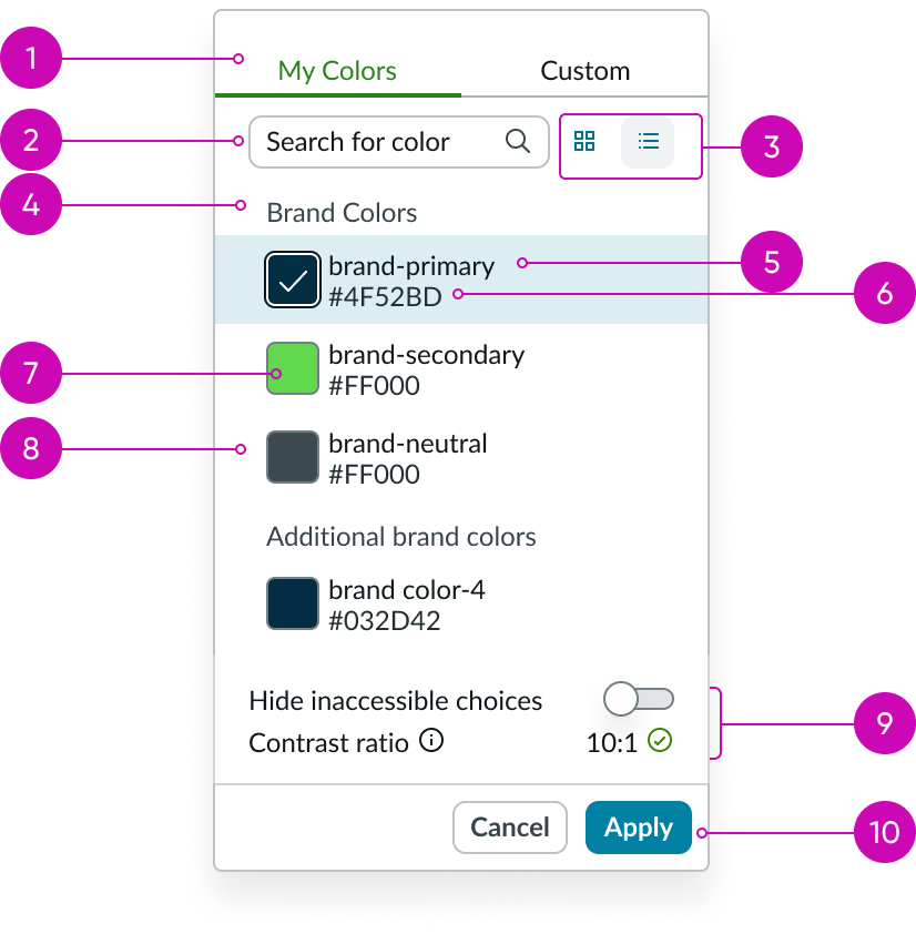
- Tabs: Enables user to separate content in pop-up modal
- Search: Text field to search globally for colors in the theme
- Stateful buttons: Enables user to switch between grid view and list view
- Swatch group label: Label used to name a group of color swatches
- Swatch name: Friendly name for the color swatch
- Swatch color variable: HEX, HSL or RGB value
- Color swatch: Square element that displays color
- Selected color swatch: Color swatch with a check-mark to indicate it is selected
- Accessibility tools (optional): Displays contrast ratio of the selected color against another configurable color; shows or hides colors that have insufficient contrast
- Footer buttons: “Cancel” disregards any choices made, “Apply” confirms any color changes to the color swatch that launched the color selector
Usage
This component can be used to select colors and to display information for a selected color swatch, with the ability to switch between a selector view, grid view, and palette view. You can access custom colors in addition to HEX, RGB, and HSL values.
Variants
Learn about the variants of color selector.
Configurations
Learn how to customize color selector by configuring the available properties.
Trigger type
You can choose either a button trigger or select trigger for your color selector.
Label
You can select “show label” to include a label for your color selector.
Color selector panel position
Using an array, you can define possible positions that the color selector panel can appear, relative to the trigger.
Tabs
You can assign a name to the tabs that will show in grid and list view. The default used is “My Colors,” and “Custom.”
Initial color
You can assign the initial color to display when the selector is opened.
Colors
You can provide an array of color objects to display in the “My Colors” tab, and assign them names.
Helper content
If set, an iconic button with popover appears next to the color name label for displaying additional info about the color name
Footer actions
You can configure the footer to include user actions such as “Cancel” and “Apply.”
Accessible color selector
You can enable accessibility options for color selector to configure the contrast check type and the comparison color.
Contrast check type
You can set the text contrast or the graphics contrast to determine the minimum visual contrast ratio for accessible design. Visit the links below for more information on text and non-text contrast standards.
Text contrast accessibility standards
Non-text contrast accessibility standards
Comparison color
Configure this property to set the comparison color. When the user selects a color, it will be compared to the comparison color to find the contrast ratio.
UI text guidelines
These are some recommendations for using text within color selector:
- The field helper text should provide additional context to the form label
- Use a tooltip on the Edit icon to show the verb that will happen when the person selects it
Behavior
Learn how color selector behaves when the display changes or a user interacts with the component.
Color swatch states (grid view)
Color selector swatches in grid view have the following states: default, hover, press/focus, and selected.
| State | Example |
|---|---|
| Default | |
| Hover | |
| Press/focus | |
| Selected |
Color swatch states (list view)
Color selector swatches in list view have the following states: default, hover, press/focus, and selected.
| State | Example |
|---|---|
| Default | 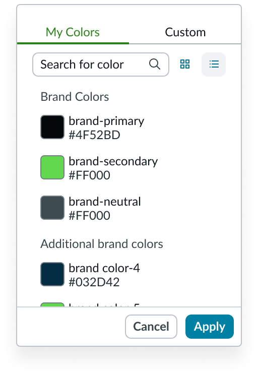 |
| Hover | 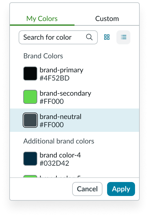 |
| Press/focus |  |
| Selected | 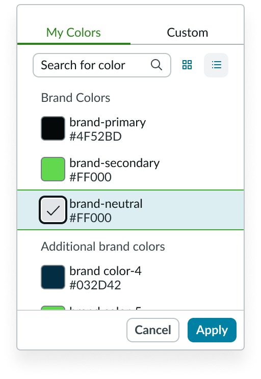 |
Monocle states
The color selector monocle has following states: default and active.
| State | Example |
|---|---|
| Default | |
| Active |
Hue slider states
The color selector hue slider has following states: default and active.
| State | Example |
|---|---|
| Default | |
| Active |
Responsive behaviors
Learn how color selector responds to changes in a container or display.
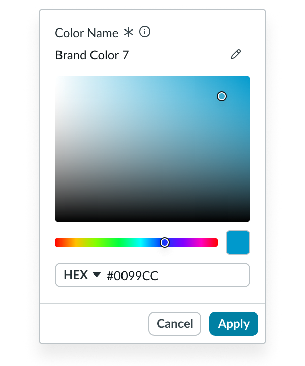
Autofill color variable digits
If a user enters shorthand variables, the rest of the color’s digits will autofill. For example, #09C will be automatically corrected to #0099CC.
Scrolling
The scroll bar is hidden by default, it will appear once the user hovers over the scroll bar area.
Interactions
Learn how color selector responds when a user interacts with it.
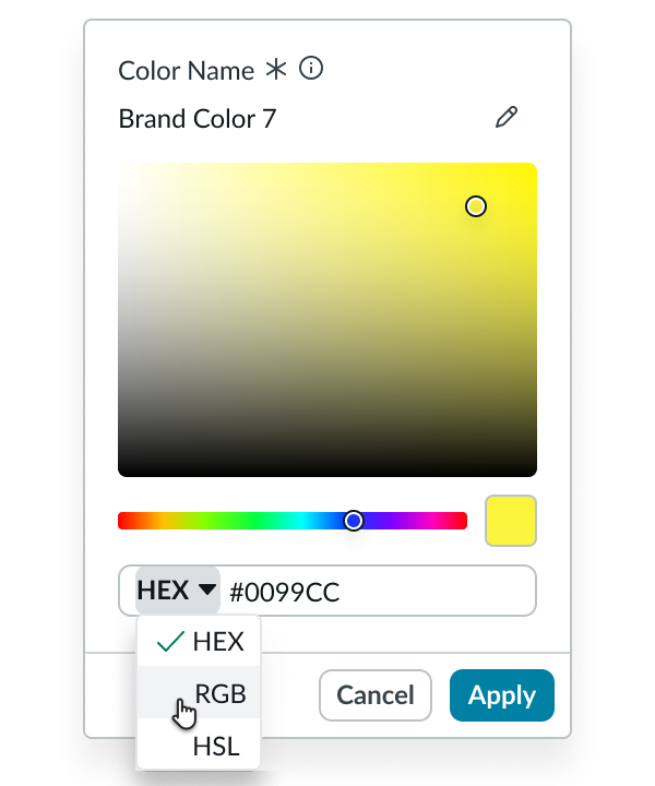
Select a color using the dropdown
The user can select a color by entering a HEX, RGB, or HSL variable into the dropdown below the hue slider. If variables are removed, it will automatically display the last accepted value. The user can also switch between using HEX, RGB, or HSL values by selecting the dropdown and choosing a different color variable type.
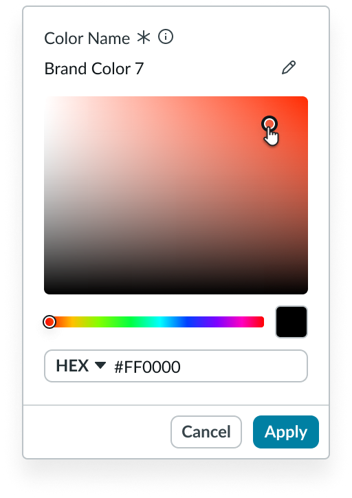
Change a color with the monocle
When the color monocle is active, the user can move it to change the color displayed in the saturation-brightness area.
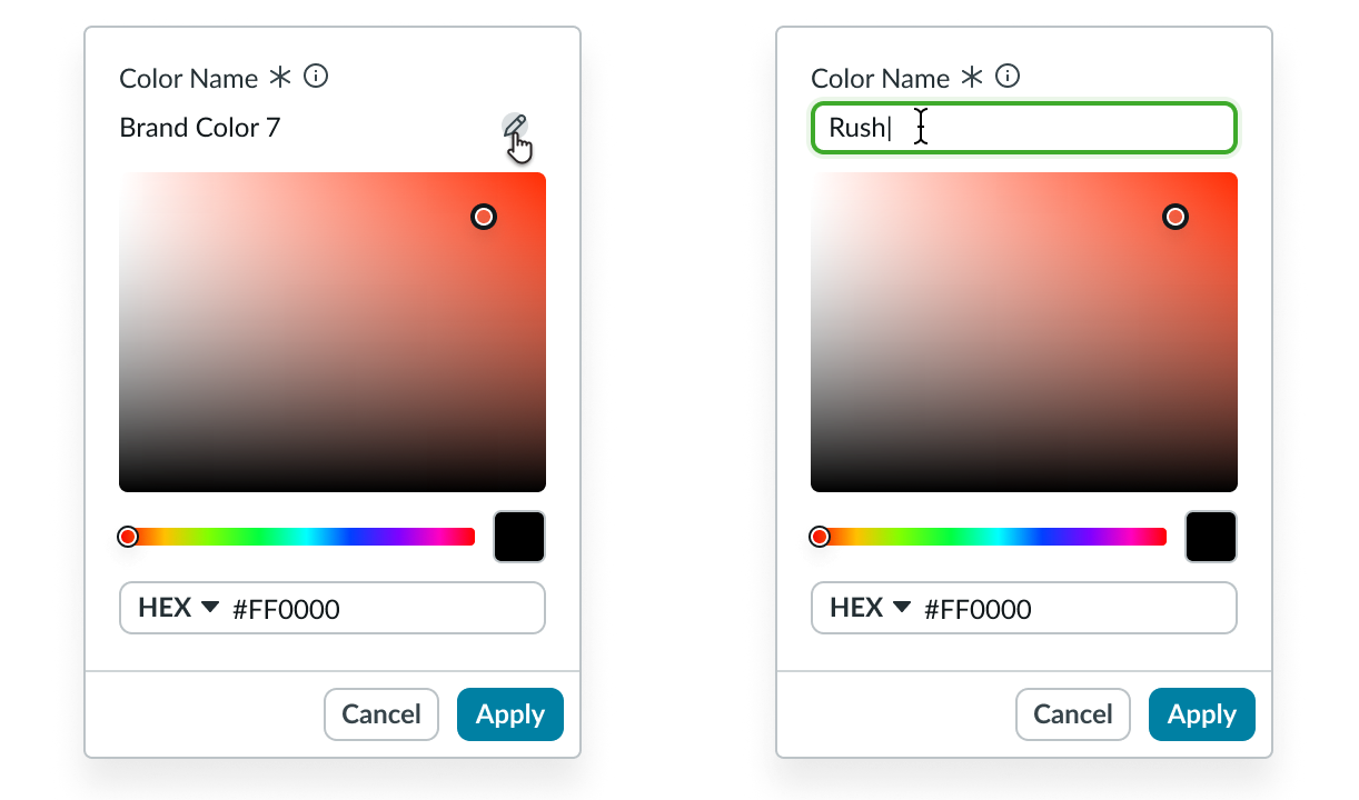
Change a color name
The user can select the pencil icon next to the current color name to open an input field where a new name may be entered.
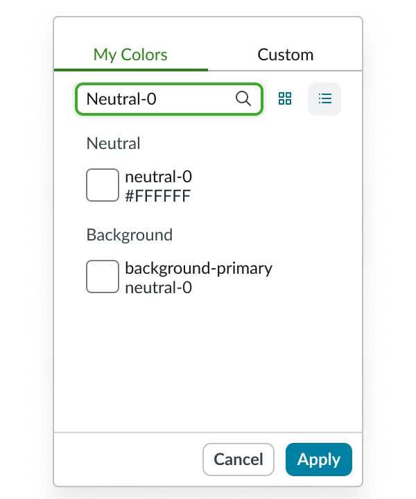
Search for colors
The user can search for colors in the “My Colors” tab using theming variable names, friendly names, hexcode, RGB, and HSL values.
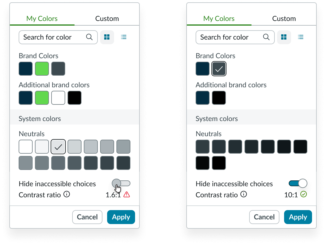
Hide inaccessible colors
If accessibility tools are enabled, users can hide colors that have insufficient contrast. By default, “hide inaccessible choices” toggle is off, and the color selector displays all colors. When the user toggles it on, color selector hides colors that have insufficient contrast with its comparison color. This is only available in the “my colors” tab.
Usability
Color selector complies with all internationalization and accessibility requirements.
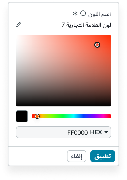
Internationalization
When this component is used in a platform configured for a right-to-left (RTL) language, the text and elements move to the opposite side.
Accessibility
Learn how to access the actionable elements of color seletor through keyboard interactions and screen readers.
Selector view tab order
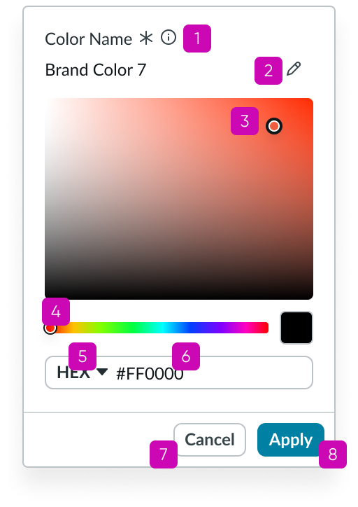
Custom color view
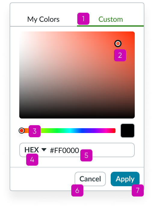
Keyboard interactions
You can access the actionable elements of color selector with these keyboard keys:
- Tab: Moves focus to the next actionable element
- Shift + Tab: Moves focus to the previous actionable element
When focus is on the color monocle:
- Arrow keys: Moves the monocle around to change the color in the saturation-brightness area
Screen readers
When you apply ARIA labels to a component, screen readers announce the controls and content of color selector in the prescribed tab order.


