Anatomy
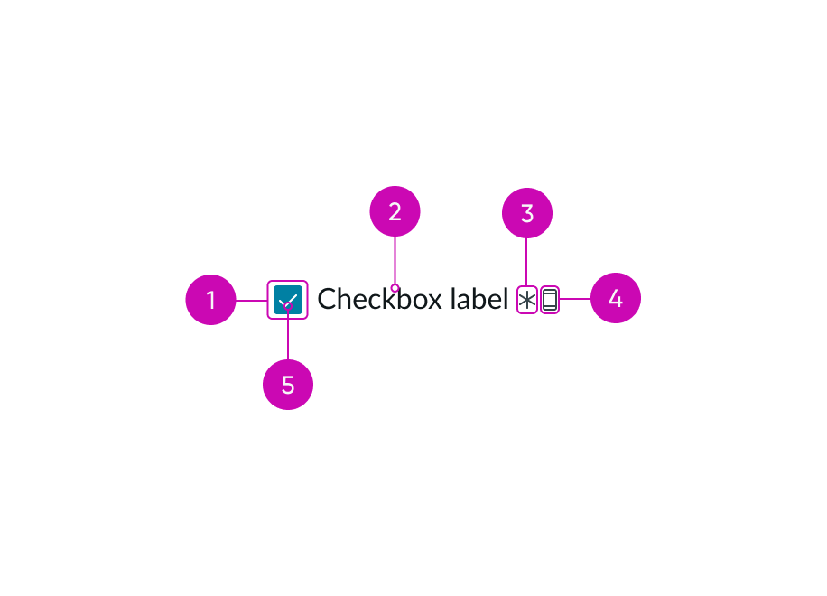
- Checkbox container: Area that contains an icon when the checkbox is in a selected or indeterminate state; it appears empty when unselected
- Label (optional): Text that supports the checkbox
- Required indicator (optional): An asterisk icon signifying a required field; it always appears after the label
- Label-inline slot (optional): An available slot for an additional label icon
- Container icon: Icon that appears in the container; can be either the checkmark icon or the indeterminate icon
Subcomponents
See usage guidance for radio buttons
See usage guidance for input field
Usage
Use checkboxes to help users select items in a checklist or filter.
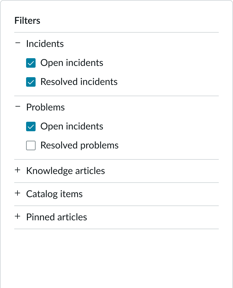
In this example, the user can select the checkboxes to apply a filter to the content.
You can also use checkboxes in a form, when a user needs to select certain options before submitting.
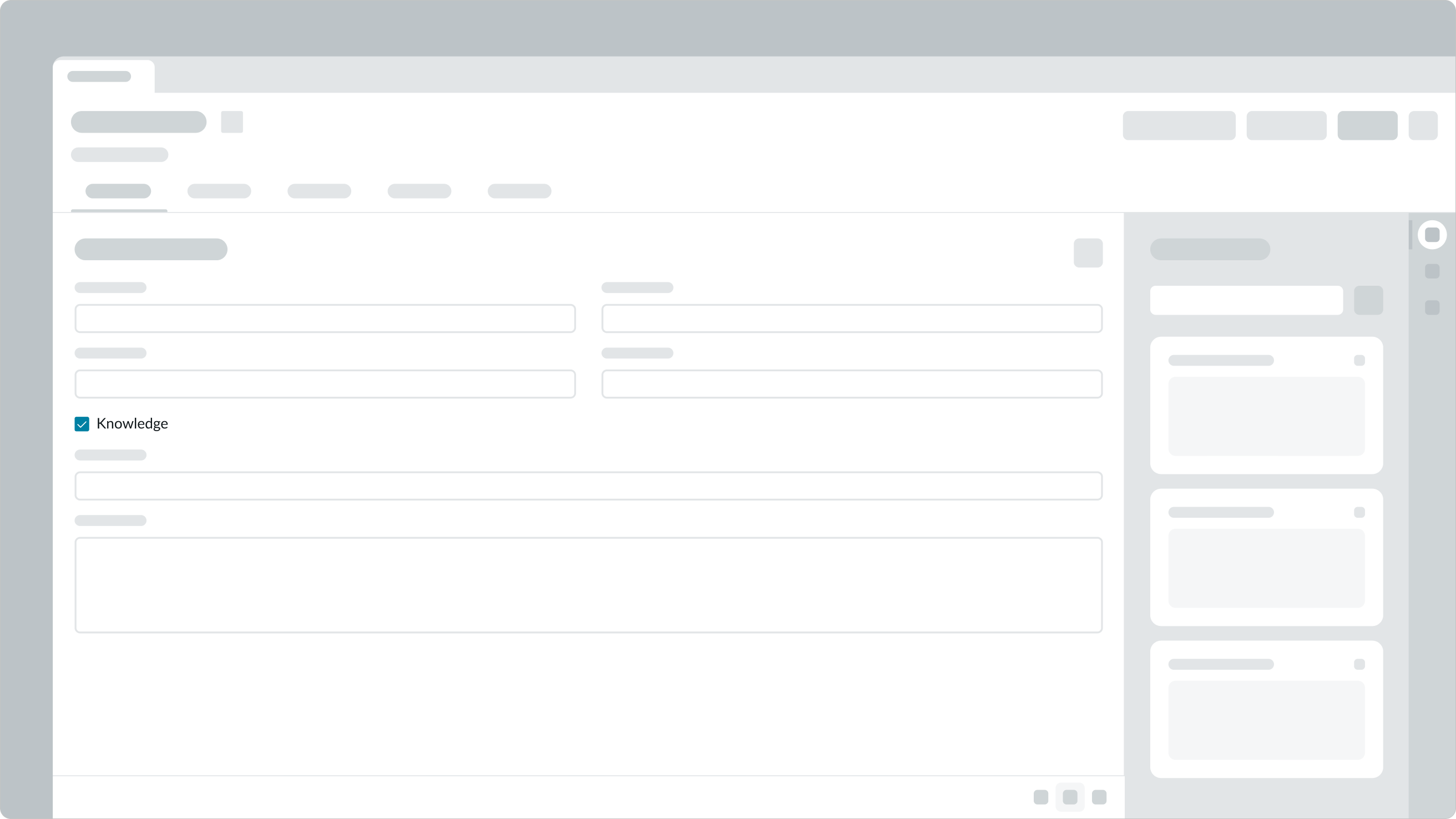
In this example, the checkbox lets the user know that a Knowledge Base article exists about this issue.
Use a checkbox to help a user accept and agree to the terms and conditions on a site.
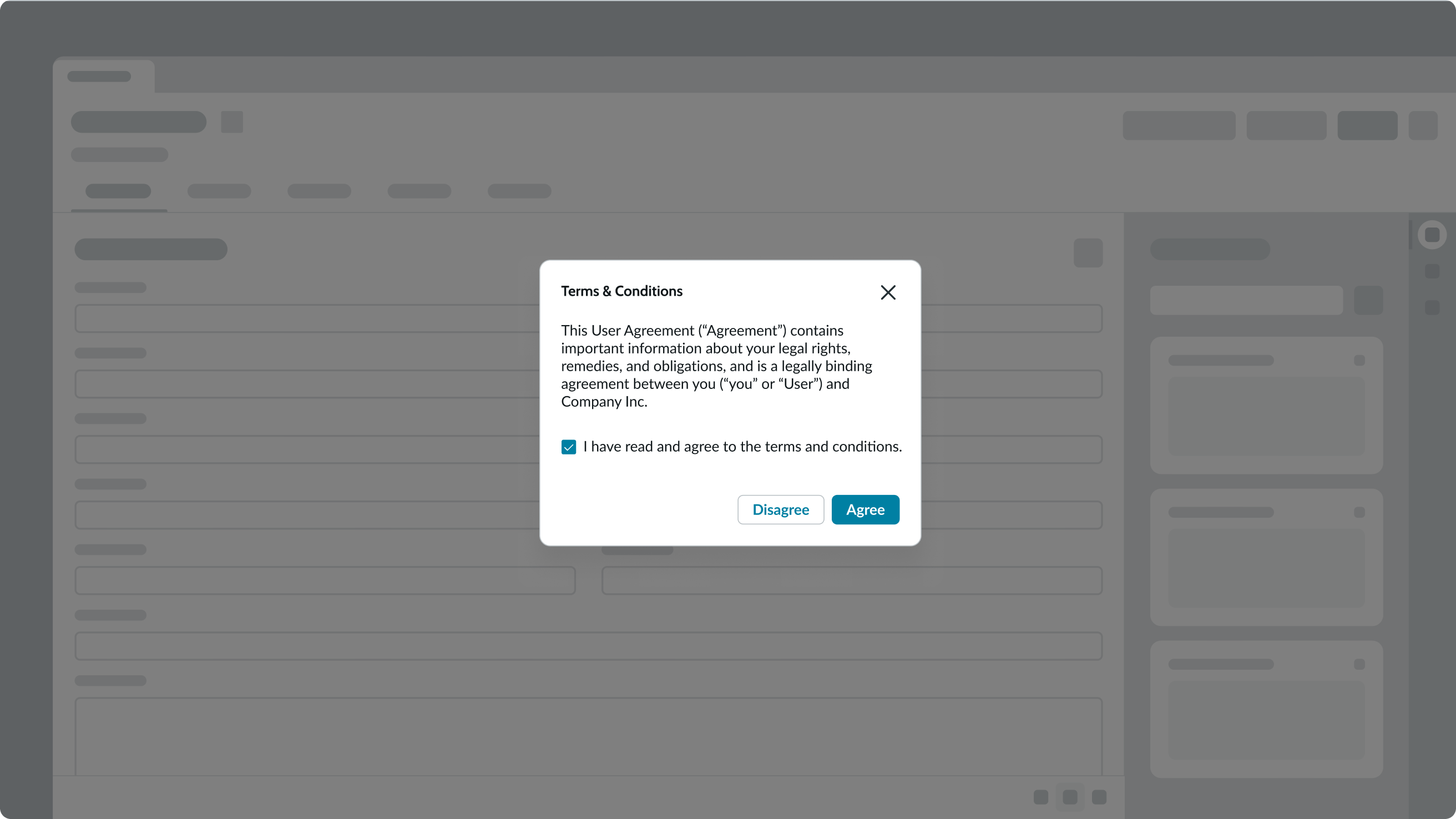
In this example, the checkbox for accepting the terms and conditions is a required field.
You can also use checkboxes to help a user make selections in a list.
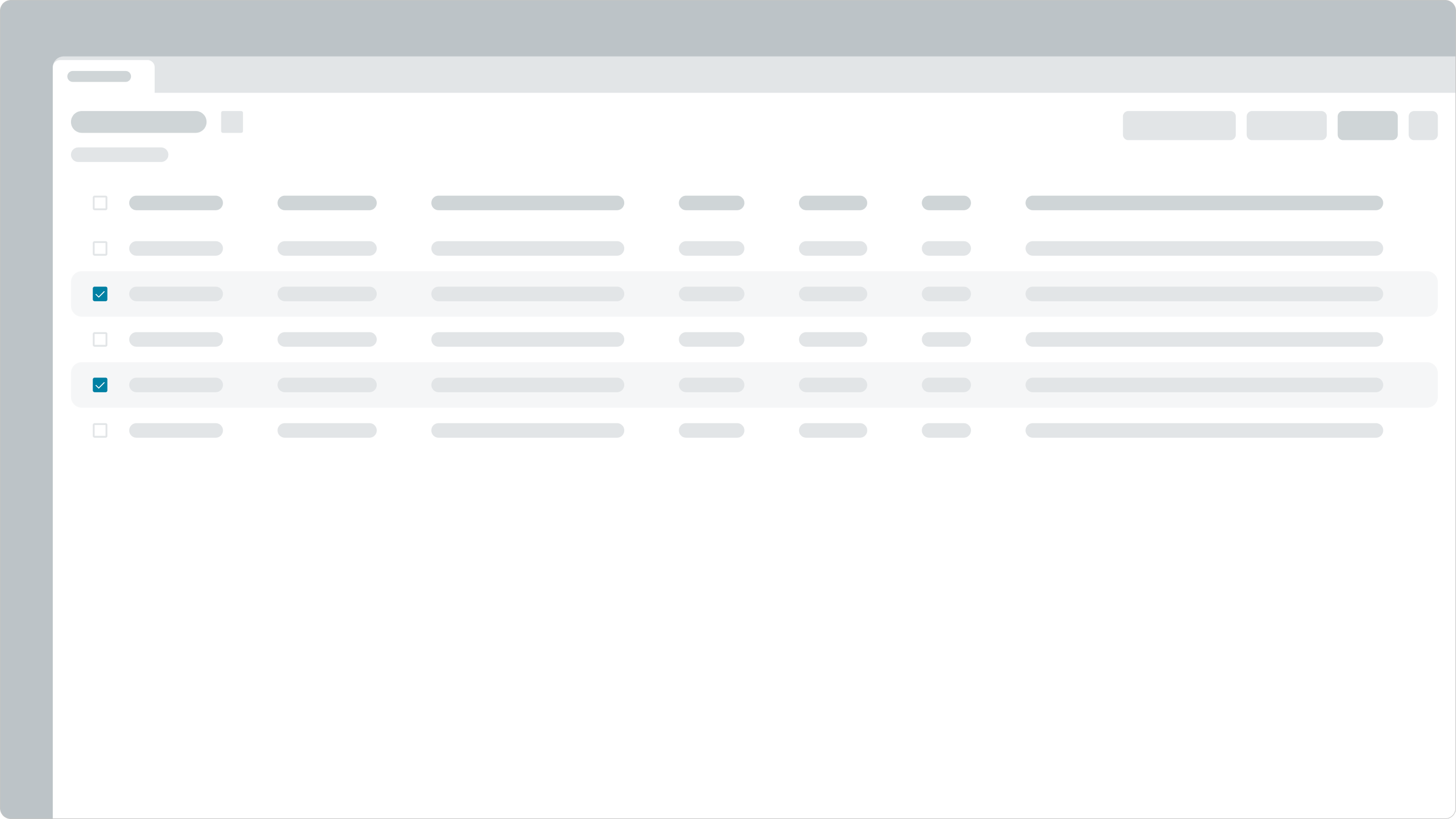
In this example, the checkboxes show which records the user has selected.
Checkboxes vs. radio buttons
Checkboxes and radio buttons may look like similar components, but when you use them varies.
- If the user can only choose one item from a group, use a radio button. But if the user can select more than one option from the group, use a checkbox instead.
- If you're offering the user only one option, use a radio button. Only use checkboxes for groups of options.
- If the user can turn a selection either ON or OFF, use a checkbox. For this to work, it must be clear what the ON and OFF states. If the meaning of the selected or unselected checkbox isn't clear, use radio buttons instead.
- If a "yes" or "no" answer is required, you can use either a single checkbox or two distinct radio buttons.
Variants
Learn about the attributes of checkbox.
Sizes
Checkbox has 2 sizes: small and medium. Choose a size that fits with your display and surrounding content.
Small

Medium

Configurations
Learn how to customize checkbox by configuring the available properties.
Slot
The label has an in-line slot for additional information. The label-inline slot is available immediately after the field helper icon. You can add anything to the label-inline slot, but icons are the most appropriate use for this slot.

This example shows a device type indicator in the label-inline slot.
| Configuration | Example |
|---|---|
| Checkbox only | |
| Checkbox with label | |
| Checkbox with label and required field indicator |
Label alignment
You can configure labels to align to the left of the checkbox.

Design recommendations
Learn how to apply checkbox in your design.
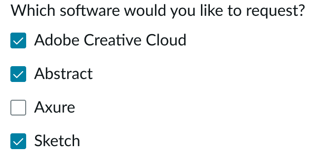
Use checkboxes when the user can select more than one option.
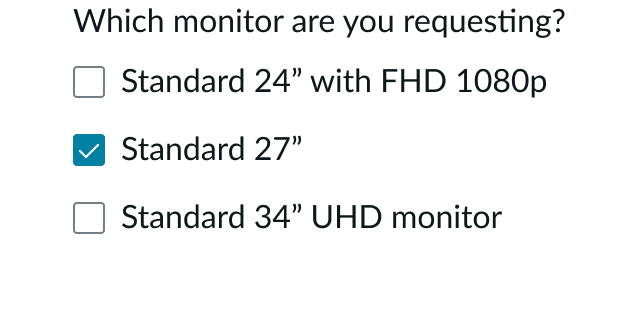
Don't use checkboxes for a group of items where the user can select only a single option. Instead, use radio buttons.
Alignment and positioning
Depending on your use case, you can position these checkboxes in different areas. For instance, you can place checkboxes in forms, lists, or side panels in an experience. Where you place the checkbox determines where it aligns according to the surrounding context. The checkbox follows the guidelines of any adjacent, larger page element or structure (such as a list or side panel).
For left-to-right (LTR) languages, always place the checkbox to the left of the label. Make sure to keep the checkbox and label near each other so that users can see that they're related.
UI text guidelines
These are some recommendations for using text within checkbox:
- Be specific about what happens and include the action and outcome
- For example, “Make this form available to everyone”
- Start the label with a positive verb instead of an object
- For example, “Show all recipients”
- Avoid repeating the same phrase at the beginning of the label if you have multiple checkboxes in a group
- Avoid adding a period at the end of a checkbox label
- If you have a group of checkboxes, the labels should be the same length and written similarly to improve scanning
- If the checkbox is for a setting, make sure the text represents what happens when the setting is turned on
- For example, “Include attachments”
- If the person is opting in or consenting to something, use the pronoun “I” since the person is performing the action
- For example, “I want to receive marketing materials”
Behavior
Learn how checkbox behaves when the display changes or a user interacts with the component.
States
Checkbox has the following states: default, hover, focus, checked, intermediate, read-only, disabled, invalid.
| State | Example |
|---|---|
| Default | |
| Hover | |
| Focus | |
| Checked | |
| Intermediate | |
| Read only | |
| Disabled | |
| Invalid |
Invalid state
An invalid state occurs when a required checkbox isn't selected by the user. An error message appears under the checkbox label, and if the asterisk icon is present, it turns red.

Responsive behavior
The checkbox label will wrap to fit its container width.

Interactions
Learn how checkbox responds when a user interacts with it.
Checkbox behavior
| Behavior | Description | Example |
|---|---|---|
| Checked | When the user selects an unchecked checkbox, a check mark appears to indicate the checked state. | |
| Unchecked | When the user selects a checked checkbox, the check mark disappears to indicate the unchecked state. Unchecked is the default for a checkbox. | |
| Indeterminate | When the user selects some (and not all) of the checkboxes under a parent checkbox, a horizontal line appears in the parent checkbox to indicate an indeterminate selection. |
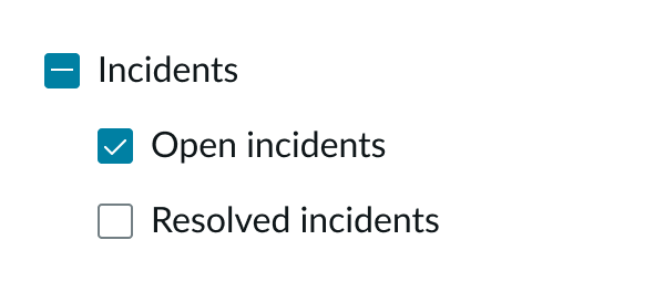
In this example, only one of the two options is selected under the parent option. As a result, the parent checkbox shows the indeterminate state.
Checkbox groups
In a checkbox group, the user can select more than one checkbox at a time.
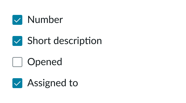
In this example, all checkboxes are on the same level in the hierarchy.
Checkboxes can be grouped to display parent-child relationships. In this type of group, the child checkboxes are indented and are nested below the parent's checkbox. The parent-to-child relationships in checkbox hierarchies are defined by product developers when they assemble the groups.
When a user selects a parent checkbox option in the hierarchy, all the child options are also selected. The user can select the parent checkbox option again to unselect all child options.
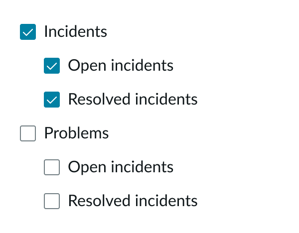
In this checkbox group, the hierarchy shows the relationships between the parent and child options.
Usability
Checkbox complies with all internationalization and accessibility requirements.
Internationalization
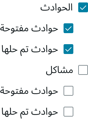
When the display translates to a right-to-left (RTL) language, the checkbox moves to the right of the label and aligns with the right side of the container. In a hierarchical checkbox group, the child options indent from the right.
Accessibility
Learn how to access the actionable elements of checkbox through keyboard interactions and screen readers.
Keyboard interactions
You can access the actionable elements of checkbox with these keyboard keys:
- Tab: Moves focus to a checkbox
- Space: When focus is on a checkbox, it selects or deselects a checkbox
Screen readers
When you apply ARIA labels to a component, screen readers announce the controls and content of checkbox in the prescribed tab order. The checkbox has a role of checkbox.
The checkbox has an accessible label provided by one of the following:
- When checked, the checkbox element has state aria-checked set to "true"
- When not checked, the checkbox element has state aria-checked set to "false"
- When partially checked, the checkbox element has state aria-checked set to "mixed"
- If a set of checkboxes is presented as a logical group with a visible label, the checkboxes are included in an element with role group that has the property aria-labelledby set to the ID of the element containing the label
- If the presentation includes additional descriptive static text relevant to a checkbox or checkbox group, the checkbox or checkbox group has the property aria-describedby set to the ID of the element containing the description

