

Anatomy
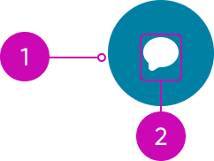
- Container: Area the user can select to initiate the button action
- Icon: Graphic element that represents the button's intent
Usage
Button circular should always perform an action that is directly related to the content in view. Use the button circular to initiate a primary action in an experience. The action could affect the content in view, open a window (like a popover or modal) on top of the content, or take the user to another page.
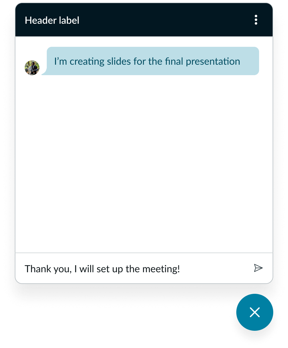
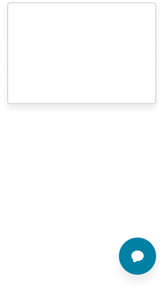
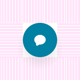
In this example, you can use a button circular to open or close a chat window in an experience.
Avoid using the button circular for any actions that are minor or destructive (like deleting a file).
Button circular versus button iconic
The button circular and button iconic look similar, but when and where you use the two components varies. Use a button circular when you want an action to always be present while the user engages with different pages or flows in an experience. Use a button iconic for actions that are only relevant to the page the user is currently viewing.
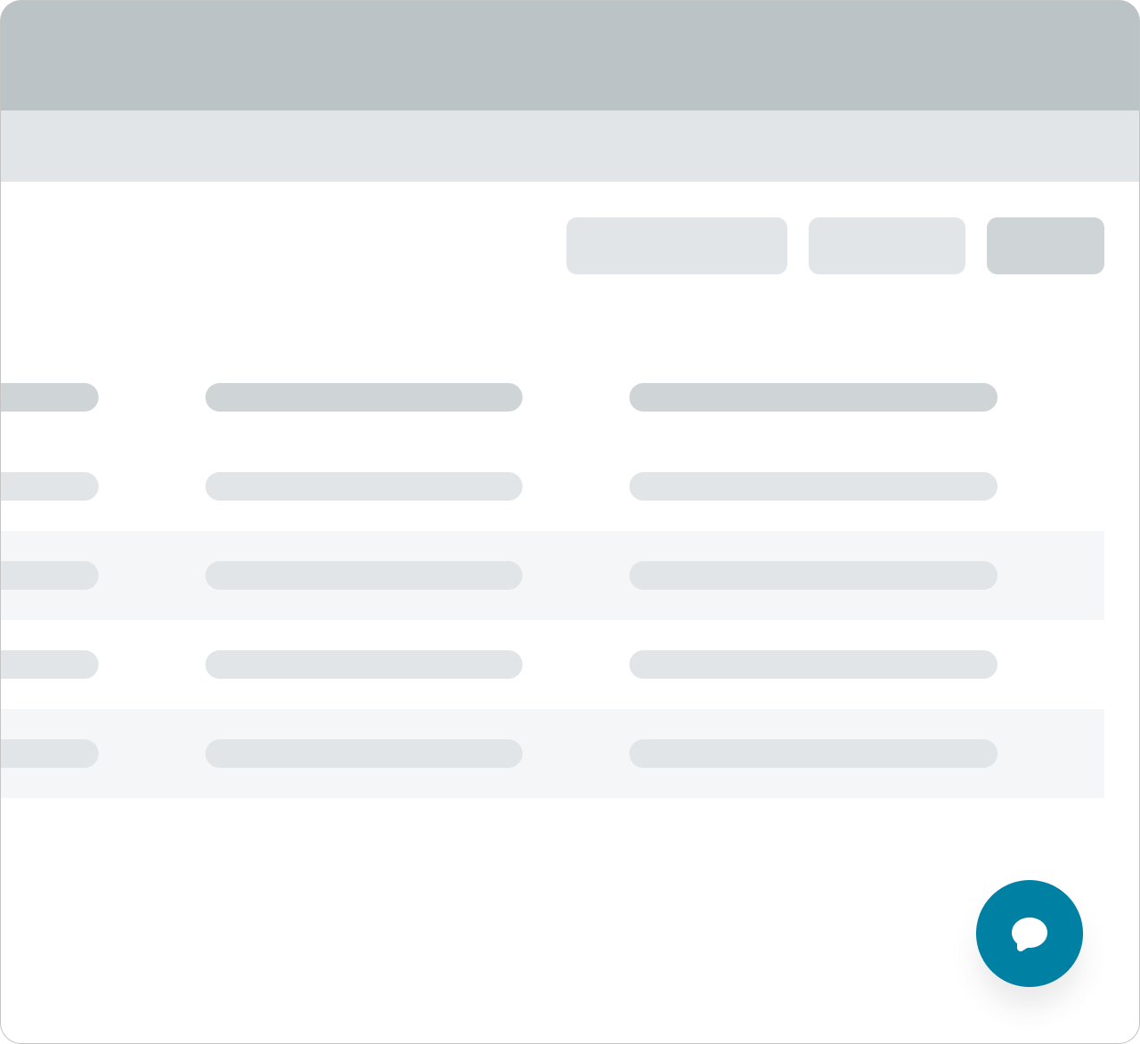
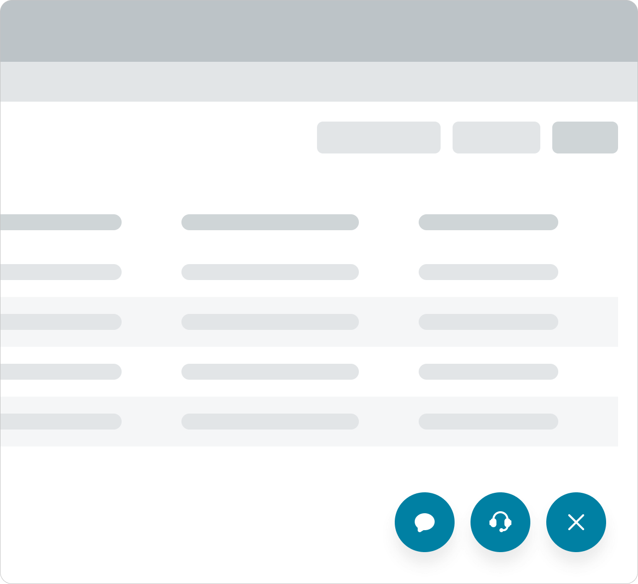
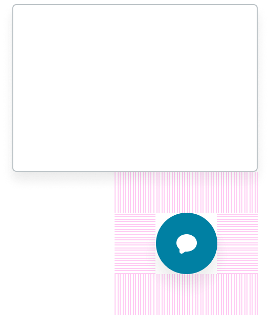
In this example, the overflow iconic button contain actions that are only relevant to the current page, while the “Chat” circular button opens and closes a chat window across different pages.
Variants
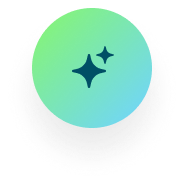
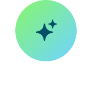
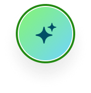
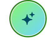
Button circular has the following style variants: initial and AI.
You can use the initial variant for most use cases. Use the AI variant to indicate AI usage.
Initial

AI variant

Types
Button circular is a type of the button component. For additional button types, see the usage guidance for the button component.
Sizes
Button circular has only one size. Whichever icon you use for the button circular automatically defaults to the large icon size. Button circular always stays the same size regardless of the display size.
Configurations
You can customize button circular by configuring the available properties.
Presets and controllers
This component contains a preset configuration that automatically configures properties and event handlers for a component, making the component ready to work when you add it to a page. A preset is designed to suit a specific use case. However, you can override preset property values with a custom configuration if you find it necessary for your design. Preset values that you override aren’t upgraded when updates are available. If you don’t want to use the preset values provided, select the option to configure the component manually. You can apply one preset to a single instance of a component on a page. For more information, see Presets.
A preset is always associated with a controller, which acts as a data resource for the component. Controllers provide the configuration data and event bindings the component needs to function in your experience. By selecting a preset, the required controller is added to the page. By adding a controller to the page, any new applicable components will have that controller's preset. For more information about how controllers work, see Controllers. For instructions on using the data inspector to view the default presets for a component, see View properties and events in the Controller API.
Icon
You can select any of the icons in the Icon Gallery for the button circular. When selecting an icon, be sure that it always provides context around what happens when the user selects the button circular. Avoid selecting an icon that is ambiguous or could refer to multiple actions. The default is “chat-fill.”

Examples of using different icons in a button circular
Animated icon
You can set an animated icon instead of a normal icon.
Accessibility
You can configure the ARIA properties for your button, set high contrast, and enable the landmark focus keyboard shortcut to focus on the button.
Design recommendations
Learn how to apply button circular in your design.
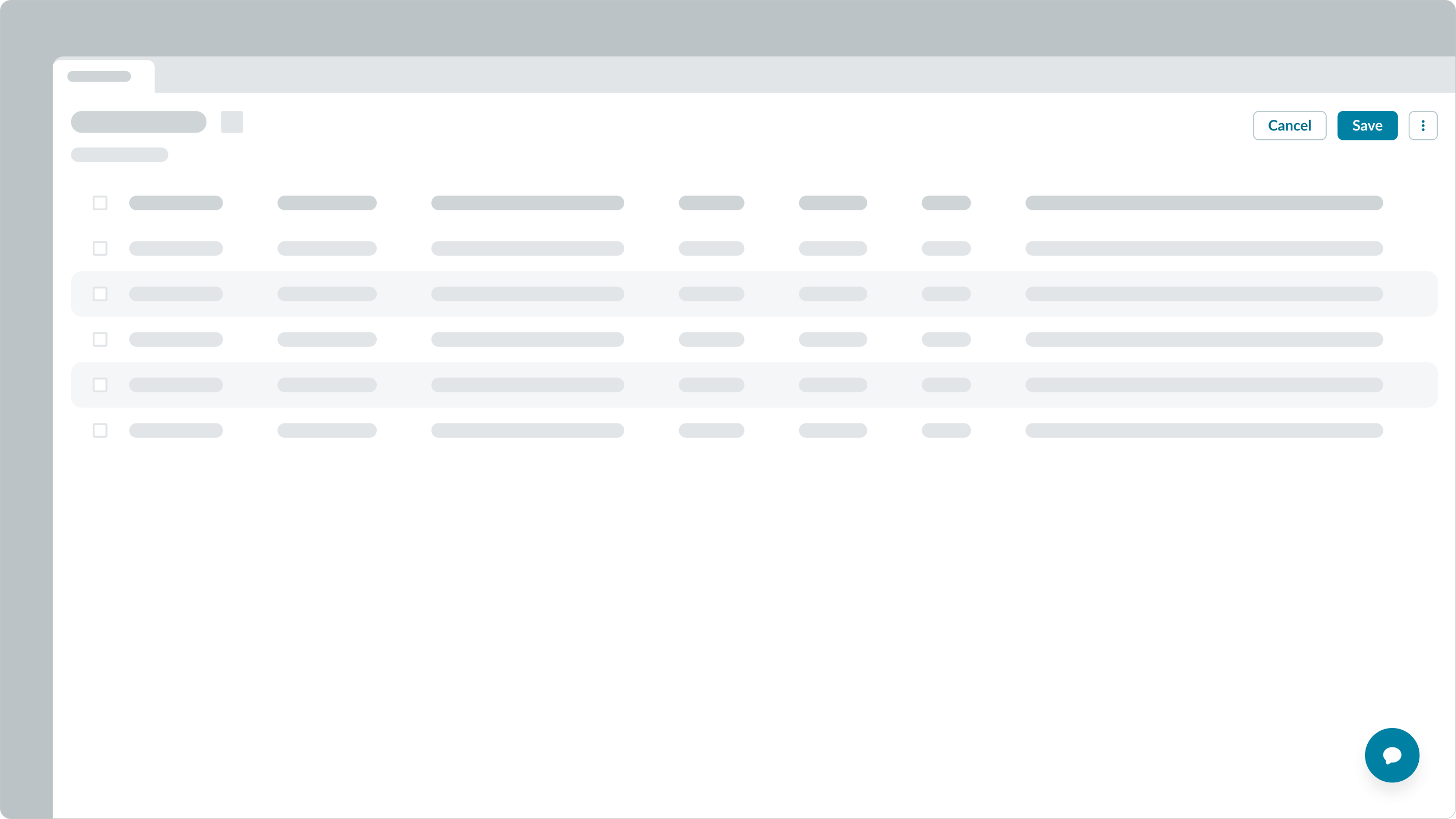
Place the button circular near the component it affects to show a clear relationship.
Avoid placing the button circular too far away from the component it opens. When the distance between the two is too far, their relationship can be unclear.
Use one button circular per page to focus on one important action.
Avoid using multiple circular buttons because it confuses the user as to which action is the most important.

The button circular should be findable, visible, and not clash with other components or elements in the experience.
The button circular can get lost when there are too many elements in the same area of the display.
Alignment and positioning
Where you place the button circular depends on your use case, but remember to always position it in the same place throughout the experience. This consistency creates familiarity for the user and helps them use the experience more smoothly.
The icon within the button circular is always center aligned.
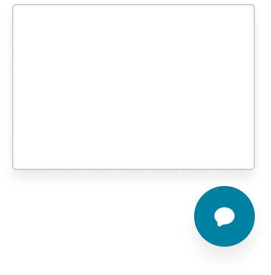
You can add space around the outside of the container but ensure that the space isn't so large that it obscures the button's relationship with the item it affects.
In this example, the space outside of the button circular is too large that it obscures the button’s relationship with the popover.
Behavior
Learn how button circular behaves when the display changes or a user interacts with the component.
States
Button circular has the following states: default, hover, pressed, focus, and disabled. A button circular may appear in the disabled state if the user's permissions don't give them access to the action or if the user can't perform the button's action on the current page.
Note: For mobile users, remember to remove the hover state so that the button isn't accidentally selected while scrolling.
| State | Shadow | No shadow | AI Shadow | AI No Shadow |
|---|---|---|---|---|
| Default |  |
 |
 |
 |
| Hover |  |
 |
 |
 |
| Pressed |  |
 |
 |
 |
| Focus |  |
 |
 |
 |
| Disabled |  |
 |
 |
 |
Responsive behaviors
The button circular always stays in the same spot regardless of the display size.
Dragging and floating
You can configure a button circular to either drag or float as the user interacts with the experience. The drag behavior means that the button circular attaches to a predetermined position on the content and moves as the content scrolls. The float behavior means that the button circular attaches in a constant position on top of the content (like an edge or corner).
Interactions
The user can only select the button circular to initiate an action, like opening a modal or popover.
Usability
Button circular complies with all internationalization and accessibility requirements.
Internationalization
When the display translates to a right-to-left (RTL) language, the button flips its orientation on the screen. The icon only flips if it is directional based.
Accessibility
Learn how to access the actionable elements of button circular through keyboard interactions and screen readers.
Keyboard interactions
You can access the actionable elements of button circular with these keyboard keys:
- Tab: Shifts focus to the button circular if enabled
- Space or Enter: Initiates the button circular action
Screen readers
The button circular requires configuration of the aria-label attribute in the configAria property to be accessible using a screen reader.
By default, the screen reader announces the button label based on any text content inside the button element. However, because there is no text inside the button circular, a text label must be provided another way. Use aria-label to add a text label to the button circular.
When the button is linked to a dialog or non-modal window, It should have a label that indicates the availability of an interactive element that can be initiated by the button. To do this, use the aria-haspopup property.