Anatomy
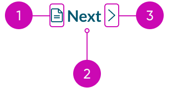
- Icon before (optional): You can place an icon at the beginning of the label; the icon size is proportional to the label size
- Label: The text that defines the button's action
- Icon after (optional): You can place an icon at the end of the label; the icon size is proportional to the label size
Usage

Use a button bare to provide the user with tertiary actions in a non-obtrusive way. Examples include a "Show More" option, a "Cancel" button in a modal, or a "Next" button in pagination.
Variants
Learn about button bare and find out how to use it in your design.
Colors
Button bare has the following variants: primary, secondary, and tertiary. The primary color variant emphasizes important actions in the display. Meanwhile, the secondary and tertiary color variants signify actions of lesser importance.
| Variant | No icon | With icon |
|---|---|---|
| Primary | ||
| Secondary | ||
| Tertiary |
Types
The button bare has the following types: text bare and text bare with icon.
Text bare
This type displays only text as the button bare. Use this type when you want to place a button bare with static text or labels.
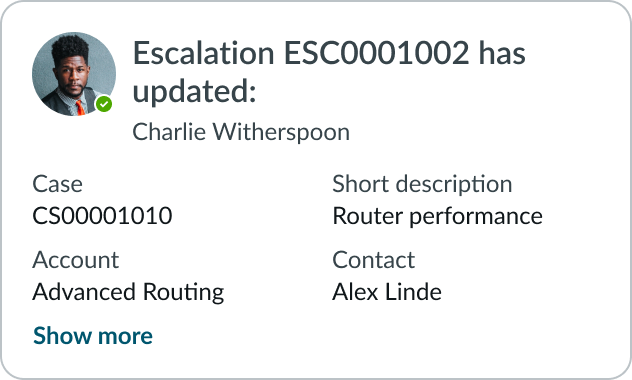
In this example, the “Show more” text is a button bare.
Text bare with icon
This type has an icon before or after the text label, but never both. Using an icon can provide the user with extra visual context regarding the purpose of the button bare.

The button bare with an icon placed before the label.

The button bare with an icon placed after the label.
Sizes
The button bare has the following sizes: small (sm) and medium (md). For both sizes, the icon is the same size as the text label. Size helps reinforce visual hierarchy, differentiate button types, and indicate button functions. Choose the size based on the importance of the action and the surrounding context.
Small
Use the small size when space is limited. You can also use this size for non-essential actions.

Medium
Use the medium size to match the size of surrounding components and context. Medium is the default size.

Design recommendations
Learn how to apply button bare in your design.

Do use buttons for actions, i.e., submit a form, save a change, or show more information.

Don't use button bare in place of a text link. Buttons trigger actions while links redirect users to pages
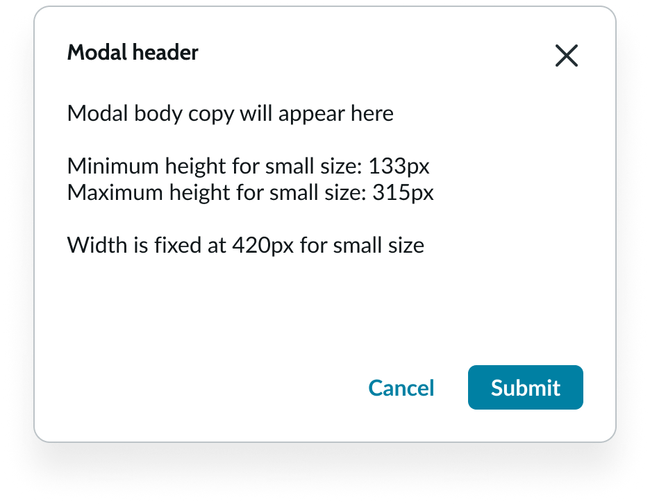
Do use button bare for lowest priority actions.
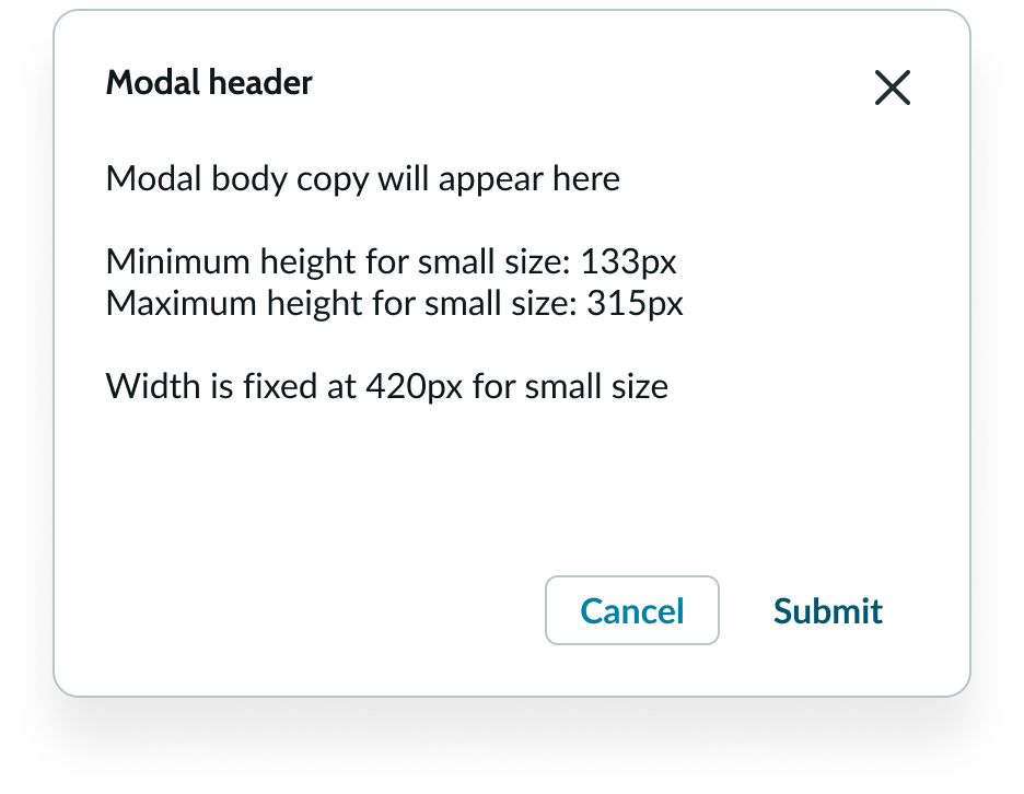
Don't use button bare as the primary CTA.
UI text guidelines
These are some recommendations for labeling a bare button:
- Start with a verb to describe a specific action. This sets the expectation of what happens next.
- Use short labels. Two words is ideal. Three is OK. If needed for clarity, four is acceptable.
- Avoid commas, periods, and other punctuation
- Add an object to the verb if additional context or clarity is needed
- For example, “Add table"
- Add an article (like “a” or “an”) to add a more human, conversational tone
- For example, “Add a person”
- Use the same verb tense if there are multiple buttons
- For example, two buttons could be “Apply” and “Close,” both of which are present tense
Behavior
Learn how button bare behaves when the display changes or a user interacts with the component.
States
Button bare has the following states: default, hover, pressed, focus, and disabled.
| State | No icon | With Icon |
|---|---|---|
| Default | ||
| Hover | ||
| Pressed | ||
| Focus | ||
| Disabled |
Interactions
If a button action changes when the user interacts with it, clearly communicate this to a user in the button bare label. See example below.
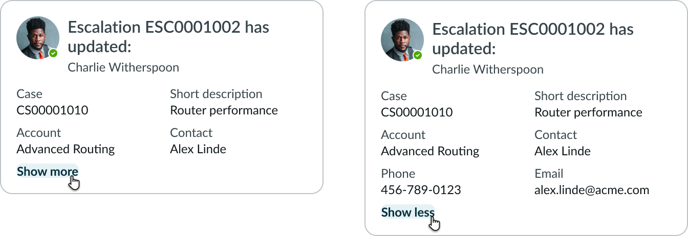
The “Show More” button bare clearly indicates what happens when a user interacts with it. The button bare changes to “Show less” after the user interacts with it to indicate the new action.
Truncation
If the button bare label is longer than the container, it truncates with an ellipsis. If the label also includes an icon, the text truncates with an ellipsis but the icon remains. The full label is available in a tooltip on hover.

An example of how the button bare label with an icon truncates.
Usability
Internationalization
When the display translates to a right-to-left (RTL) language, the icon for a button bare flips its positioning. The icon itself will also flip if it communicates direction.

