

Anatomy
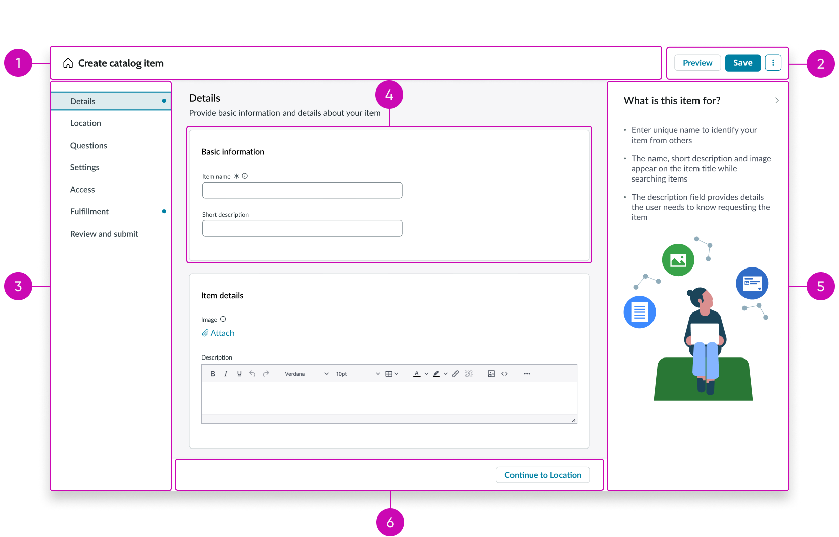
- Wizard title bar: This houses the home button, title of the wizard, and declarative action buttons
- Declarative actions: If the component has any declarative actions configured, they’re shown in this section
- Steps: The list of steps in the catalog wizard; helps with navigation
- Section: A section in a step’s details; separates information about the step into different parts
- Feedback panel: A panel containing additional information on how to fill out the step sections
- Footer: Catalog wizard footer; can contain optional navigation or or a submit button
Usage
Catalog wizard can be used for guided experiences, such as an employee onboarding. It should be used for intake experiences where there is a need for a lot of detail and grouping so that the information can be shown in steps.
Configurations
Learn how to customize catalog wizard by configuring the available properties.
Identification
Configure the sys ID, template ID, and record ID to properly identify your resources. For the record ID, you can set the mode to “normal” for creating or editing records. If your catalog wizard will be used to create or edit catalog templates, then you can set the mode to “template.”
Mode
You can set the mode to “normal” for creating or editing records. If your catalog wizard will be used to create or edit catalog templates, then you can set the mode to “template.”
Home button
You can configure the home button icon and tooltip, or you can hide the home button. By default, the home button isn’t hidden.
Mandatory template
You can set this property to be true to require a valid template ID in order for catalog wizard to generate an entity.
Field space
You can specify the amount of spacing between questions in a section.
Nav buttons
You can make the forward and back buttons visible or hide them. By default, the forward button is visible and the back button is hidden. You can configure the forward button variant type. By default, it’s set to a primary button type.
Design recommendations
Learn how to apply Catalog wizard in your design.
Behavior
Learn how Catalog wizard behaves when the display changes or a user interacts with the component.
Interactions
Learn how Catalog wizard responds when a user interacts with it.
Instructional content
Users can select the navigational icon in the instructional content area to move through to the next content section.
Section detail
Users can select the section detail area to add content for every step of the Catalog wizard.
Buttons
Users can select the submit button after filling out the section detail area to navigate to the next step. They can also access the primary and secondary buttons in the Catalog wizard header to perform actions such as previewing the completed content or saving the content that has been completed so far.
Truncation
When text in Catalog wizard exceeds the width of the container or content area, the text truncates with an ellipsis, and a tooltip shows the full content on hover.
Usability
Catalog wizard complies with all internationalization and accessibility requirements.
Internationalization
When this component is used in a platform configured for a right-to-left (RTL) language, all content will flip to the other end of its respective container. The steps and instructional content will also swap positions with each other.
Accessibility
Learn how to access the actionable elements of Catalog wizard through keyboard interactions and screen readers.
Keyboard interactions
You can access the actionable elements of Catalog wizard with these keyboard keys:
- Tab or space: Navigates to the next actionable item
Screen readers
When you apply ARIA labels to a component, screen readers announce the controls and content of Catalog wizard in the prescribed tab order.