
Comparison
Comparison charts display variations and similarities in data.
Example use cases:
- Catalog items inventory
- Reopened incidents by priority
Chart types
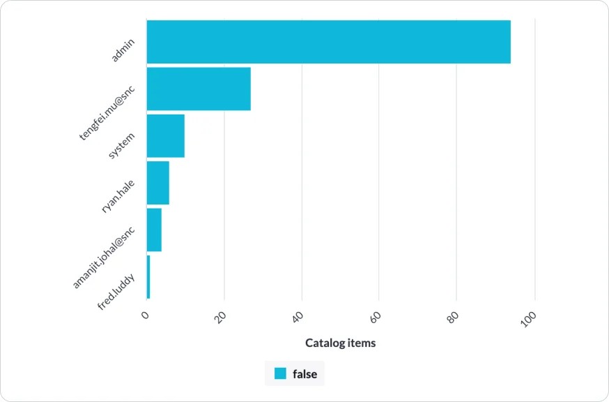
Horizontal bar: A horizontal bar chart visually compares data using horizontal bars. It's great for quickly identifying the largest or smallest values in different categories.

Vertical bar: A vertical bar chart visually compares data using vertical bars. It's effective for quickly identifying the largest or smallest values in different categories.

Bubble: A bubble chart is a visual representation of data using bubbles of different sizes. It displays data on both the x and y axes, with the size of each bubble representing a third variable. This chart type is useful for showing relationships between three different variables and allows for easy identification of patterns or outliers. The position of each bubble on the chart indicates its x and y values, while the size represents the magnitude of the third variable.
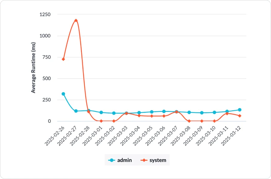
Trend
Trend charts display information that has undergone transformations throughout a period of time.
Example use cases: Application runtime trends
Chart types

Line: A line chart is a type of chart that displays data using a series of data points connected by straight lines. It is commonly used to show trends or changes in data over time or other continuous variables. Line charts are effective in visualizing the relationship between two variables and identifying patterns, fluctuations, or correlations.
Spline: A spline chart is a type of chart that is similar to a line chart, but the lines are smoothed using a mathematical function called a spline. This smoothing technique helps to reduce the jaggedness of the lines and provides a more visually appealing representation of the data. Spline charts are commonly used to display trends or changes in data over time or other continuous variables, just like line charts. The smooth curves of the lines make it easier to identify patterns and trends in the data, especially when there are fluctuations or irregularities.

Area: An area chart is a type of chart that displays data using filled areas between lines. It is similar to a line chart, but the area below the line is filled with color or pattern. Area charts are useful for showing the cumulative totals or proportions of different categories over time or other continuous variables.

Column: A column chart is a type of chart that displays data using columns or bars.

Step: A step chart, also known as a step plot or a step line chart, is a type of chart that displays data using a series of horizontal and vertical lines. It is commonly used to show changes in data over time or other continuous variables, similar to a line chart. However, unlike a line chart where the data points are connected by straight lines, a step chart connects the data points using horizontal and vertical lines that create a step-like appearance.
Part to whole
Part-to-whole charts display the sum of partial components in relation to the whole.
Example use cases:
- Incident monitoring
Chart types

Pie: A pie chart is a circular chart that represents different categories or proportions of a whole. Each slice corresponds to a category, and its size indicates the proportion it represents. Pie charts are useful for comparing proportions, but it's not recommended to use more than 5 or 6 slices as they can become difficult to interpret.

Donut: A donut chart is a variation of a pie chart with a hole in the center. It displays the same type of data as a pie chart, showing proportions or percentages of a whole. The outer ring of the donut chart represents the total, while the slices represent different categories. Like pie charts, it’s not recommended to use more than 5 or 6 slices in a donut chart for clarity and ease of interpretation.

Semi donut: A semi-donut chart, also known as a half-donut or a half-pie chart, is a variation of a donut chart that displays data in a half-circle shape. Like pie charts, it is not recommended to use more than 5 or 6 slices in a donut chart for clarity and ease of interpretation.

Stacked bar: A stacked bar chart is a type of bar chart that displays multiple categories or subcategories as stacked bars within each main category. Each bar represents the total value of the main category, and the different segments within the bar represent the proportions or values of the subcategories.

Stacked area: A stacked area chart is a type of chart that displays the cumulative values of multiple categories or variables as stacked areas. Each area represents the total value of the category or variable at a given point in time or along an axis.

Speedometer: A speedometer chart is commonly used to represent metrics such as progress, performance, or levels of achievement. The chart typically consists of a circular scale with labeled intervals or ranges, and a needle or pointer that indicates the value being measured.

Dial: A dial chart, also known as a radial chart or circular gauge, is a type of chart that represents data using a circular dial or gauge. It is similar to a gauge chart but typically does not have a needle or pointer.
Correlation
Correlation charts display the association between two or more variables.
Example use cases:
- Incidents by priority and state
Chart types

Heat map: A heat map is a type of chart that uses color to represent the magnitude or density of values within a matrix or table. It is particularly useful for visualizing large datasets and identifying patterns or trends within the data.
Geospatial
Geospatial data visualization display information that is related to geographic locations or spatial relationships.
Example use cases:
- Sales performance in a country divided by districts, cities, etc.
Chart types

Geo map: A geo map, also known as a choropleth map, is a type of map that uses color or shading to represent data values for specific geographic regions. It is a powerful visualization tool for displaying spatial patterns and variations in data across different areas or regions.
Tabular
A tabular chart, also known as a table, displays data in a structured format with rows and columns.
Example use cases:
- Analyze customer support tickets by category and response time to identify areas for improvement.
Chart types:

Pivot: A pivot table is to summarize and analyze large datasets. It allows you to rearrange and aggregate data based on different variables, providing quick insights and answers to specific questions.
KPI
A key performance indicator (KPI) is a measurable value that helps organizations track and evaluate their progress towards achieving specific goals or objectives.
Example use cases:
- To understand the number of open incidents and their related target, gap, and change analysis.
Chart types:

Single score: A single score displays a score with an accompanying icon to represent the current score of a source when the data was collected or a job was run. It also includes information on the change, target, and gap. Additionally, it features a trend preview in the form of a line, with a target line for reference. This visualization provides a concise summary of the source's performance and its progress towards the target.
Pareto analysis
Pareto analysis is a technique used to identify and prioritize the most significant factors or issues that contribute to a problem or outcome
Example use cases:
- In incident management, identify the 10% of incident contributing to the overall count.
Chart types

Pareto: A Pareto chart is a visual tool that combines a bar chart and a line graph to display data in descending order of importance. It helps identify the most significant factors contributing to a problem or outcome. The bars represent the frequency or magnitude of each category, while the line graph shows the cumulative percentage. This chart allows for quick analysis and prioritization of issues based on their impact.