
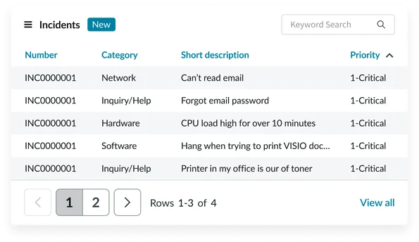
Usage
Use the Data table widget to display structured information in a portal so users can quickly scan and interact with data. Keep the following suggestions in mind:
- Prioritize clarity: Ensure data, like dates or status info, is formatted consistently so it stays clear and easy to read.
- Optimize for scannability: Use visual hierarchy, consistent column widths, and logically grouped columns. Use alternating row colors, where applicable, to improve readability.
- Manage data density: Carefully consider the amount of data displayed. Avoid displaying too many columns and enable pagination to limit the number of records per page.
Examples
Data table widgets display sets of data. Sometimes these are from ServiceNow tables and other times URLs/APIs. They’re suitable for a range of scenarios:
- Display a list of open incidents: A user wants to see all the incidents they've reported that are still open.
- Display a list of approved change requests: Management or relevant stakeholders need a quick overview of all approved change requests. This allows for monitoring of upcoming changes and potential impacts.
- Display a catalog of hardware assets: Employees need to quickly browse and view available hardware assets (laptops, monitors, etc.). This can be used for asset management and to facilitate hardware requests.
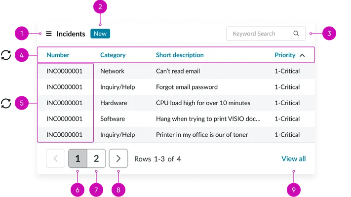
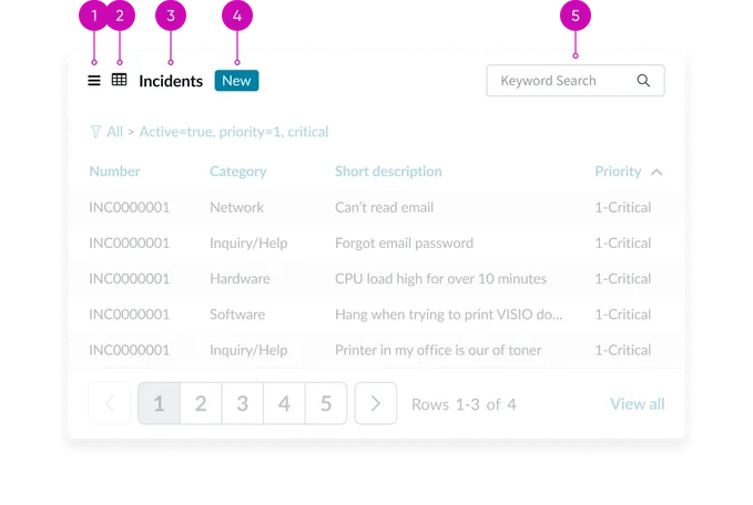
Anatomy
The Data table widget is composed of the following elements:
Header anatomy
The header provides key information and functionality. It includes:
- Action menu: A dropdown menu that allows users to perform actions like exporting data.
- Glyph (optional): An icon representing the table's data type or purpose, providing a visual cue.
- Widget title: A clear and concise title providing context for the displayed data.
- Badge (optional): A visual indicator displaying relevant information, such as the number of selected items or a status.
- Search (conditional): A text input field enabling users to filter data by keyword. Only available via the Data table from URL definition widget.
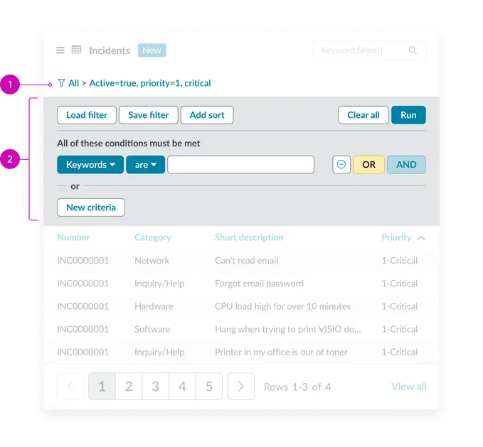
Filters (conditional by type):
- Filters breadcrumb: Displays the filters that have been applied. Filter icon also activates the filter menu.
- Filters (optional): Collapsed by default, filters allow users to refine data using various controls (text fields, dropdowns, date pickers, etc.). Filter indicators show active filters.
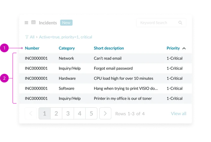
- Column headers: Labels that identify each column of data, with interactive elements for sorting. Sorting indicators (arrows) show sort direction
- Grid data rows: Rows containing individual records or data entries. The core of the data table, displaying data in rows and columns. Ensures optimal viewing across devices and screen sizes.
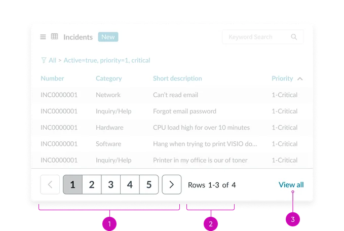
- Pagination bar: The pagination bar helps users navigate larger datasets, providing controls to move to specific pages or between pages
- Page counter: Text noting currently displayed rows as well as total number of pages
- View all link: Links to a separate page where a user can see all records
Instance options
Data Table from Instance
Data
| Field | Description |
|---|---|
| Table | The table that the widget displays records from. |
| Filter | Text field from the condition builder that you can use to limit the items returned in the table. To create a filter, use the context menu to open the widget instance in the platform. Then use the condition builder to create a filter. |
| Fields | Select the fields from the table to display in the widget instance. |
| Maximum entries | Limits the number of items displayed in the table. If there are more entries than allowed in the table, users can scroll to the next page. |
| Order by | Define which field to sort the table. |
| Order direction | The direction to order items: ascending or descending. |
Presentation
| Field | Description |
|---|---|
| Title | The title of the widget. If you leave this field empty the name of the table displays as the widget name. |
| Glyph | Icon that displays beside the widget title. |
| Bootstrap color | Color scheme for the widget. The default colors are defined by the portal theme, but if you want the instance to have a specific color, select the option from the list. |
Behavior
| Field | Description |
|---|---|
| Link to this page | Define what page to open when a user clicks on a record. The record's sys_id is passed in the URL so the destination page can provide appropriate context. |
Data Table from URL Definition
Data
| Field | Description |
|---|---|
| Fields | Columns to display in the table. For example, short description or priority. |
Presentation
| Field | Description |
|---|---|
| Title | The title of the widget. Select the Use Instance Title check box to use this title instead of the name of the table. |
| Glyph | Icon that displays beside the widget title |
| Bootstrap color | Color scheme for the widget. The default colors are defined by the portal theme, but if you want the instance to have a specific color, select the option from the list. |
Behavior
| Field | Description |
|---|---|
| Link to this page | Direct users to a specific page when the click a record. By default, clicking an entry in the table opens that entry in a form. |
| Use Instance Title | Select to use the title in the Title field instead of the table title |
| Enable Filter | Select this check box to allow users to create their own filter for the table |
Usability
The Data table widget complies with all internationalization and accessibility requirements.
Internationalization
Accessibility
Learn how to access the actionable elements of the data table through keyboard interactions and screen readers.
Data table tab order