
Usage
Use the Announcements widget to deliver timely information within the portal. Sometimes these are from ServiceNow tables and other times URLs/APIs. Prioritize clarity, visibility, and accessibility, ensuring announcements are concise and strategically placed. Keep the following suggestions in mind:
- Ensure strategic placement and visibility: Announcements should be placed in a prominent location on the portal, typically at the top of the page, to ensure maximum visibility.
- Prioritize clarity and concision: Announcements should be brief and to the point. Avoid lengthy paragraphs, and use clear, direct language that is easily understood by all users. Displaying too much text can cause visual problems. Follow our guidelines on Writing with words.
- Handle different announcement types: Use a distinct visual style for urgent, informational, and scheduled announcements.
Examples
The Announcements widget is suitable for a range of scenarios, like:
- System updates: Inform users about scheduled maintenance, new features, or system outages.
- Company news and policy changes: Share important company-wide announcements.

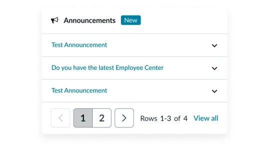
Header:
- Glyph (optional): A visual cue that represents the announcement type. The default is the megaphone. Hide this by selecting the blank icon in the instance options.
- Widget title: A brief, descriptive heading that summarizes the widget’s contents. If left blank, it defaults to Announcements.
Body:
- Title: A brief, descriptive name for the announcement
- Message (optional): A short message area displays when the accordion panel is opened. Can contain links and buttons.
Footer (conditional): Present only when the number of announcements are more than the max records field
- Pagination bar: Allows users to navigate between announcements in the widget
- Page counter: Text noting current page as well as total number of pages
- View all link: Links to a separate page where a user can see all announcements
- Glyph (optional): A visual cue that represents the announcement type. The default is the megaphone. Hide this by selecting the blank icon in the instance options.
- Widget title: A brief, descriptive heading that summarizes the widget’s contents. If left blank, it defaults to Announcements.
- Empty state message: A brief, descriptive message that lets users know there are no announcements
Instance options
The instance options below define the announcements widget.
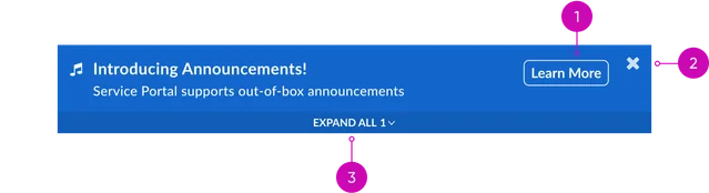
Announcements banners
If an announcement record is defined as a banner, it will automatically display. No widget is required for banners to display. They’re built into the portal.
Announcements widget
| Data Field | Description |
|---|---|
| Type | Select your type. Choose from an announcement banner or announcement widget. If the type is not defined, the widget will display all active announcements. |
Presentation
| Field | Description |
|---|---|
| Title | Widget header title. |
| Glyph | Select the icon that displays to the left of the title. If this field is not defined, it will default to an icon of a megaphone. If you don’t want an icon to display, select the first empty icon, where no icon is displayed, in the dropdown. |
| Use display style | If selected, each announcement displays according to the style defined in the announcement record. Before selecting this option, consider how the widget will display if multiple announcements in the widget use different styles. It may look disjointed to users. |
Behavior
| Field | Description |
|---|---|
| Pagination | Turn this on to break up a list of announcements into multiple pages |
| Maximum records | Number of announcements to display per page |
| View all page | Click target for “View all” link. The “View all” link only displays when: There are more announcements than can be displayed in a single page. The Max Records field defines the number of records displayed per page. A view all page is defined. |
Usability
The Announcements widget complies with all internationalization and accessibility requirements.
Internationalization
Announcements banner


Accessibility
Learn how to access the actionable elements of the Announcements widget through keyboard interactions and screen readers.
Announcements banner tab order

Keyboard interactions
You can access the actionable elements of the announcements widget with these keyboard interactions:
- Tab: Focus moves to the next interactive element within the announcement (e.g., close button, call to action)
- Shift + tab: Focus moves to the previous interactive element
- Enter/spacebar: Activates the focused element (e.g., closes the announcement, follows the call to action link)
- Escape (esc): Closes the announcement, if open