Usage
The Announcements (CD) widget excels in various organizational communication scenarios where scheduling, targeting, visibility and timeliness are paramount. Keep the following suggestions in mind:
- Be consistently succinct: For a smooth user experience, maintain consistent message lengths within the widget. Content with varying lengths will cause the widget's height to jump as the carousel moves, which can be jarring for users.
- Ensure strategic placement and visibility: Announcements should be placed in a prominent location on the portal, typically at the top of the page, to ensure maximum visibility.
- Prioritize clarity and concision: Announcements should be brief and to the point. Avoid lengthy paragraphs, and use clear, direct language that is easily understood by all users. Displaying too much text can cause visual problems. Follow our guidelines on Writing with words.
Examples
- Role-based system notifications: Inform administrators, managers, or specific job roles about system changes, new features, or procedural updates relevant to their responsibilities.
- Time-sensitive policy updates: Communicate urgent policy changes, security alerts, or compliance requirements that need immediate attention from specific user populations.
Anatomy
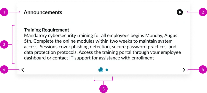
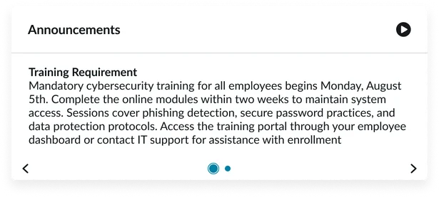
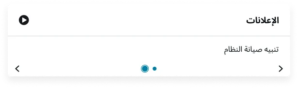
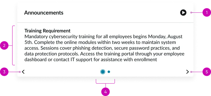
- Title: A brief, descriptive heading summarizing the content of the individual announcement slide.
- Play button: When clicked, this toggles the carousel’s auto-advance feature. The button also changes to display a pause icon.
- Body: The main content area where the announcements are displayed. This includes text/links. This section does not scroll. It keeps expanding the more text you add.
- Navigation controls (arrows): Buttons for moving between different announcement slides in the carousel.
- Pagination dots: Indicators showing the current announcement slide's position within the sequence and allowing direct navigation to other slides. The active dot should be visually distinct.
Instance options
Other options
| Field | Description |
|---|---|
| Display heading text | Shows or hides the widget title at the top of the widget |
| Display bounding box | Toggles the border frame around the widget to visually separate it from other page elements |
| Display widget background color | Controls whether the widget shows its background color or remains transparent to blend with the page. |
With the heading text, bounding box, or background instance options turned off
Usability
The Announcement (CD) widget complies with all internationalization and accessibility requirements.
Internationalization
Accessibility
Learn how to access the actionable elements of the Announcements (CD) through keyboard interactions and screen readers.
Announcements (CD) tab order
Keyboard interactions
You can access the actionable elements of the Announcements (CD) widget with these keyboard interactions:
- Tab: Moves focus to the next interactive element within the widget
- Shift + tab: Moves focus to the previous interactive element within the widget
- Enter/spacebar: Activates the focused element
- Escape (esc): Blur focus of element