

Usage
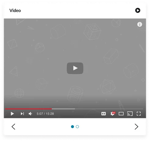
The Video carousel widget is used for portals requiring video content that benefits from a sequential, visually appealing presentation.
Examples:
- Tutorials: Step-by-step guides that help users learn how to perform specific tasks or use software effectively
- Product demos: Live or recorded presentations showcasing the features and benefits of a product to potential customers
- Training materials: Comprehensive resources designed to educate employees or users on processes, tools, or skills necessary for their roles
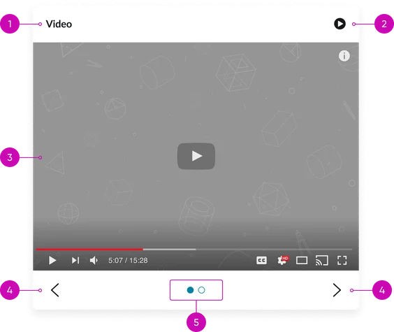
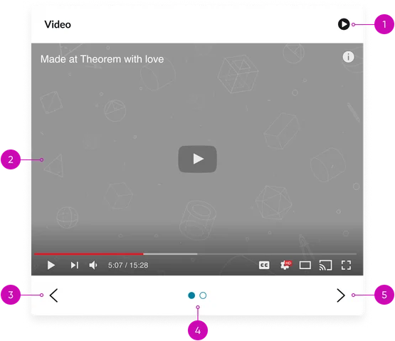
- Widget title: You can toggle this area on and off as well as customize the text displayed via the platform’s instance options
- Play button: When clicked this toggles the carousel to auto-advance to the next slide. The button also changes to display a pause icon
- Video player: The component that plays the video when selected, displaying the current video thumbnail
- Navigation controls (arrows): Buttons for moving between videos
- Pagination dots: Indicators showing the current video's position and allowing direct navigation to other videos. The active dot should be visually distinct.
Instance options
Other options
| Field | Description |
|---|---|
| Display heading text | Controls the visibility of the widget's main title. When enabled, the widget's configured title will be displayed above the video carousel. |
| Display bounding box | Determines whether a visible border or distinct container is rendered around the entire Video carousel (CD) widget. This option helps to visually delineate the widget's area and separate it from surrounding page content. |
| Display widget background color | Sets a custom background color for the entire Video carousel (CD) widget's container. This allows for visual customization to match page themes or provide specific visual contrast for the video content. |
| Show empty state | When enabled, displays a predefined message or a visual indicator within the widget if no videos are currently configured, found, or available for display based on the widget's content source and filtering. |
Usability
The Video carousel (CD) widget is designed to comply with all internationalization and accessibility requirements.
Internationalization
Accessibility
Learn how to access the actionable elements of the Video carousel (CD) through keyboard interactions and screen readers.
Video carousel (CD) tab order
This is the tab order for the Video carousel (CD).
Keyboard interactions
You can access the actionable elements of the data table with these keyboard interactions:
- Tab: Focuses on the carousel container, navigation controls, and play button
- Arrow keys (left/right): Navigates between videos when navigation controls are focused
- Enter/spacebar: Plays the video when the play button is focused
- Escape (esc): Closes the video player modal (if applicable)