


Usage
The Upcoming events (CD) widget is designed to be easily integrated into your portal. Designers should consider its placement to ensure it effectively communicates the events without being intrusive. Keep the following suggestions in mind:
- Configuration: Ensure that the widget’s content is properly configured to display events based on user roles and/or scheduling.
- Event details: Provide clear and concise event details, including date, time, location, and a brief description.
- Linking: Use the widget's linking capability to direct users to event registration or details pages.
Examples
- Open enrollment: Schedule the annual "Open enrollment period" event to appear exactly on the start date and expire on the closing date. Use audience targeting to ensure only active employees see this critical, time-bound item.
- Software updates: Alert specific departments or users about an upcoming "Major software update" or system downtime. The card should clearly state the date, time window, and the expected impact, linking to the full details.
- Building closures: Communicate temporary changes, such as a "Building closed for renovation" notice. Scheduling ensures the message is visible for the appropriate advance notice period and is automatically removed once the closure date has passed.
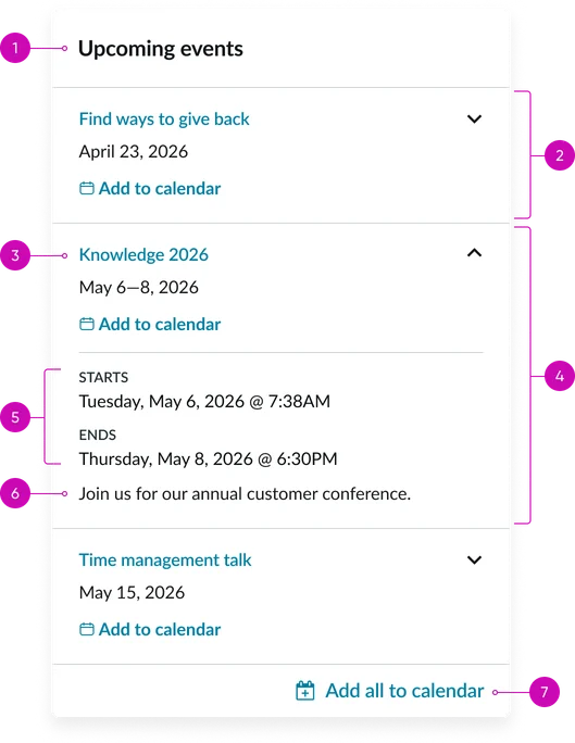
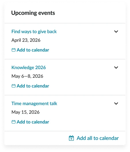
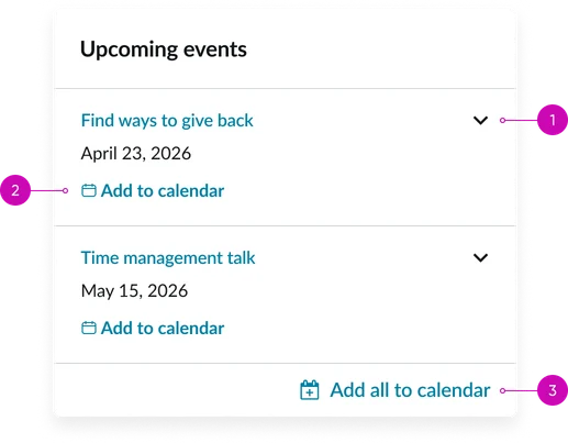
- Widget header: The title (e.g., "Upcoming events"). To edit this, update it in the platform.
- Event card (default state): The individual, repeatable container unit representing a single scheduled event.
- Event card details (expanded state): General container for the event metadata (date, time, location, short description).
- Event name: The bold, primary heading of the event card; it is typically a clickable link to the full event details page.
- Event timespan: A clear representation of the event's duration.
- Message: The short description or summary of the event.
- Add to calendar: A call-to-action (CTA) button or icon that allows the user to download an iCalendar file (or equivalent) for easy personal calendar integration.
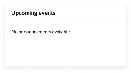
Empty State
This displays when there are no events available for display in the portal and the show empty state instance option is active.
Instance options
Other options
| Field | Description |
|---|---|
| Display heading text | Toggles the visibility of the widget header (e.g., "Upcoming events"). |
| Display bounding box | Toggles the visibility of the border around the entire widget container. |
| Display widget background color | Toggles the visibility of the widget background. |
| Show empty state | Controls whether the dedicated Empty state message is displayed when the data source returns no events. Keep this enabled to ensure users understand that the widget is functioning but currently has no data. |
Usability
This widget complies with all internationalization and accessibility requirements.
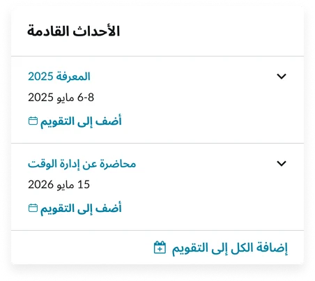
Internationalization
Accessibility
Learn how to access the actionable elements of this widget through keyboard interactions and screen readers.
Widget tab order
#Keyboard interactions
You can access the actionable elements of this widget with these keyboard interactions:
- Tab: Moves focus to the next interactive element within the widget (e.g. the next link in the list)
- Shift + tab: Moves focus to the previous interactive element within the widget (e.g. the previous link in the list)
- Enter/spacebar: Activates the focused element
- Escape (esc): Blur focus of element