

Usage
The Styled content (CD) widget is designed to be easily integrated into your portal. Keep the following suggestions in mind:
- Content limit: Use the Body text field for no more than 3-4 sentences to ensure the content remains scannable and fits within common widget layouts.
- CTA Focus: Restrict the widget to one clear Call to action (CTA) via the Button/Link option to maintain user focus and avoid choice overload.
- Media use: When using the Video content style, ensure the video is short and relevant as it plays inline and should not dominate the portal experience.
- Backgrounds: Use the Background color or Background image sparingly for emphasis; reserve contrasting backgrounds for the most critical or promotional content.
Examples
- Policy callout: A subtly styled block placed within a standard page layout to draw attention to a critical security or compliance notice related to the page content.
- Instructional block: Use the Block style with a simple background color and clear body text to highlight instructions before a Service catalog item.
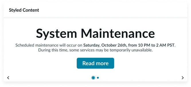
- Widget header: Container that houses the Widget title and the Play button.
- Widget title: A brief, descriptive heading summarizing the content of the individual announcement slide.
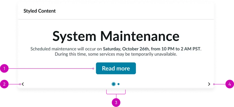
- Body: The main content area where the styled content, created via Content Publishing, is displayed. This includes text, links, and video. This section’s height is limited and will scroll if too much content is added to the Body text field.
- Navigation controls (arrows): Buttons for moving between different announcement slides in the carousel.
- Pagination dots: Indicators showing the current rich content slide's position within the sequence and allowing direct navigation to other slides. The active dot should be visually distinct.
Instance options
Other options
| Field | Description |
|---|---|
| Display heading text | Toggles the visibility of the Widget header that contains both the Widget title and Play button. When unchecked, the header will be hidden. |
| Display bounding box | If checked, adds a subtle visual border (bounding box) around the widget content to visually separate it from other elements on the page. |
| Display widget background color | Toggles the application of the widget's background color, often used to switch between a transparent and colored container. |
Usability
This widget complies with all internationalization and accessibility requirements.
Internationalization
Accessibility
Learn how to access the actionable elements of this widget through keyboard interactions and screen readers.
Widget tab order
Keyboard interactions
You can access the actionable elements of this widget with these keyboard interactions:
- Tab: Moves focus to the next interactive element within the widget (e.g. the next link in the list)
- Shift + tab: Moves focus to the previous interactive element within the widget (e.g. the previous link in the list)
- Enter/spacebar: Activates the focused element
- Escape (esc): Blur focus of element