
Usage
Use the Simple list widget to display concise, unordered information within the portal. Its strength lies in its simplicity and ability to present short, digestible pieces of data. Focus on clarity, brevity, and consistent visual presentation to maximize its effectiveness. The Simple list widget is best suited for short lists.
Examples
- Service requests: Display a list of open service requests for a user to track and manage
- User records: List users or team members with relevant contact information
- Task management: Present a list of tasks or to-do items for project management
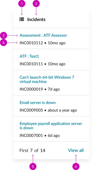
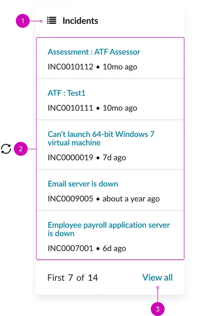
Header:
- Glyph (optional): A visual element that represents the list item
- Title: The primary text that identifies each list item
Simple list cards:
- Link title: Displays the link title
- Subtitle/description (optional): Additional text that provides context or supplementary information
Footer:
- Page counter: Text noting current page as well as total number of pages
- View all link: Links to a separate page where a user can see all records
Instance options
Data
| Field | Description |
|---|---|
| Table | Define the source data for the list. |
| Filter | Conditions that are applied to the list. |
| Display field | Main field that displays as the "link title" of the list item. |
| Secondary fields | Additional fields from the table that display below the link title. |
| List page | The page that opens when a user selects View all in the widget footer. Select a page that correlates with the items that display in the list. |
| Enforced field-level Read ACLs on filter query terms | If enabled, only query on fields based on the Read ACL policy. |
Presentation
| Field | Description |
|---|---|
| Glyph | Icon that displays next to the widget name in the header. |
| Bootstrap color | Color scheme for the widget. The default colors are defined by the portal theme, but if you want the instance to have a specific color, select the option from the list. Use these options with care. |
| Bootstrap size | Size of the widget. |
| Maximum entries | Maximum allowed number of entries that will appear in the list at one time. |
| List body height | Actual length of the widget in pixels or EMs. A long list with a small body height will automatically activate the scroll bar in the user interface. |
| Image field | Displays an image in the list. Select a field type that includes an image. For example, Photo. |
| Rounded images | Makes any images selected in the Image field round in the list. |
| Hide footer | When selected, hides the display of the widget footer. By default it is set to visible. |
Behavior
| Field | Description |
|---|---|
| Link to this page | Portal page to link to from a list item. |
| Show even when empty | Widgets are designed to hide on a page when no results meet criteria. Select this option to make the simple list widget display on a page even when empty. |
| View | The view option for when a list item links to a form. The “Link to this page” field must be set to a form page for this option to work. |
| Disable record watcher | Turn off automatically updating the list based on changes to the filtered records. |
Usability
Simple lists comply with all internationalization and accessibility requirements.
Internationalization
Accessibility
Learn how to access the actionable elements of the simple list widget through keyboard interactions and screen readers.
Simple list tab order