

Usage
The Rich content (CD) widget is designed to be easily integrated into your portal layouts. Designers should consider its placement and content to ensure it effectively communicates its intended message without being intrusive. Keep the following suggestions in mind:
- Clarity: Ensure clear information hierarchy (e.g., proper heading and paragraph tags) follow typographic guidance.
- Performance: Avoid displaying exceptionally long content blocks (that exceed three full screens of scrolling) to maintain page load performance and user engagement.
- Responsiveness: Always test content in mobile and tablet views. Since content in this widget can sometimes be complex, verify that your content displays correctly.
- Whitespace: Ensure adequate padding and margin around the widget, especially when it contains images or blocks of text, to prevent crowding with neighboring widgets.
Examples
- Instructional sidebar: Embedding a short video tutorial or a quick-start guide in a narrow column on a record page.
- Policy communications: Displaying a structured, multi-section policy update that uses an accordion block for easy navigation of the policy.
- Employee All Hands: Provide a visually engaging wrap up with video and images from the event to drive awareness.
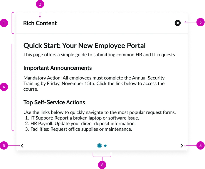
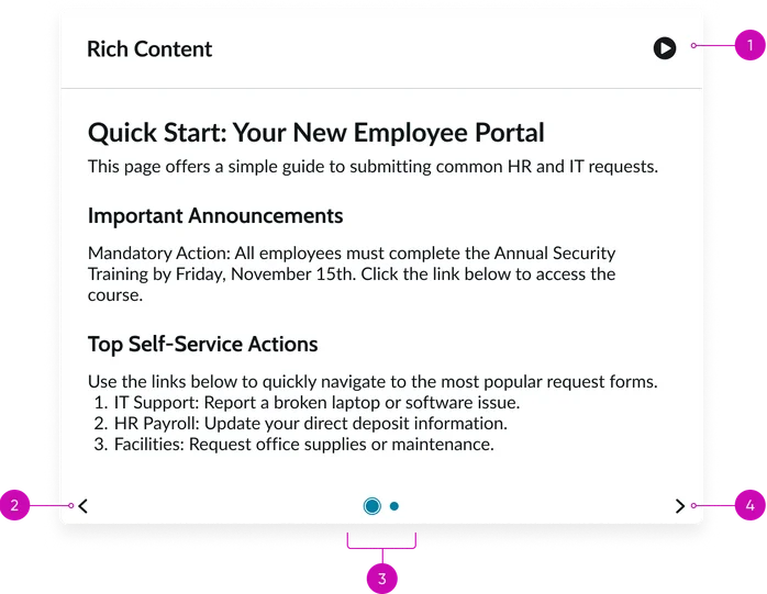
- Widget header: Container that houses the Widget title and the Play button.
- Widget title: A brief, descriptive heading summarizing the content of the individual announcement slide.
- Play button: When clicked, this toggles the carousel’s auto-advance feature. The button also changes to display a pause icon.
- Body: The main content area where the rich content, created via Content Publishing, is displayed. This includes text, links, bulleted lists, and images. This section does not scroll. It adjusts its height according to what is displayed in the carousel slide.
- Navigation controls (arrows): Buttons for moving between different announcement slides in the carousel.
- Pagination dots: Indicators showing the current rich content slide's position within the sequence and allowing direct navigation to other slides. The active dot should be visually distinct.
Instance options
Other options
Field Description Display heading text Toggles the visibility of the Widget header that contains both the Widget title and Play button. When unchecked, the header will be hidden. Display bounding box If checked, adds a subtle visual border (bounding box) around the widget content to visually separate it from other elements on the page. Display widget background color Toggles the application of the widget's background color, often used to switch between a transparent and colored container.
Usability
This widget complies with all internationalization and accessibility requirements.
Internationalization
Accessibility
Learn how to access the actionable elements of this widget through keyboard interactions and screen readers.
Widget tab order
Keyboard interactions
You can access the actionable elements of this widget with these keyboard interactions:
- Tab: Moves focus to the next interactive element within the widget (e.g. the next link in the list)
- Shift + tab: Moves focus to the previous interactive element within the widget (e.g. the previous link in the list)
- Enter/spacebar: Activates the focused element
- Escape (esc): Blur focus of element