
Usage
Designers should consider its placement and content to ensure it effectively communicates its intended message without being intrusive. Position the widget high on the page (above the fold) to maximize visibility for critical actions. Keep the following suggestions in mind:
- Content relevance: Only include links that are used by 80% or more of the target audience.
- Maximum count: Limit the total number of links to a maximum of six to prevent cognitive overload.
- Title clarity: Titles should be clear, concise and action-oriented, ("Request a service").
- Accessibility check: Ensure all link titles meet the minimum color contrast requirements of 4.5:1 against the background.
Image and performance guidelines
Image sizing is critical for optimal portal performance. Keep in mind the following:
- Image file size: Do not rely on the browser to resize high-resolution images. You must scale images before upload to minimize file size because uploading a large file (e.g., 3MB) and letting it size down visually in the browser will still load the full file size and severely impact page load speed for every user.
- Maximum dimensions: All link images must conform to a maximum area of 130px width by 60px height. The image width will scale down proportionally to maintain its aspect ratio, but it will never exceed the 60px height or 130px width limit.
Examples
- HR Portal: For employee self-service, link to systems such as "Retirement account," "Time tracking system," and "Payroll"
- IT Portal: Link employees to critical actions and support such as "Report an incident" and "Request a new laptop"
- Customer Portal: Link customers to tasks like "Check order status," "View knowledge base," and "Submit a support case"
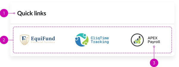
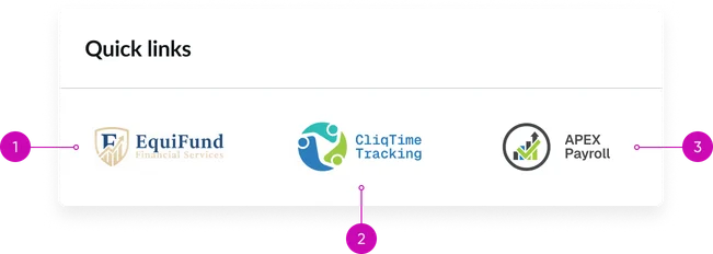
- Widget title: A short heading that gives context to the widget’s contents. If you don't provide one, it defaults to "Quick links."
- Link container: Area where the image-based links are displayed.
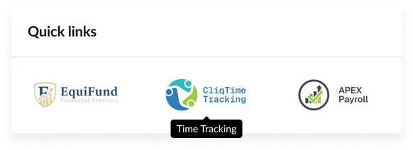
- Image-based link: Each individual quick link should contain an image. The appearance of the images within the links maintains its ratio, adjusting to the link’s maximum size of 130px x 60px. In cases where an image may not load, its text will be displayed.
It’s important to use a clear title for images because if an image fails to load, the link text will be displayed instead.
Instance options
Other options
| Field | Description |
|---|---|
| Display heading text | Shows or hides the widget title at the top of the widget |
| Display bounding box | Toggles the border frame around the widget to visually separate it from other page elements |
| Display widget background color | Controls whether the widget shows its background color or remains transparent to blend with the page. |
Usability
This widget complies with all internationalization and accessibility requirements.
Internationalization
Accessibility
Learn how to access the actionable elements of the widget through keyboard interactions and screen readers.
Widget tab order
Keyboard interactions
You can access the actionable elements of the widget with these keyboard interactions:
- Tab: Navigate through each link, sequentially, within the widget using the Tab key
- Shift + tab: Navigate backward through the links using the shift + tab key combination
- Enter/spacebar: Pressing the enter key or the spacebar on a focused link will activate the link and navigate the user to the specified destination.