
Usage
The Portal data list widget is ideal for scenarios where you need to display a collection of items in a tabular or list-like view.
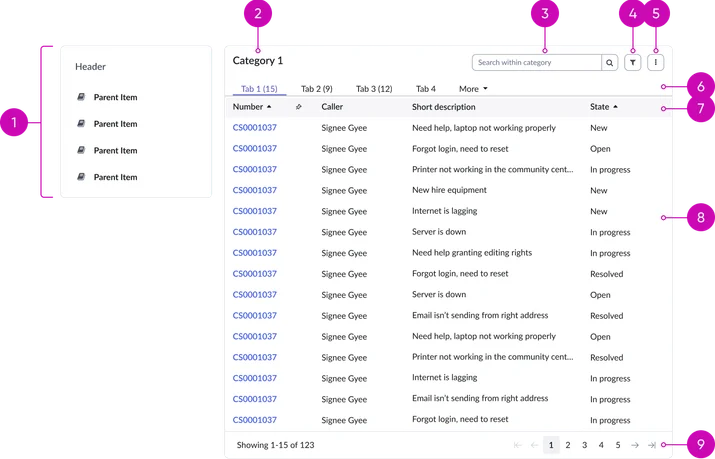
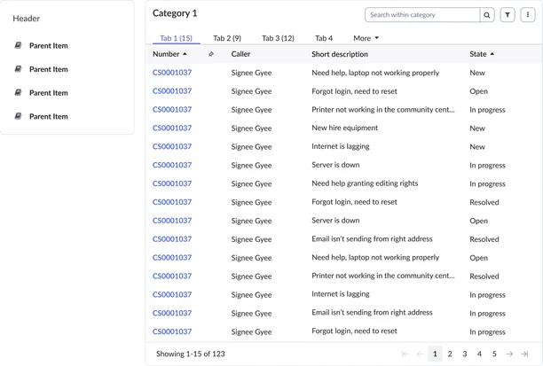
Navigation:
- Left navigation menu: Presents a hierarchical structure of available categories, allowing users to navigate through different datasets.
Header:
- Title: A prominent heading for the data list. This might reiterate the category name or provide a more specific label for the displayed data.
- Search: A text input field that allows users to quickly find specific records within the current dataset by entering keywords.
- Filter: Enables users to narrow the data list based on specific criteria, allowing them to focus on relevant subsets of records.
- Overflow menu: Contains actions beyond the primary display, such as exporting the current data view for analysis or sharing.
- Tabs (optional): Provides an additional layer of categorization for the data within a selected category, enabling users to further refine their view by switching between different perspectives or subsets of the data.
Data list:
- Column headers: Contains column headers that label each data field. Includes sorting controls (e.g., ascending/descending arrows).
- Data list: The primary area displaying the structured data in rows and columns, presenting individual records and their associated attributes. This is where the actual data is rendered.
Pagination:
- Pagination (conditional): Breaks large datasets into manageable pages. Includes controls for navigating between pages. This typically includes record counts, page numbers, "previous" and "next" buttons.
Instance options
Data
| Field | Description |
|---|---|
| Data | Defines the configuration of the list with a JSON object. |
| Dynamic data list | Option to display records dynamically based on the configuration provided in the parameter of a portal page URL. Note: The configuration enables administrator to display records from any tables by passing following URL parameters: table, filter, sort order, view, and target view page. When the Dynamic data list is selected, the JSON configuration in the Data field is not available. |
Presentation
| Field | Description |
|---|---|
| Categories heading | Required title for the category list column. |
Behavior
| Field | Description |
|---|---|
| Layout | Layout type of the case records and their details displayed in the widget. The available options are:
|
| Number of records per page (Desktop) | The number of cases to appear by default on the widget in the desktop. The default value is 20. The maximum value is 1000. |
| Number of records per page (Mobile) | The number of cases to appear by default on the widget on a mobile device. The default value is 8. |
| Show search | Option to display a search field in the widget. |
| Show export actions | Option to enable the export of records in pdf, Excel, and csv formats. |
| Categories condition script | Script to show or hide the data list category on the widget. |
Usability
Portal case cards comply with all internationalization and accessibility requirements.
Internationalization
Accessibility
Learn how to access the actionable elements of portal case cards through keyboard interactions and screen readers.
Portal data list tab order
Keyboard interactions
You can access the actionable elements of the portal case cards with these keyboard interactions:
- Tab: Navigates between interactive elements (column headers, filter controls, pagination, row actions).
- Enter: Activates a selected element (sort, filter, page, row action).
- Arrow keys (up/down): Navigates between rows in the list.
- Spacebar: Toggles checkboxes or selection states.
- Escape (esc): Closes filters or other modal elements.