

Usage
The Portal browse taxonomy widget is ideal for scenarios where information requires hierarchical organization and categorization.
Examples:
- Knowledge management systems: Enterprise knowledge bases that require organized article categorization, enabling users to browse through structured topics and find relevant documentation without relying solely on search functionality.
- Service catalogs with multiple tiers: Complex service offerings organized in hierarchical structures, allowing users to navigate through categories, subcategories, and specific service items in an intuitive manner.
- Portal interfaces for content discovery: Allow for browsing and exploring available resources is a primary activity, providing an alternative to search-based navigation for users who prefer structured exploration.
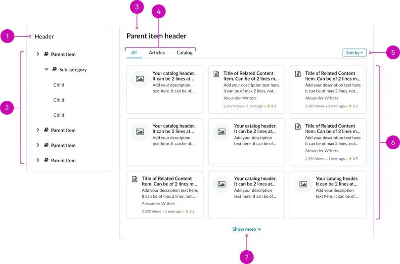
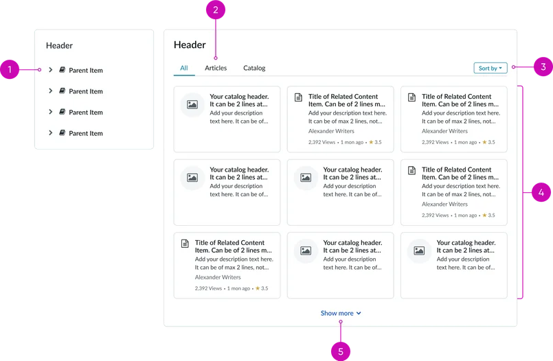
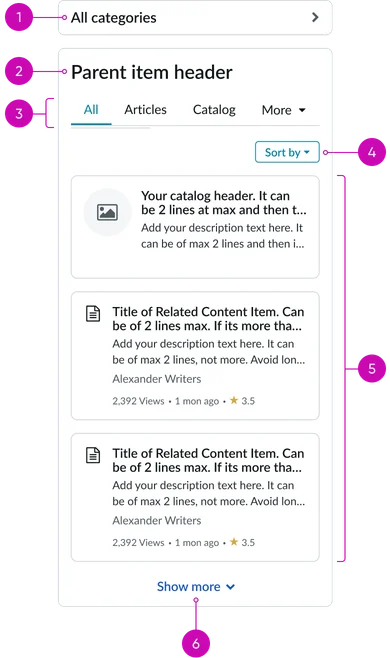
Navigation Pane:
- Header: Displays the taxonomy title (e.g., "Browse categories")
- Category list: Scrollable list of top-level categories for initial navigation
Content View:
- Parent item header: Displays the selected category from the category list
- Tabs: Displays tab content type when selected
- Sort dropdown: Reorder displayed items by name, date, relevance, or other criteria
- Content grid: Displays content in a grid view for this breakpoint
- Pagination: Navigate through additional content when results exceed the current view
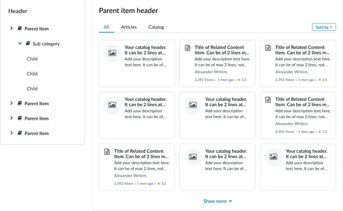
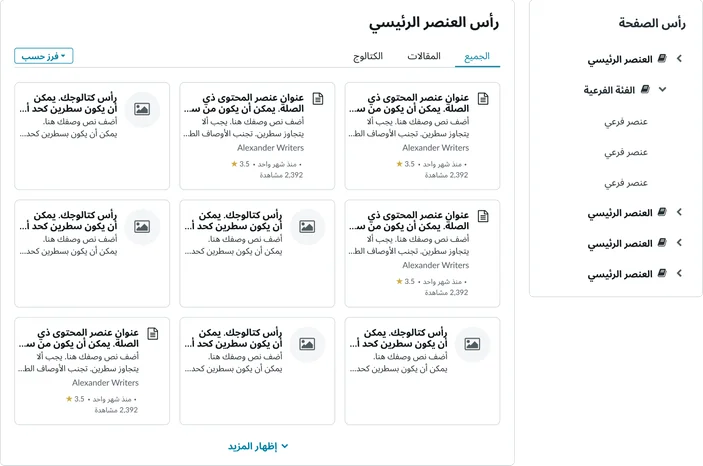
Navigation Pane:
- Category list: When tapped, opens a scrollable list of all categories
Content View:
- Parent item header: Displays the selected category from the category list
- Tabs: Displays tab content type when selected
- Sort dropdown: Reorder displayed items by name, date, relevance, or other criteria
- Content list: Displays content in a single column list view for this breakpoint
- Pagination: Navigate through additional content when results exceed the current view
Instance options
Behavior
| Field | Description |
|---|---|
| Records per view | The number of catalog items and knowledge articles to appear by default on the widget. The default value is 9. |
| Glyph for article cards | The glyph to appear on the cards for knowledge articles, which is chosen from a set of predefined glyphs. |
| Show author | Option to display the author's name |
| Show view count | Option to display the total number of views of an article |
| Show last updated | Option to display the date of the last changes made to an article. |
| Show rating | Option to display the rating received on an article. |
| Article view page | The article page that opens when the article card is accessed. |
| Catalog card display style | The display style of a catalog card inside the widget. The available choices are:
|
| Glyph for catalog items | Displays a window to select a symbol for a catalog items. Note: The value in this field is used only when Glyph is selected in the Catalog Card Display Style field. |
| Catalog item page | The Catalog item page that opens when the catalog item is accessed.By default, this field is set to the Catalog Item [sc_cat_item] table. |
| Display icons for topics | Option to display an icon for the taxonomy topics. |
Usability
The Portal browse taxonomy complies with all internationalization and accessibility requirements.
Internationalization
Accessibility
Learn how to access the actionable elements of the Portal browse taxonomy through keyboard interactions and screen readers.
Portal browse taxonomy tab order