


Usage
The Portal banner carousel is ideal for scenarios requiring visual impact and efficient space utilization. For consistency, ensure all banners maintain the same dimensions.
Examples:
- Promotional campaigns: Showcase products, services, or limited-time offers with engaging visuals and direct links
- Important announcements: Highlight critical updates, system outages, or policy changes requiring immediate attention
- Feature spotlights: Introduce new portal features with quick overviews and links to detailed guides
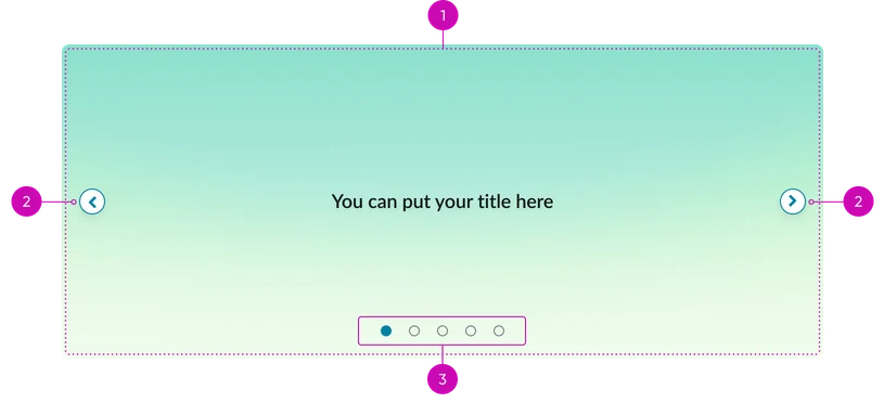
- Slide: The container for each element assigned to the carousel
- Navigation controls (arrows): Buttons for moving between slides
- Pagination dots: Visual Indicators showing the current slide's position. Allows for direct navigation to other slides. The active dot should be visually distinct.
Instance options
Data
| Field | Description |
|---|---|
| Slides | The images to appear on the widget chosen from a set of predefined slides or slides that you have created, see Create a slide for the Portal Banner Carousel widget for more information. |
Presentation
| Field | Description |
|---|---|
| Title color | Color of the title for all carousel slides in hex code format.The default value is #FFFFFF (white). |
| Alignment | The content alignment, inside the widget, for all carousel slides. Available options are:
|
Usability
The Portal banner carousel complies with all internationalization and accessibility requirements.
Accessibility
Learn how to access the actionable elements of the Portal banner carousel through keyboard interactions and screen readers.
Portal banner carousel tab order
This is the tab order for the Portal banner carousel.
Keyboard interactions
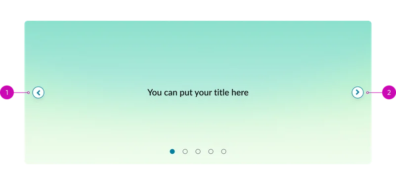
You can access the actionable elements of the Portal banner carousel with these keyboard interactions:
- Tab: Moves focus from one navigation arrow to the next
- Arrow keys (left/right): Navigates between slides when container is focused
The pagination dots are not accessible via keyboard interactions. They are accessible only via mouse.