


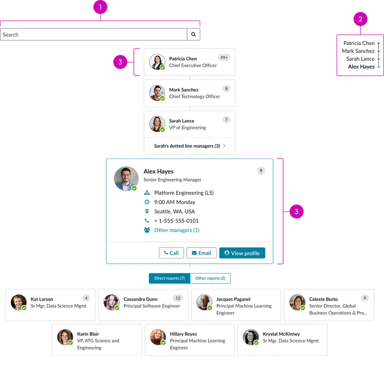
Usage
To effectively use the Organization chart (CD) widget, keep the following suggestions in mind:
- Use a dedicated page: Use this widget, by itself, on a single page.
- Configuration: Ensure the data model feeding the widget is configured with a clear, unambiguous manager-to-report relationship to prevent logical errors (like multiple CEOs reporting to each other). The component relies on accurate hierarchical data to render correctly.
Examples
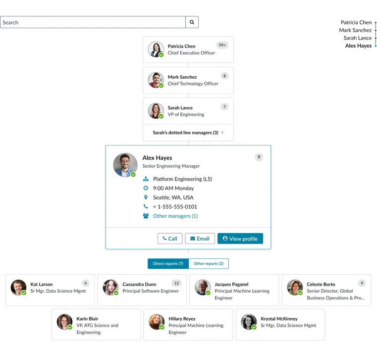
- Employee directory: Enables users to quickly search for a colleague and immediately visualize their entire reporting chain (manager, peers, and reports) within the organization.
- HR & onboarding: Provides new employees with a clear, visual map of their department and leadership structure for rapid role and reporting comprehension.
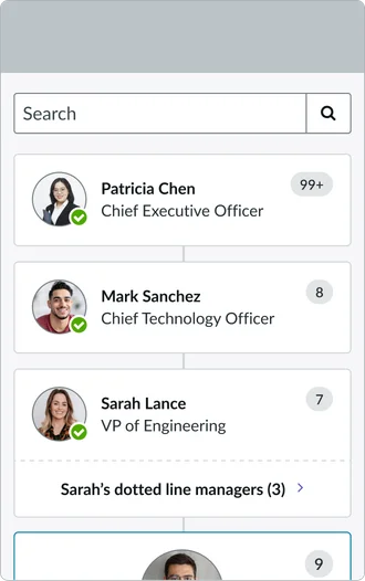
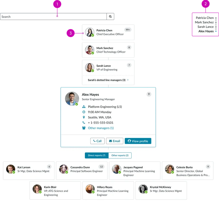
- Search: A search bar at the top of the widget allows users to find specific people within the organization.
- Reporting structure: Displays the vertical flow of authority and accountability, showing the precise relationship between a manager and their direct reports.
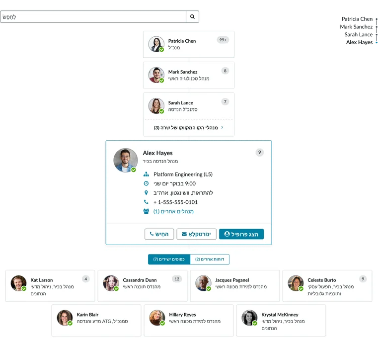
- Node card: This is the visual representation of an individual in the organization chart. The node card displays either a compact or expanded view. In the compact mode, it displays the minimal information needed to identify a person in the organization. In the expanded mode, it displays more details such as level and contact information.
- Connections tray: This displays when the active card has direct reports. It’s a visual representation of who is connected, to the active node card, in the organization. This often includes a numerical indicator (e.g., "12+") showing the total number of connections.
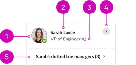
Default/idle state: Displays the compact view for a node card.
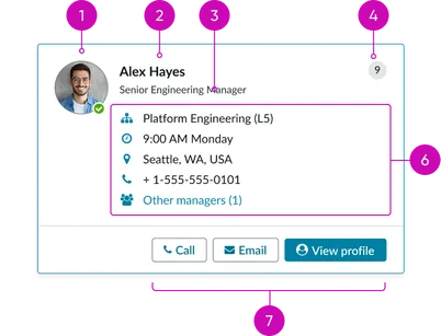
Expanded state: Displays the expanded view for a node card.
- Avatar: A small profile photo that relates a face to the name. It includes a status indicator to show if the person is currently logged in to ServiceNow. If no photo is available, the avatar’s fallback is to display the user’s initials.
- Name: The person's first and last name, serving as the main identifier on the card.
- Job title/role: The official title that gives context to the person's position and role within the company.
- Connections badge: A small numeric visual representing the total number of people the person is connected to within the organization.
- Dotted line reports (optional): In some cases, a numerical count displays showing additional dotted line reports the person manages.
- Profile information: Essential details that provide a richer context for the individual. This includes their department or team and contact information like their email and phone number.
- Contextual actions: Interactive buttons that allow users to take immediate action, such as "Call," "Email," or "View profile." These are accessible directly from the card to save time.
Instance options
Important
There are no instance options to customize this widget within the Service Portal Designer.
Usability
This widget complies with all internationalization and accessibility requirements.
Internationalization
Accessibility
Learn how to access the actionable elements of this widget through keyboard interactions and screen readers.
Widget tab order
Keyboard interactions
You can access the actionable elements of this widget with these keyboard interactions:
- Tab: Moves focus to the next interactive element within the widget (e.g. the next link in the list)
- Shift + tab: Moves focus to the previous interactive element within the widget (e.g. the previous link in the list)
- Enter/spacebar: Activates the focused element
- Escape (esc): Blur focus of element