Usage
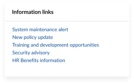
The Information links (CD) widget is designed to fit easily into your portal. Consider its placement to ensure the information links are helpful, meaningful and not intrusive. Keep the following suggestions in mind:
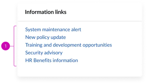
- Consider placement, context, and quantity: Position the Information links (CD) widget where users naturally expect to find navigation aids, such as sidebars or a dedicated resource section. Limit the display of no more than 10 links.
- Use clear and descriptive link titles: Write link titles that clearly communicate the destination or purpose. Avoid technical jargon or ambiguous language that might confuse users when possible. Follow our guidelines on Writing with words.
- Maintain relevance and accuracy: Regularly audit and update all links in the content library to ensure they remain current and functional. Remove outdated or broken links as they can frustrate users and undermine trust in the portal.
Examples
- Knowledge base and self-help resources: Direct users to FAQ sections, troubleshooting guides, and how-to articles that can resolve common issues without requiring support intervention.
- Organizational resources: Connect users to company policies, employee handbooks, benefits information, directory services, and other corporate resources.

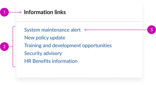
- Title: A brief, descriptive heading summarizing the type of links displayed in the widget
- Body: The main content area where the collection of information links are displayed
- Hyperlink: An individual link from the content library associated to given widget
Instance options
Other options
| Field | Description |
|---|---|
| Display heading text | Shows or hides the widget title at the top of the widget. |
| Display bounding box | Toggles the border frame around the widget to visually separate it from other page elements. |
| Display widget background color | Controls whether the widget shows its background color or remains transparent to blend with the page. |
Usability
Use the Information links (CD) widget complies with all internationalization and accessibility requirements.
Internationalization

Accessibility
Learn how to access the actionable elements of the Information links (CD) widget through keyboard interactions and screen readers.
Information links (CD) tab order

Keyboard interactions
You can access the actionable elements of the Information links (CD) with these keyboard interactions:
- Tab: Moves focus to the next interactive element within the widget (e.g. the next link in the list)
- Shift + tab: Moves focus to the previous interactive element within the widget (e.g. the previous link in the list)
- Enter/space: Activates the focused element
- Escape (esc): Blur focus of element

