


Usage
Use the Employee Center header widget when you want to provide a consistent, top-level navigation and identification element for the Employee Center portal. Use it to ensure users can easily navigate core sections and maintain brand consistency. Designers should prioritize clear information architecture, intuitive navigation, and visual alignment with the overall portal design. Keep the following suggestions in mind:
- Clear navigation structure: Design a logical and intuitive navigation menu and topic taxonomies. Limit the number of primary navigation items to reduce overwhelming your users. Use dropdown menus or secondary navigation elements for deeper content structures where needed.
- User profile and settings accessibility: Provide easy access to user profile information and settings. Ensure these elements are consistently placed and visually identifiable.
- Search functionality integration: Integrate a prominent and easily accessible search bar. Design the search input and results to align with the overall portal design.
- Informative contextual elements: Include relevant contextual elements, such as notifications or quick links, in the header. Design these elements to be visually distinct and easily understood.
Anatomy
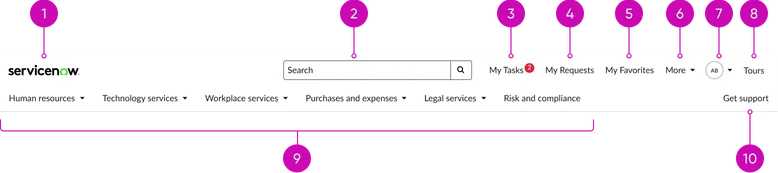
The Employee Center header widget typically comprises the following components:
Header — desktop breakpoint
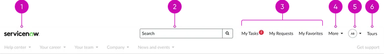
- Logo: Displays the organization's logo, linking to the Employee Center homepage.
- Search: An input field for users to search across the Employee Center content. While a large, prominent search bar is always available on the homepage, this search field is displayed in the header on all other interior pages for quick access to content.
- User’s items: A dedicated area, configured by the system administrator to display frequently accessed and personalized links, ensuring logged-in users see only the menu items relevant to their role and access, such as 'My tasks' opening the To-dos page and 'My requests' opening the My Requests page.
- More menu (optional): Contains additional user’s items.
- User profile: Displays the logged-in user's initials or their profile picture (if available). Upon interaction, it reveals a menu offering access to profile settings, account management options, and a clear logout function.
- Tours: Opens guided tours that demonstrate how to use a feature. For example, an administrator can create a task demo with callouts to demonstrate how to perform the task.

- Primary navigation: The main navigation menu providing access to the Topic Taxonomies and other resources within the Employee Center. Design should prioritize clear labeling, logical grouping, and responsive behavior across different screen sizes.
- Secondary navigation (contextual): A supplementary navigation element that provides quick access to support.
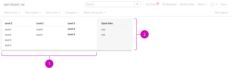
- Mega menu: Facilitates easy navigation through the portal's content hierarchy. It dynamically renders topics and child topics as menu items based on the configured Employee Center taxonomy.
- Quick links (optional, within mega menu): An additional column within the mega menu for curated shortcuts. These links can direct users to frequently accessed pages, specific services, or external resources, supplementing the main taxonomy-driven navigation. Design considerations include clear labeling and logical grouping for optimal usability.
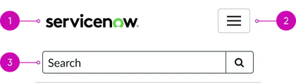
- Logo: Displays the organization's logo, linking to the Employee Center homepage.
- Mega menu (closed state): A three-line icon provides access to site navigation on smaller screens.
- Search: An input field for users to search across the Employee Center content. While a large, prominent search bar is always available on the homepage, this search field is displayed in the header on all other interior pages for quick access to content.
Header:
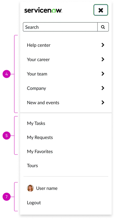
- Logo: Displays the organization's logo, linking back to the Employee Center homepage.
- Mega menu button (open state): A X icon enables users to close the mega menu.
- Search: An input field for users to search across the Employee Center content. While a large, prominent search bar is always available on the homepage, this search field is displayed in the header on all other interior pages for quick access to content.
Navigation:
- Mega menu: Facilitates easy navigation through the portal's content hierarchy. It dynamically renders topics and child topics as menu items based on the configured Employee Center taxonomy.
- User’s items: A dedicated area, configured by the system administrator to display frequently accessed and personalized links, ensuring logged-in users see only the menu items relevant to their role and access, such as 'My tasks' opening the To-dos page and 'My requests' opening the My Requests page.
- Tours: Opens guided tours that demonstrate how to use a feature. For example, an administrator can create a task demo with callouts to demonstrate how to perform the task.
Profile:
- User profile: Displays the logged-in user’s name and profile picture (if available) as well as any additional links such as: profile settings, account management options, and a clear logout function.
Instance options
There are no instance options for this widget. You can configure the Employee Center header in the theme.
Usability
The Employee Center header complies with all internationalization and accessibility requirements.
Internationalization

Accessibility
Learn how to access the actionable elements of the Employee Center header through keyboard interactions and screen readers.
Employee Center header tab order
Keyboard interactions
You can access the actionable elements of the Employee Center header with these keyboard interactions:
- Tab: Navigates between header components (logo, navigation items, search bar, user profile, notifications).
- Enter/spacebar: Activates a selected header component (navigation item, search, profile option); including opening or closing the hamburger menu.
- Escape: Closes the user profile dropdown or search suggestions.