Usage
This widget is meant to be placed strategically on portal pages where users need quick access to their personalized content. It is most effective when used on homepages and anywhere else you'd think it makes sense. Keep the following suggestions in mind:
- Contextual placement: This widget make sense on home pages, dashboards.
- Cross-widget synergy: The widget can be used in combination with other widgets to create a more powerful and personalized experience.
Examples
- Homepage: Placing this widget in a prominent item on the homepage allows users to quickly access their content after logging in.
- Task-based pages: Add the widget to the right side of a page that is part of a multi-step process. This can provide users with easy access to important documents or forms they may need to reference.
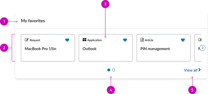
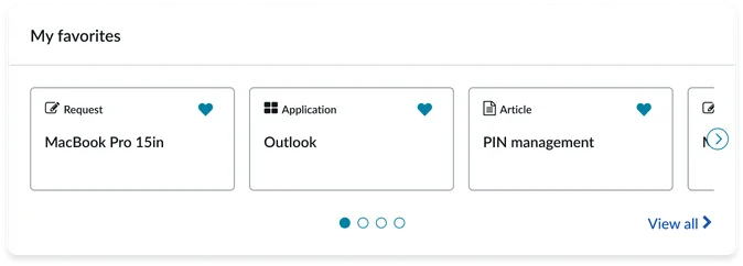
Card view displayed as a paginated carousel.
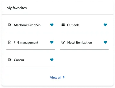
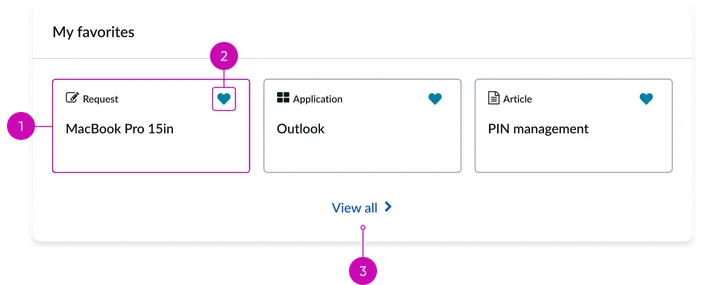
- Widget header: A title label, "My favorites", which is configurable through the instance options.
- Item list: A container to display favorited items. Its presentation view can be customized (e.g. to display as a grid or carousel).
- Item: Each item in the list displays a title, an icon, a favorite button and the item type (e.g., Knowledge article, Application, Request, Service catalog, etc.)
- Pagination: Allows users to navigate through the results, especially when the total number of items exceeds the configured display limit.
- "View all" link: Links to the dedicated My favorites page.
Other views
There are two other possible views for this widget.
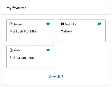
Card view displayed as a grid that wraps
Card view displayed as a list
Instance options
Other options
| Field | Description |
|---|---|
| Visible favorites | Number of favorites to show. Default value is 4. The maximum displayable is 6. |
| Show empty state | Option to show the widget with empty state message when no content is marked as favorite. |
| Sort order | Sort order of favorite items you want to view on the widget. The choices are:
|
| List type | How you want the items to appear on the widget. The choices are:
|
| Card behavior | The way you want the card to appear on the widget. The choices are:
|
| Load configuration | Select the list of Load configuration option:
|
Usability
This widget complies with all internationalization and accessibility requirements.
Internationalization
Accessibility
Learn how to access the actionable elements of this widget through keyboard interactions and screen readers.
Your favorites tab order
Keyboard interactions
You can access the actionable elements of this widget with these keyboard interactions:
- Tab: Moves focus to the next interactive element within the widget (e.g. the next link in the list)
- Shift + tab: Moves focus to the previous interactive element within the widget (e.g. the previous link in the list)
- Enter/spacebar: Activates the focused element
- Escape (esc): Blur focus of element