

Usage
When implementing the Typeahead search widget, keep in mind the following:
- Clarity: Ensure the search field's placeholder text is clear and instructs users on what they can search for.
- Performance: Optimize the search data sources to ensure quick response times, even with a large number of results.
- Relevance: Configure the widget to prioritize the most relevant results, improving the user experience.
- Placement: Place the widget in a prominent and easily accessible location, such as the portal header, for maximum visibility.
Examples
- Knowledge base search: A user starts typing "password reset," and the widget suggests relevant knowledge articles and troubleshooting guides.
- Service catalog search: As a user types "laptop," the widget displays catalog items like "Dell XPS 13" and "MacBook Pro," along with categories.
- People finder: Typing a colleague's name, such as "John Smith," populates a list of matching user profiles and contact information.

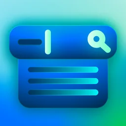
- Typeahead input field: The primary text box where users type their query.
- Placeholder text: A brief instructional message, inside the search field, that prompts a user to begin typing.
- Iconic button: An iconic button displaying an icon to initiate the search.

Field:
- Clear/cancel button: Clears the current typeahead search so that the user can start again.
Dropdown:
- Dropdown container: A container that appears directly below the input field, displaying the typeahead results in real-time.
- Result items: Individual entries within the dropdown, each representing a suggested search result (e.g., a knowledge article title, a catalog item name). Each item may include additional details like a thumbnail or brief description.
Instance options
Presentation
| Field | Description |
|---|---|
| Title | The name or words that appear in the search field before a user starts typing. For example, search or what are you looking for |
| Color | Whether the search button beside the search field is filled in or not |
| Glyph | The icon that appears in the search field beside the widget. The search icon is the default. To use a different icon, type the name of the icon in the field, for example search-plus. For a list of icons to choose from, open the instance options for the Icon Link widget |
| Size | Determines the font size and height of the widget. Choose from xs, sm, md, and lg. |
Behavior
| Field | Description |
|---|---|
| Limit | If search suggestions is enabled, enter the number of suggestion entries you want to display. If search suggestions is disabled, enter the number of typeahead entries you want to display. The default is 15. See Enable and disable search suggestions. |
| Contextual search sources | Limit the results available in the typeahead search by only configuring specific search sources. For example, users searching in the Service Catalog only see results for the Service Catalog when that search sources is configure. For more information on contextual search, see Configure Search Sources available on a page |
AI Search
| Field | Description |
|---|---|
| Search application | Defines search experience settings for the widget, such as the search engine, search results limit, and suggestions limit. By default, the widget uses the same search application configuration as the portal, but you can override this configuration at the widget level. For more information on defining a search application configuration, see Defining search application configurations. |
| Search results configuration | Defines how search results are displayed after using the widget. By default, the widget uses the same search results configuration as the portal, but you can override this configuration at the widget level. For more information on defining a search results configuration, see Define a composite dataset. |
| Disable all suggestions | Option to disable search suggestions. |
| Placeholder content | Text that appears in the search box before the user enters anything. By default, the placeholder text is Search. |
| AI Search source filter | Content that portal users can search on, including tables in your instance or external data sources. For more information, see Defining search sources. |
Usability
This widget complies with all internationalization and accessibility requirements.
Internationalization

Accessibility
Learn how to access the actionable elements of this widget through keyboard interactions and screen readers.
Typeahead search tab order

Keyboard interactions
You can access the actionable elements of this widget with these keyboard interactions:
- Tab: Moves focus to the next interactive element within the widget (e.g. the next link in the list)
- Shift + tab: Moves focus to the previous interactive element within the widget (e.g. the previous link in the list)
- Enter/spacebar: Activates the focused element
- Escape (esc): Blur focus of element