
Usage
It should be used to present a comprehensive, organized list of content in response to a user's search query, whether initiated from the main header, a search bar, or a specific category page. Keep in mind the following:
Clarity and hierarchy: Prioritize the most important information. The result title should be a clear, high-contrast link, making it the most prominent element. Use a brief, relevant snippet to provide context and help users quickly decide if the result is what they're looking for. Metadata is key: Include metadata like the article identifier and published date to help users assess the content's relevance and currency at a glance. This builds trust and helps users filter outdated or irrelevant information. Consistency: The visual presentation of each search result card should be consistent. Use the same icon for the same content type (e.g., a document icon for knowledge base articles) and maintain a uniform layout to ensure scannability.
Examples
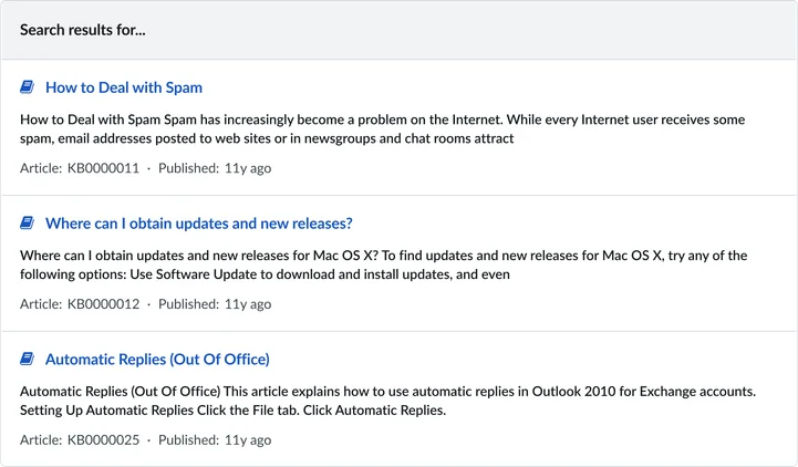
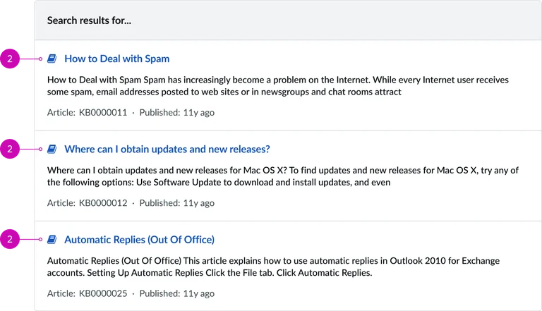
Knowledge base results: A search for "Spam" displays multiple knowledge base articles with titles, snippets, and metadata like article IDs and published dates, allowing the user to quickly scan and select the most relevant resource. Multi-source results: The widget can also be configured to display results from various sources (e.g., knowledge base, catalogs, community posts), with each result card maintaining the same visual structure while providing source-specific metadata.
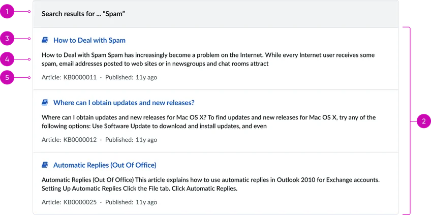
- Search title: The main heading that provides context for the search results. It clearly states the search query string.
- Search results container: The main container for the returned search results.
Individual search result card:
- Result link: A clickable link that displays the title of the search result item. It uses a clear, high-contrast style and an icon (in this case, a document icon) to visually indicate the type of content.
- Result snippet: A brief, truncated preview of the content. It provides enough context for the user to determine if the result is relevant to their query without opening the full page.
- Metadata: A line of secondary information that provides context about the source of the result.
- Article ID: A unique identifier for the knowledge base article (e.g., "Article: KB0000011").
- Published date: The date the article was published or last updated, giving the user an idea of its currency (e.g., "Published: 11y ago").
Instance options
Behavior
| Field | Description |
|---|---|
| Max results for All search | The maximum number of results that show for all search groups when viewed together. |
| Max results for single search group | The maximum number of results that show for a single search group when you view that specific search group. |
| Show “Did you mean” | Displays suggestions when a search produces no results. |
Other options
| Field | Description |
|---|---|
| Show score | When selected, shows search results relative to ranking. |
Usability
This widget complies with all internationalization and accessibility requirements.
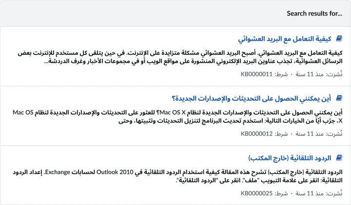
Internationalization
Accessibility
Learn how to access the actionable elements of this widget through keyboard interactions and screen readers.
Search page tab order
Keyboard interactions
You can access the actionable elements of this widget with these keyboard interactions:
- Tab: Moves focus to the next interactive element within the widget (e.g. the next link in the list)
- Shift + tab: Moves focus to the previous interactive element within the widget (e.g. the previous link in the list)
- Enter/spacebar: Activates the focused element
- Escape (esc): Blur focus of element