
Usage
Use the Quick links on a topic page widget to provide users with access to contextually relevant information on the current topic. This widget automatically pulls links associated with the current topic, streamlining the discovery of related resources. Keep the following suggestions in mind:
- Ensure accurate topic association: Verify that your quick links are correctly linked to the relevant topics within your content taxonomy to ensure they appear on the appropriate pages.
- Focus on relevance: The strength of this widget is its ability to present highly targeted resources. Ensure the links genuinely complement the topic content.
- Maintain clear link labels: Even though dynamic, ensure the link text is clear and concise, guiding users to their desired content.
Examples
- Knowledge base topic page: On a "Troubleshooting network issues" page, you might show links to "Resolving Wi-Fi connectivity problems," "Diagnosing VPN errors," or "Request new network cable."
- Service catalog topic page: For an "Employee onboarding" page, you could include links like "Complete new hire forms," "Schedule benefits enrollment meeting," or "Direct deposit form."
- HR portal topic page: On a "Benefits" page, this widget could display links to "Health insurance options," "Retirement savings plan," or "Enroll in benefits."
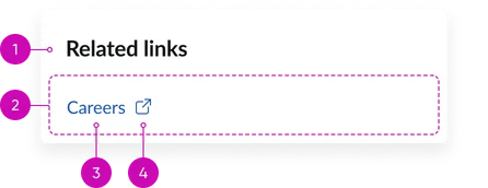
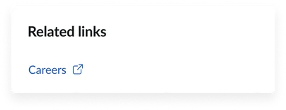
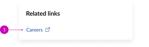
- Widget title: A short heading that gives context to the widget’s contents. The default is “Quick links” unless the title in the instance options is updated.
- Container: Displays a list of links.
- Link item: Each individual quick link typically consists of a title and hyperlink.
- Icon (optional): A visual icon that can provide additional context or visual appeal. Icons are not available in all card styles. Best practice for icons and images is to ensure that all cards have one. Otherwise it can begin to look disjointed.
Instance option
Presentation
| Field | Description |
|---|---|
| Title | A text field to set the title that appears at the top of the Quick Links widget. Default: "Quick links" (as seen in the screenshot) |
Usability
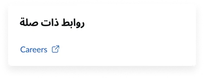
This widget complies with all internationalization and accessibility requirements.
Internationalization
Accessibility
Learn how to access the actionable elements of the widget through keyboard interactions and screen readers.
Widget tab order
Keyboard interactions
You can access the actionable elements of the widget with these keyboard interactions:
- Tab: Navigate through each link, sequentially, within the widget using the Tab key
- Shift + tab: Navigate backward through the links using the shift + tab key combination
- Enter/spacebar: Pressing the enter key or the spacebar on a focused link will activate the link and navigate the user to the specified destination.