
Usage
Designers should consider its placement and content to ensure it effectively communicates its intended message without being intrusive. Keep the following suggestions in mind:
- Content relevance: Manually curate articles that address current initiatives, high-frequency needs, or specific user roles to ensure the content remains a value-add.
- Link quantity: Limit the number of links to no more than six to eight to maintain visual clarity and prevent cognitive overload.
- Placement strategy: Place the widget in a prominent but secondary position on the page, such as a sidebar, a dedicated card slot on the homepage, or directly below the main header banner, to complement the primary search function.
- Title clarity: Ensure the widget title (e.g., "Quick Links" or "Top Articles") clearly communicates its purpose to the user.
- Link text: Use concise, descriptive link text that matches the knowledge article's title or clearly summarizes its content.
Examples
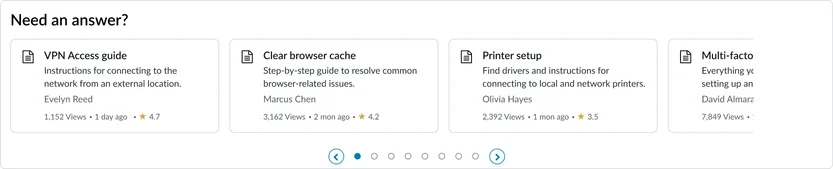
- Total Rewards topic page: Examples of articles related to company benefits (e.g. "Pay", "Healthcare", "Paid Time Off")
- HR Portal: “Quick links” to articles like “How to submit a PTO request,” “Understanding your health benefits,” and “Company holiday schedule.”
- IT Portal: “Need to know” links for “Reset your password,” “VPN connection guide,” and “Reporting an outage.”
- Facilities portal: “Facility information” linking to “Campus parking map,” “Visitor sign-in policy,” and “Submit a maintenance request.”
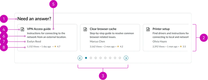
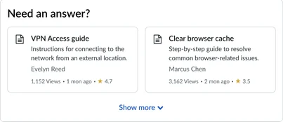
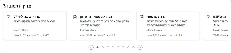
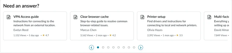
- Widget title: A configurable heading that defines the contents of the widget.
- Container: The surrounding structure that groups the cards together.
- Pagination: Allows the user to navigate through multiple pages of curated quick links when the list exceeds the container's display limit.
- Knowledge quick link (card): An individual, clickable card that navigates directly to a specific knowledge article page.
- Icon: A visual indicator (e.g., a document icon or article type icon) to quickly identify the content type.
- Headline: The primary title of the knowledge article, serving as the main navigational link text.
- Description: A short, truncated summary or excerpt of the article content, providing context without requiring the user to navigate to the full page.
- Author: Displays the name of the user who authored the knowledge article.
- Metadata: A grouping of article metrics, which includes the Views, Timestamp (date of last update/publication), and Rating (star rating based on user feedback).
Vertical
Horizontal
Instance options
Data
| Field | Description |
|---|---|
| Display articles | Displays knowledge articles from the associated knowledge base. The available options are:
|
| Criteria based | Displays articles on the widget based on the selected criteria. The available options are:
Note: Currently, if you select None, the criteria is set to Most Viewed. |
Presentation
| Field | Description |
|---|---|
| Title | Text that displays in the widget header and describes the purpose of the widget. |
Behavior
| Field | Description |
|---|---|
| Show carousel | Toggle to switch between carousel view and grid view. |
| Max Quick links to display | Number of knowledge article quick links to appear by default on the widget. Note: The default value is 10. |
| Glyph | Glyph to appear on all cards chosen from a set of predefined glyphs. |
| Show author | Toggle to display the author's name. |
| Show view count | Toggle to display the total number of views of an article. |
| Show last updated | Toggle to display the date of the last changes made to an article. |
| Show rating | Toggle to display the rating received on an article. The appearance of the star rating is defined by the [glide.knowman.show_star_rating] system property. |
| Show preview | Toggle to display of the description text. |
| Article view page | The article page that opens when the article card is accessed. By default, this field is set to the Knowledge Article View [kb_article_view] page. |
Usability
This widget complies with all internationalization and accessibility requirements. Internationalization
Accessibility
Learn how to access the actionable elements of the widget through keyboard interactions and screen readers.
Widget tab order
Keyboard interactions
You can access the actionable elements of the widget with these keyboard interactions:
- Tab: Navigate through each link, sequentially, within the widget using the Tab key
- Shift + tab: Navigate backward through the links using the shift + tab key combination
- Enter/spacebar: Pressing the enter key or the spacebar on a focused link will activate the link and navigate the user to the specified destination.