
Usage
The Portal catalog quick links widget integrates easily into a portal layouts. Keep the following suggestions in mind:
- Placement: Position the Portal catalog quick links widget prominently above the fold on a service portal homepage, typically near the search bar or main welcome content, for maximum visibility.
- Context: Only include links that are directly relevant to the portal's primary audience and their most frequent tasks.
- Clarity: Ensure the link labels are concise and action-oriented, clearly communicating the item's purpose (e.g., "Order a Mobile Phone" instead of "Mobile").
- Iconography: Select meaningful and recognizable icons from the available icon set to visually reinforce its purpose and align with the Horizon Design System's visual language.
- Quantity: Limit the number of links displayed to a maximum of 15 to maintain visual balance and not create decision paralysis.
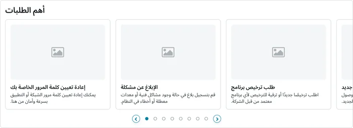
Examples
- Customer facing portal: Highlighting key self-service options like "Check case status," "Submit new inquiry," and "View knowledge base" to deflect common support calls and empower customers.
- Emergency communications: Featuring a prominent quick link labeled "Report an outage" that immediately launches a critical record producer, ensuring users can report service disruptions with minimum friction during high-stress situations.
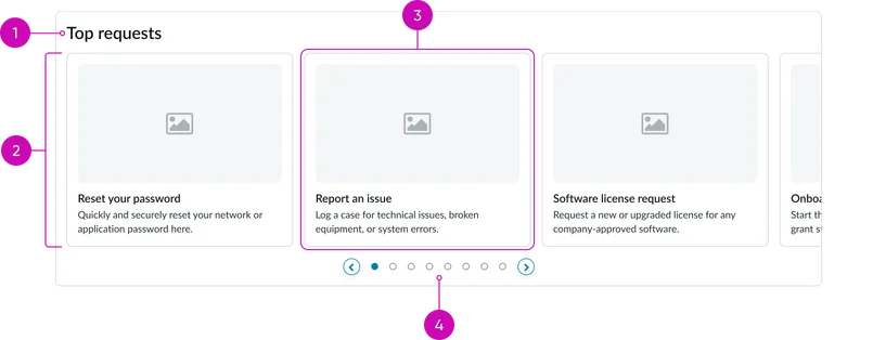
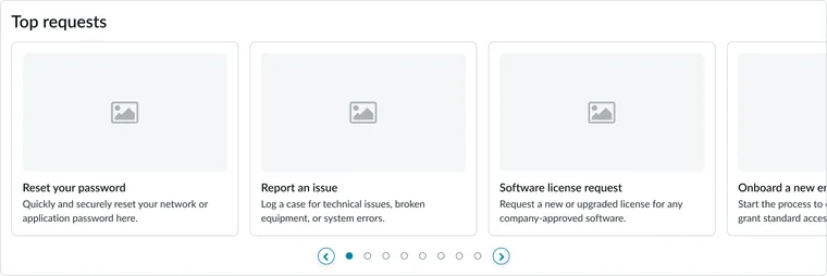
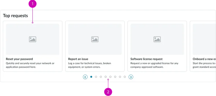
- Widget title: A configurable heading that defines the content of the quick links section
- Quick links container/tray: The surrounding structure that groups the quick link cards together
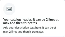
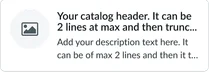
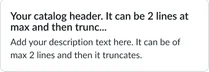
- Catalog quick link card: An individual clickable card that navigates directly to a specific page. It can house an image/icon along with a title and a brief description of the link destination.
- Pagination: Allows the user to navigate through multiple pages of curated quick links when the list exceeds the container's display limit.
- View all link: This displays if you have more than 15 items to display in the the widget.
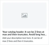
Image card
Top icon card
Left icon card
Text only card
Instance options
Data
| Field | Description |
|---|---|
| Catalog item table | Table from which the records shown as a card on the widget are selected. By default, this field is set to the Item [sc_cat_item)] table. |
| Display catalog items | Displays catalog items according to the selection. The available options are:
The default selection is Dynamic query. Note: Currently, if you select None, the selection is set to Dynamic query. |
| Manually select catalog items | The catalog items to appear on the widget chosen manually from a set of predefined catalog items that are associated with the portal |
| Dynamic query | Query to filter catalog records to display on the widget. This field applies only when Dynamic query is selected from Display articles. |
| Sort by | Field in the table that determines the field by which records are sorted and displayed on the widget. This field applies only when Manually select or Dynamic query is selected from Display articles. |
| Sort order | The order in which the catalog items appear on a widget. The default sort order is Z to A. |
Presentation
| Field | Description |
|---|---|
| Title | Text that displays in the widget header and describes the purpose of the widget. |
Behavior
| Field | Description |
|---|---|
| Show carousel | Option to switch between carousel view and grid view. |
| Max quick links to display | Number of catalog items to appear by default on the widget. The default value is 10. |
| Card display style | The display style of a card on the widget. The available options are:
Note: Currently, if you select None, the display style is set to Thumbnail. |
| Catalog item page | The Catalog item page that open when the catalog item is accessed. By default, this field is set to the Service Catalog items [sc_cat_item] page. |
Usability
The Portal catalog quick links widget complies with all internationalization and accessibility requirements. Internationalization
Accessibility
Learn how to access the actionable elements of the widget through keyboard interactions and screen readers.
Widget tab order
The widget is focused when the first card in the tray is active. The user then steps through each of the cards until the pagination control becomes active.
Keyboard interactions
You can access the actionable elements of the widget with these keyboard interactions:
- Tab: Navigate through each link, sequentially, within the widget using the Tab key
- Shift + tab: Navigate backward through the links using the shift + tab key combination
- Enter/spacebar: Pressing the enter key or the spacebar on a focused link will activate the link and navigate the user to the specified destination.