

Usage
Only use this widget within Customer portals (e.g. Business Portal).
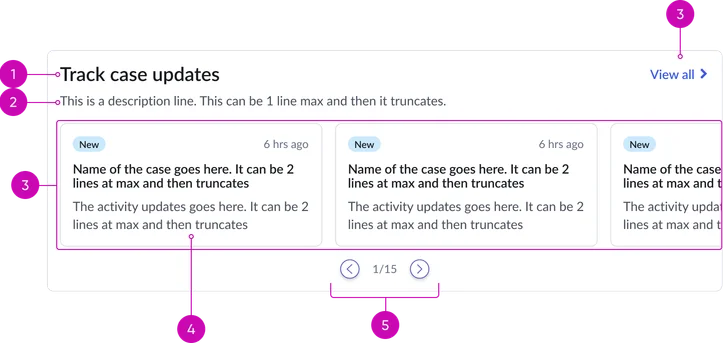
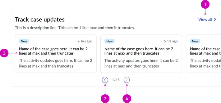
Header:
- Title: A clear and concise heading for the widget, indicating the purpose of the displayed cases.
- Description (optional): A brief introductory text providing additional context or instructions related to the displayed case cards.
- View all link: A clearly labeled hyperlink that navigates the user to a dedicated page containing a list of all relevant case records.
Cards carousel:
- Carousel: A scrollable or paginated container displaying individual case summaries. The carousel allows for the presentation of multiple cases in a limited screen area.
- Card: Displays record details in a card format
- Pagination (conditional): Visual indicators (e.g., dots, arrows) displayed when the number of cases exceeds the visible area in the carousel, allowing users to navigate through the different sets of cards.
- Title: A clear and concise heading for the widget, indicating the purpose of the displayed cases (e.g., "My Open Cases," "Recently Updated Cases").
- Description (optional): A brief introductory text providing additional context or instructions related to the displayed case cards.
- Illustration: A visual representation of the empty state. This should clearly communicate that there are currently no items to display, encouraging users on potential next steps or explaining why the list might be empty. Examples include a simple graphic of an empty folder or inbox, accompanied by a brief, helpful message. Ensure the illustration is visually consistent with the overall design language of the portal.
- Message: A brief and helpful message displayed in the empty state. This should guide the user on what to do next or explain why the list is currently empty.
Case cards anatomy
There are two types to choose from:
Activity update
Focuses on recent activities or updates related to a case.
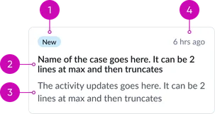
- Status/state indicator: A visually distinct element (e.g., colored pill, icon with text) clearly indicating the current operational status of the case (e.g., New, Open, In Progress, Resolved, Closed). Use a consistent color palette to represent different statuses.
- Title: A prominent and easily readable identifier for the specific case, often the case number or a concise summary of the issue.
- Short description: A brief and concise summary of the case's subject matter, providing enough context for the user to quickly understand the issue without needing to open the full record. Truncation should be implemented gracefully with a visual cue (e.g., ellipsis).
- Timestamp: Displays the date and time when the case was last modified, providing context for the recency of updates or activity. Use a consistent and user-friendly date/time format.
Case details
Similar to activity update, it provides a summary of key information about the case. What is different are the key-value pairs.
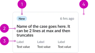
- Status/state indicator: A visually distinct element (e.g., colored pill, icon with text) clearly indicating the current operational status of the case (e.g., New, Open, In Progress, Resolved, Closed). Use a consistent color palette to represent different statuses.
- Title: A prominent and easily readable identifier for the specific case, often the case number or a concise summary of the issue.
- Key-value pairs: A section displaying key-value pairs providing important details about the case. Each pair consists of a clear label and its corresponding value.
- Timestamp: Displays the date and time when the case was last modified, providing context for the recency of updates or activity. Use a consistent and user-friendly date/time format.
Instance options
Each Portal card case widget consists of the following key components:
Data
| Field | Description |
|---|---|
| Case Table | Table from which the records shown as case cards on the widget are selected. By default, this field is set to the Cases [sn_customerservice_case] table and the extended table is Complaint Case [sn_complaint_case]. |
| Query | Query to filter the case records. The default query shows cases that are awaiting information or are resolved. Note: If no query is provided, all case records are displayed in the widget. For more information, see Generate an encoded query string through a filter. |
| Sort by | Field in the Cases [sn_customerservice_case] table that determines the field by which cases are sorted when displayed on the widget. The default value is Last updated. |
| Sort order | The order in which the case cards are displayed (e.g., by updated date, priority level). Available options are: z to a, and a to z. The default sort order is z to a. Note: Currently, if you select None, the order is set to z to a. |
Presentation
| Field | Description |
|---|---|
| Title | Required title of a Portal Case cards widget. The default text is Track case updates. |
| Description | Subtitle that appears below the heading. |
Behavior
| Field | Description |
|---|---|
| Max cases to display | Number of cases to appear by default on the widget. The default value is 10. |
| Card title | Field to use to define each card's title. |
| State highlight color | Color of the background and text for the different states of a case in hex code format. |
| Card display style | Display style for a case card inside the widget. The available options are:
|
| Case view page | The portal page that displays the details of a case record when the case card is accessed. By default, this field is set to the Case (csm_ticket) page. |
| View all page | Option to display all cases when View all is accessed on the widget. The View all option on the Portal Case Cards widget is displayed under the following conditions:
|
| Hide empty case widget | Option to hide the widget when no records are available to display. If this option isn’t selected, an empty widget shows the text defined in the Empty State Text option. |
Usability
Portal case cards comply with all internationalization and accessibility requirements.
Internationalization

Accessibility
Learn how to access the actionable elements of portal case cards through keyboard interactions and screen readers.
Portal case cards tab order
This is the high-level tab order for portal case cards.
Keyboard interactions
You can access the actionable elements of the portal case cards with these keyboard interactions:
- Tab: Navigate through the individual case cards within the widget using the Tab key. Focus will move sequentially from one card to the next.
- Shift + tab: Users can navigate backward through the case cards.
- Enter/spacebar: When a case card has keyboard focus, pressing the enter key or the spacebar will trigger the action to view the full details of that specific case, typically navigating to the case form.