
Usage
Consider how Popular topics effectively guides users to trending content without overwhelming them. Keep the following suggestions in mind:
- Placement strategy: Place the widget high up on the page or within the main content column to capture user attention early in their session.
- Title clarity: Use a descriptive title like "Trending Topics," "What's Popular Now," or "Most Viewed Services" to clearly communicate the widget's purpose.
- Minimalism: Limit the displayed topics to between 5 and 7 items to maintain visual balance and prevent the widget from becoming a dense list.
Examples
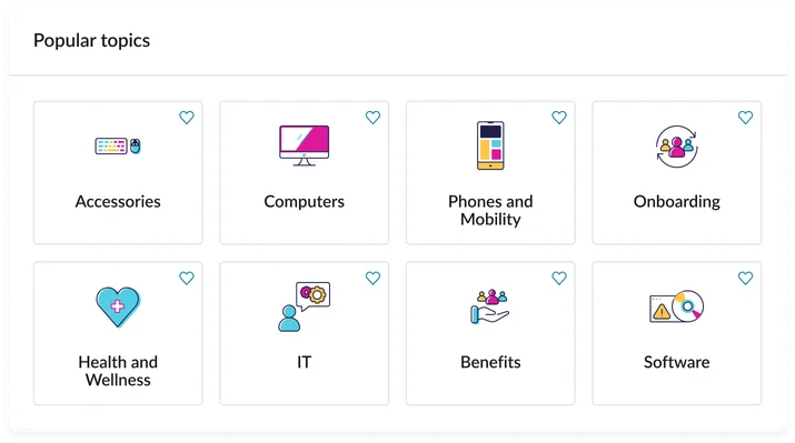
- Portal homepage: A list of the most viewed service catalog items in the past week to highlight frequently requested services.
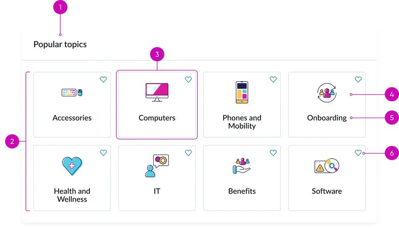
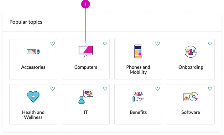
- Widget title: A configurable heading (e.g., "Popular topics") that describes the purpose of the widget.
- Tray/grid: The visual container or layout structure (list or grid) that holds the individual topic items, often aligning with the responsive container tokens of the Horizon design system.
- Topic item: The clickable element that directs the user to the underlying content (article, catalog item, etc.)
- Text: The label or name of the popular topic (e.g., the title of a Knowledge article or Catalog item) displayed within the topic item.
- Icon (optional): A relevant icon to enhance visual appeal.
- Favorite button: When clicked adds topic to favorites.
Instance options
Presentation
| Field | Description |
|---|---|
| Title | Text that displays in the widget header and describes the purpose of the widget. |
| Number of topics | Number of topics you want to appear on the widget. Default value: 8 |
| Display size | Size of the card tiles on the widget. The choices are:
|
| Border color | Select a border color variable to use for this widget instance. The border color choices for this widget are:
|
| Hexcode | Define the border color when Hexcode is selected for Border color option. |
| Show topic icon | Toggles the visibility of the topic icon |
Other options
| Field | Description |
|---|---|
| Load configuration | Order in which the page and widget's data loads. Select one of the following options:
|
| Show empty state | Determine whether to show the widget when there is no content to display. |
| Widget behavior during high load | Option to show the view from the available options:
|
Usability
This widget complies with all internationalization and accessibility requirements.
Internationalization
Accessibility
Learn how to access the actionable elements of the widget through keyboard interactions and screen readers.
Widget tab order
Tab through each button
Keyboard interactions
You can access the actionable elements of the Information links (CD) with these keyboard interactions:
- Tab: Moves focus to the next interactive element within the widget (e.g. the next link in the list)
- Shift + tab: Moves focus to the previous interactive element within the widget (e.g. the previous link in the list)
- Enter/spacebar: Activates the focused element
- Escape (esc): Blur focus of element