Usage
Because the News feed widget is highly effective for keeping users informed and engaged with the latest information relevant to their roles or interests, it’s important to keep in mind the following:
- Don’t use multiple News feed instances: Doing this can fragment user attention and dilute important messages.
- Limit the number of visible items: Prevent cognitive overload by restricting the number of articles displayed (typically 5-10 items) to ensure users can quickly scan and digest the most important information.
- Ensure content headlines are descriptive and actionable: Craft headlines that are concise and directly communicate the main point of the news, encouraging users to click and learn more.
- Establish a consistent content publishing schedule: Publish news on a regular basis to maintain user engagement and build an expectation of fresh, relevant content. Also consider the audiences an article is targeted to
- Implement clear content governance: Ensure all published messages are high-quality, relevant, and consistent with organizational messaging by establishing a clear review and approval process.
Examples
- Employee Center homepage: Displaying HR announcements, company events, and policy updates
- Manager dashboard: Featuring leadership communications, performance updates, and strategic initiatives
- Department-specific portals: Highlighting team-specific news, project updates, and relevant training opportunities
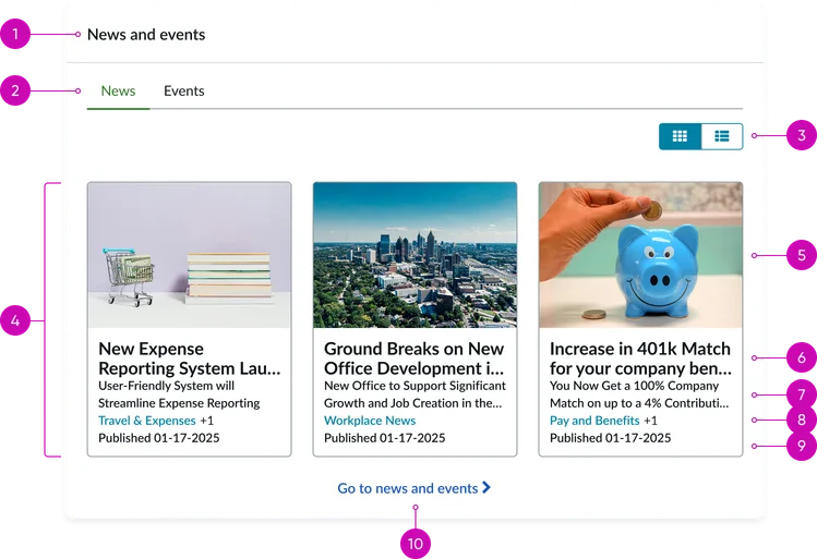
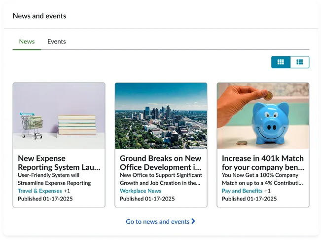
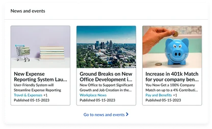
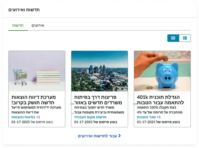
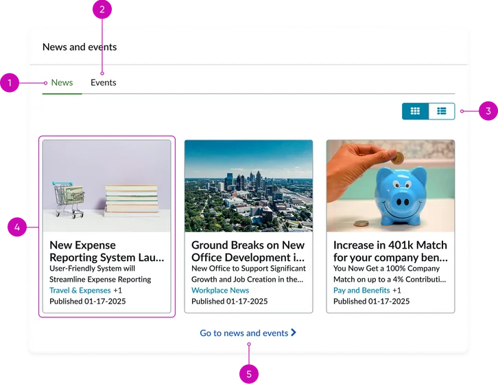
- Widget header: Contains the widget title (e.g., "News" or “News and events”)
- Tabs (optional): Tabs appear when the “Enable calendar” option is selected. Otherwise they are hidden and only articles are displayed.
- Toggle buttons: These allow the user to change the visual display of the contents from a vertical list view to a wrapping grid view.
- Content container: Houses the list of item entries
News item entry:
Image: A thumbnail image associated with the news article
Headline: A brief, descriptive title for the article
Summary/excerpt: A condensed content preview
Category & sub-category: Labels that help classify the news content
Published date: The date the news article or event was made public or published
More link: A hyperlink that directs the user to the full, detailed content of the article or event
Other views
When configured using the instance options, you have access to additional display views and options.
Show thumbnails: True and Default view: Grid
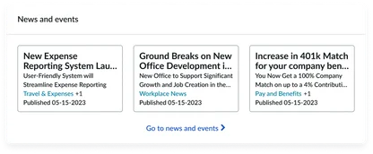
Show thumbnails: False and Default view: Grid
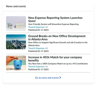
Show thumbnails: True and Default view: List
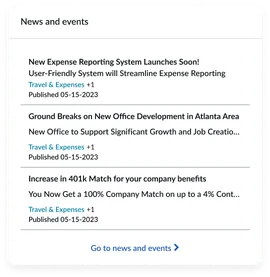
Show thumbnails: False and Default view: List
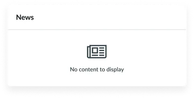
Empty view: Displays when “Allow empty state” is toggled.
Instance options
Data
| Field | Description |
|---|---|
| Load Async | Load asynchronously (Async) is the default value and provides the fastest initial page load speed. For pages where this widget is placed prominently, such as on a homepage, leaving this toggled to its default state "on" is recommended. |
Presentation
| Field | Description |
|---|---|
| Show title | An option to display the news article's header title. This is selected by default. |
| Title | The title of the widget. The default is “News” if not changed. |
| Show thumbnail | Displays a thumbnail image for each news article, if available. |
| Show subheadline | An option to display the news article's subheadline or a brief summary. |
| Inline loading | Enables employees to open other news articles from the Article detail page without refreshing the web page |
| Enable grid/list controls | Displays an option for the user to switch between a grid and list view of news articles |
| Default view | Sets the display for news articles.
|
| Show categories | An option to show or hide the categories assigned to each news article. |
| Show content date | Displays the publication date of the news articles. |
| Show calendar indicator dot | When enabled displays a calendar indicator dot for days with events. Enable calendar widget must be enabled for this feature to work. |
Behavior
| Field | Description |
|---|---|
| Pagination type | Changes how users navigate through news articles. The choices are:
|
| Number of items per page | Sets the maximum number of articles to display per page. |
| Call to action: Text | The text for the call-to-action link. This option is used when the Call to action pagination type is selected. |
| Call to action: Page ID | The page where to redirect users who click on the call to action link |
| Default thumbnail image | Select an image to display when a news article doesn't have a thumbnail image |
| Show articles of which type | Select whether the widget instance shows news articles, corporate events, or both. |
| Default calendar option | Sets the initial default view for the calendar, such as month or week. |
| Calendar display options for content type | Customizes how different content types are displayed within the calendar view, such as color coding or icons. |
| Default content | Specifies a default news article or content to display if the main data source is empty. |
Other options
| Field | Description |
|---|---|
| Allow empty state | Allows the widget to appear if there are no published news articles |
Usability
This widget complies with all internationalization and accessibility requirements.
Internationalization
Accessibility
Learn how to access the actionable elements of this widget through keyboard interactions and screen readers.
News feed tab order
Keyboard interactions
You can access the actionable elements of this widget with these keyboard interactions:
- Tab: Moves focus to the next interactive element within the widget (e.g. the next link in the list)
- Shift + tab: Moves focus to the previous interactive element within the widget (e.g. the previous link in the list)
- Enter/spacebar: Activates the focused element
- Escape (esc): Blur focus of element