

Usage
The My items widget is ideal for the home page. Designers should consider placing it in a prominent area where users can readily find their personal item information.
Examples
- Record management: Users quickly view and manage their open support records directly from the portal homepage.
- Approval management: Managers efficiently approve or reject pending requests displayed in the widgets.
Header:
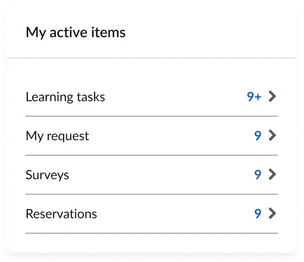
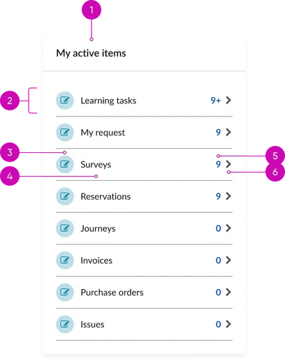
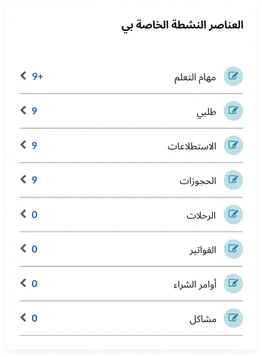
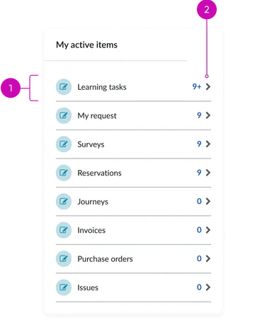
- Title: A clear and descriptive heading indicating the widget's content (e.g., "My requests," "My tasks," "My approvals"). The default title is "My active items." Consider providing customization options for this title.
Category List:
- List Item: Represents a distinct category of items relevant to the logged-in user (e.g., "Open incidents," "Pending approvals," "To-do tasks"). The entire list item should be designed as a clickable area to navigate to the detailed view for that category.
List Item Details:
- Glyph (optional): A visual icon or indicator providing a quick visual representation of the item category (e.g., a ticket icon for requests, a checkmark for approvals). Ensure a consistent and intuitive icon set.
- Category name: A concise label clearly identifying the type of items within that category (e.g., "Service requests," "Change tasks"). Use consistent terminology.
- Quantity/count: Displays the number of items within that specific category that require the user's attention or are currently in progress. The default state should clearly indicate zero items.
- Chevron Indicator: A visual cue (e.g., a right-pointing arrow) indicating that clicking the list item will navigate the user to a dedicated view containing the detailed list of items within that category. Ensure sufficient visual contrast and clear affordance.
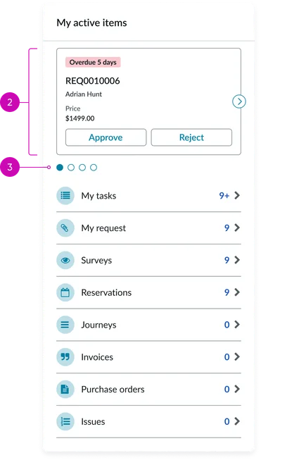
- Carousel: A paginated container displaying cards. The carousel allows for the presentation of multiple cards in a limited screen area.
- Card: Displays a card with the active item
- Pagination (conditional): Visual indicators (e.g., dots) displayed when the number of cards exceeds the visible area in the carousel, allowing users to navigate through the different sets of cards.
Instance options
Other options
| Field | Description |
|---|---|
| List view count | Specify the number of cards, up to 6, to display in the first panel. |
| Load configuration | Specify how you want the content to load. Options are:
|
| Card behavior | Columns to display in the table |
| Show icons | Limits the number of items displayed in the table. If there are more entries than allowed in the table, users can scroll to the next page. |
| Show view details when no actions are defined | Limits the number of items displayed in the table. If there are more entries than allowed in the table, users can scroll to the next page. |
Usability
The My active items widget supports the following keyboard interactions for accessibility:
Internationalization
Accessibility
Learn how to access the actionable elements of the Employee Center header through keyboard interactions and screen readers.
My active items tab order
Keyboard interactions
You can access the actionable elements of the my items with these keyboard interactions:
- Tab: Navigates to the next focusable element, including each list item (if links are included)
- Shift + tab: Moves focus in reverse order
- Enter/spacebar: Activates the link associated with the focused list item