

Usage
This widget excels in scenarios where immediate search access improves user experience and content discoverability. Users expect search functionality to be readily available, especially on complex sites with extensive content libraries. Keep in mind the following:
- Prominent placement: Position the search widget prominently on the page, typically in the header or hero section, to ensure it is readily visible and accessible.
- Configure search scope: Configure the search scope to include relevant content sources for your user base, ensuring that search results are valuable and accurate.
- Clear placeholder text: Implement clear placeholder text that indicates what users can search for, setting accurate expectations and guiding their input.
Examples
- Unified portal experiences: Enabling search across HR example, IT example, miscellaneous example.
- Knowledge base search: A user starts typing "password reset," and the widget suggests relevant knowledge articles and troubleshooting guides.
- Service catalog search: As a user types "laptop," the widget displays catalog items like "Dell XPS 13" and "MacBook Pro," along with categories.
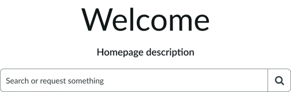
- Title: The main message displayed on the widget. It usually sets a friendly and helpful tone for the user's visit.
- Short description: Additional greeting text message for users.
Typeahead search
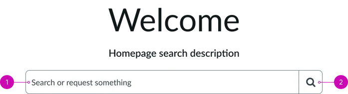
- Input field: Where users type their search queries. As they type, the system provides real-time suggestions to help them find what they're looking for more quickly.
- Iconic button: A button with a magnifying glass icon. Clicking this button submits the query and directs the user to the search results page.
Instance options
Presentation
| Field | Description |
|---|---|
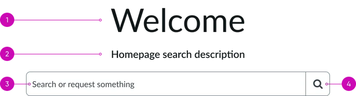
| Title | Name that appears above the search bar (e.g. “Welcome” or "How can we help?"). |
| Short description | A subtitle that appears below the title. |
| Typeahead search | Controls the appearance of the search bar. Use a comma separated list inside curly braces to add style details to the search bar, for example {title: 'Search', color: 'blue', size: 'lg'}. For more information on which style options you can add, see the instance options for the Typeahead search widget. |
AI Search
| Field | Description |
|---|---|
| Search application | Defines search experience settings for the widget, such as the search engine, search results limit, and suggestions limit. By default, the widget uses the same search application configuration as the portal, but you can override this configuration at the widget level. For more information on defining a search application configuration, see Defining search application configurations. |
| Search results configuration | Defines how search results are displayed after using the widget. By default, the widget uses the same search results configuration as the portal, but you can override this configuration at the widget level. For more information on defining a search results configuration, see Define a composite dataset. |
| Disable all suggestions | Option to disable search suggestions. |
| Placeholder text | Text that appears in the search box before the user enters anything. By default, the placeholder text is ”How can we help?”. |
| AI search source filter | Content that portal users can search on, including tables in your instance or external data sources. For more information, see Defining search sources. |
Usability
This widget complies with all internationalization and accessibility requirements.
Internationalization

Accessibility
Learn how to access the actionable elements of this widget through keyboard interactions and screen readers. Homepage search tab order
Keyboard interactions
You can access the actionable elements of this widget with these keyboard interactions:
- Tab: Moves focus to the next interactive element within the widget (e.g. the next link in the list)
- Shift + tab: Moves focus to the previous interactive element within the widget (e.g. the previous link in the list)
- Enter/spacebar: Activates the focused element
- Escape (esc): Blur focus of element