
Usage
Effective use of the Faceted search widget enhances the user's ability to quickly find and access information. When implementing the Faceted search widget, keep in mind the following:
- Prioritize and order facets: Identify the most important attributes for your content and arrange them in a logical order. Users typically engage with the most relevant filters first.
- Provide clear labels: Ensure facet titles and filter options are concise and easy to understand.
Examples
- Knowledge base: Filter articles by category, author, or last updated date.
- Service catalog: Refine service offerings by category, price range, or approval workflow.
- Employee directory: Search for employees by department, location, or job title.
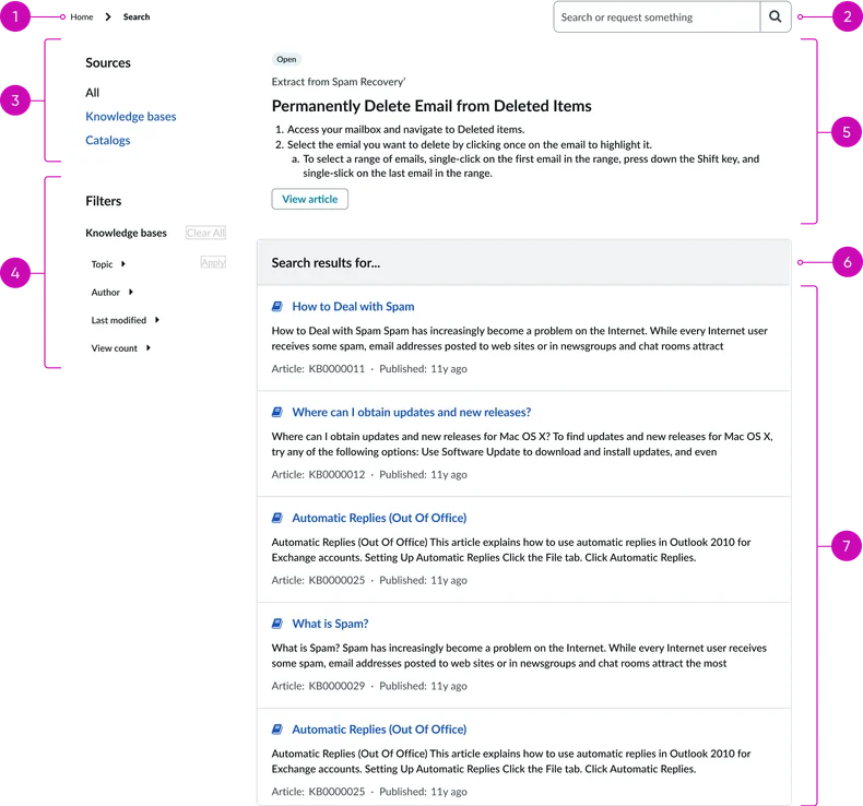
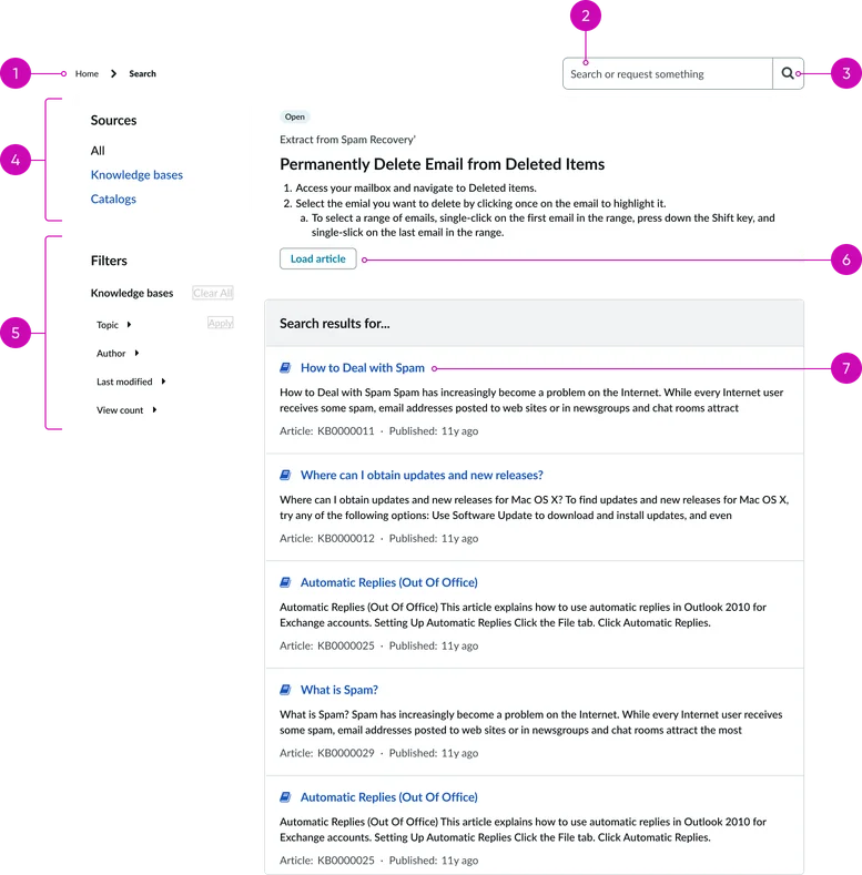
- Breadcrumb: This navigational element shows the user's current path within the portal hierarchy; helping them understand their location as well as providing them an easiy way to navigate back to the previous page(s).
- Typeahead search widget: An advanced search field that not only accepts a user's search query but also provides real-time, predictive suggestions as the user types. See the Typeahead widget page for more information.
Filters:
- Source filters: These are the top-level filters that allow users to narrow their search by the content source.
- Faceted filters: Faceted search controls are configurable to align with the content available in the portal. The example shows categories like "Knowledge bases," "Topic," "Author," "Last modified," and "View count," but these are dynamic to the content structure and can be anything defined for this particular section of the portal. Users can click on the category to expand it in order to see and select specific filter options. A "Clear All" link is available to reset all applied filters.
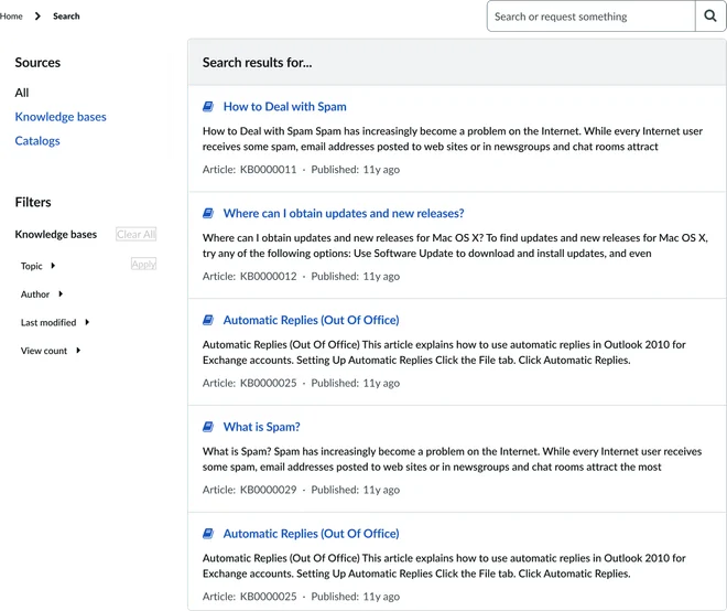
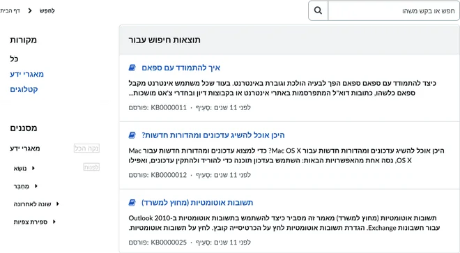
Results:
- Top Results (optional): This area displays an AI generated summary of the search results.
- Search results header: A simple header indicating the search results and original search string.
- Search results list: This is the main content area where individual search results are displayed. Each result is typically comprised of the following elements:
- Title: A clickable headline that links to the full content.
- Snippet: A brief excerpt of the content that highlights the most relevant information.
- Metadata: Additional information that is pertinent about the content, such as an article number and/or timestamp. Metadata helps users quickly assess the relevancy and recency of the result without having to open the content.
Instance options
Presentation
Field |
Description |
|---|---|
| Facet list title | Set the title for the widget. |
| Typeahead search - title | Placeholder text in the typeahead search component. |
| Typeahead search - color | Whether the glyph in the typeahead component is filled in. |
| Typeahead search - glyph | Icon that appears in the search field beside the widget. The search icon is the default. To use a different icon, type the name of the icon in the field, for example search-plus. For a list of icons to choose from, open the instance options for the Icon link widget. |
| Typeahead search - size | Determines the font size and height of the widget. Choose from xs, sm, md, and lg. |
| Show Typeahead search box | Option to show or hide the search box on the portal page. |
Behavior
Field |
Description |
|---|---|
| Max results for All search | Maximum number of results that display for all search sources when viewed together. |
| Max results for single search source | Maximum number of results that display for a single search source. |
| Show did you mean | Displays suggestions when a search produces no results. |
| Typeahead search - limit | Number of typeahead search results displayed. The default is 15. |
AI Search
Field |
Description |
|---|---|
| Placeholder | Text that appears in the search box before the user enters anything. By default, the placeholder text is Search. Note: This instance option applies only if AI Search is enabled in your portal. For more information on enabling AI Search for Service Portal, see Enable and configure AI Search in Service Portal. |
Usability
This widget complies with all internationalization and accessibility requirements.
Internationalization
Accessibility
Learn how to access the actionable elements of this widget through keyboard interactions and screen readers.
Faceted search tab order
Keyboard interactions
You can access the actionable elements of this widget with these keyboard interactions:
- Tab: Moves focus to the next interactive element within the widget (e.g. the next link in the list)
- Shift + tab: Moves focus to the previous interactive element within the widget (e.g. the previous link in the list)
- Enter/spacebar: Activates the focused element
- Escape (esc): Blur focus of element