Usage
The Event calendar (CD) widget integrates easily into portal layouts. Designers should consider its placement and content to ensure it effectively communicates its intended message without being intrusive. Keep the following suggestions in mind:
- Placement: Place the calendar on dedicated pages or prominent dashboards where event viewing is a primary user task. Avoid burying it in deep navigation.
- Data strategy: Clearly define the data sources for the calendar. Limit the number of event types (data sources) to prevent visual clutter and confusion.
- Color-coding: Use distinct, accessible color-coding for different event types. Do not rely on color alone to differentiate events; ensure the event title or label is always descriptive.
Examples
- HR portal: Showing company holidays, benefits enrollment deadlines, and well-being event schedules.
- Training portal: Displaying course start dates and durations, allowing users to click and register.
- Project dashboard: Showing key fixed milestones or government reporting dates segmented by year.
- Benefits portal: Listing annual enrollment periods or wellness program start dates.
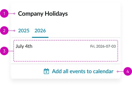
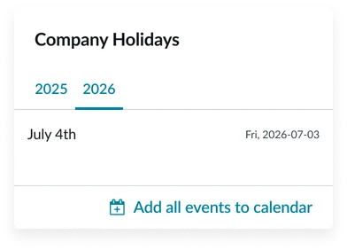
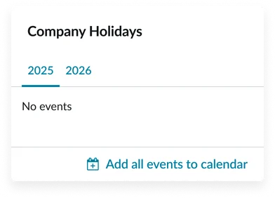
- Widget title: A short heading that gives context to the widget’s contents/events.
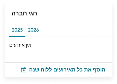
- Tabs: Displays the corresponding events list, typically organizing events in order of occurrence. If the current year has no events, the tab structure will still display, and the content pane will display “No events”.
- Events list: The content area where individual events are presented, usually in a chronological, vertical list format under the selected tab. Where the event name and date/timeframe are on the same row.
- “Add all events to calendar” link: A prominent link or button that lets the user add the events to their calendar.
Instance options
Other options
| Field | Description |
|---|---|
| Display Event calendar for every user | Toggles the display of the widget for all users, often used to turn off the widget entirely if no event data is present or relevant. |
| Display heading text | Shows or hides the widget title at the top of the widget |
| Display bounding box | Toggles the border frame around the widget to visually separate it from other page elements |
| Display widget background color | Controls whether the widget shows its background color or remains transparent to blend with the page. |
Usability
This widget complies with all internationalization and accessibility requirements.
Internationalization
Accessibility
Learn how to access the actionable elements of the widget through keyboard interactions and screen readers.
Widget tab order
Keyboard interactions
You can access the actionable elements of the widget with these keyboard interactions:
- Tab: Navigate through each link, sequentially, within the widget using the Tab key
- Shift + tab: Navigate backward through the links using the shift + tab key combination
- Enter/spacebar: Pressing the enter key or the spacebar on a focused link will activate the link and navigate the user to the specified destination.