
Usage
Consider its placement and application links to ensure it effectively guides users to primary destinations without cluttering the page. Keep the following suggestions in mind:
- Introduction: The App launcher widget should be strategically placed based on the portal's content hierarchy and user journey priorities.
- Placement: The widget's placement should reflect the strategic importance of app access. If the portal's primary purpose is to serve as a launchpad, place it near the top. For content-first portals (like the default Employee Center), position it further down the page, after more critical information or calls-to-action (e.g., Search, Announcements) have been displayed.
- Content: Only include high-priority applications or services that represent the primary user journeys within the portal.
Examples
- Homepage navigation: Use the widget on the portal’s homepage to serve as the main launchpad, leveraging the 'Featured', 'Favorites', 'Categories', and 'Recently opened' options for better usability and quick navigation.
- Topic-based filtering: Use the widget to display a curated, filtered set of applications on a specific topic page (e.g., show only apps related to 'Human resources' on the HR topic landing page). This is typically achieved by linking the widget instance to the topic's associated category element.
- Personalized profile: Embed the App launcher within a user's profile to list personal, high-value applications or tools similar to how you would their assigned hardware or assets list.
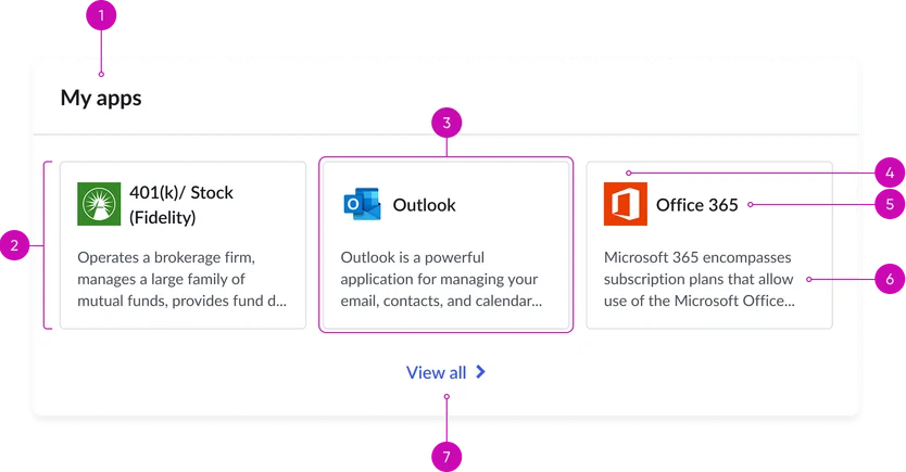
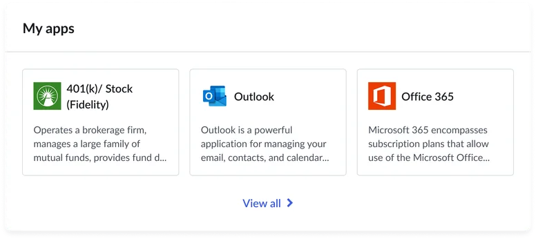
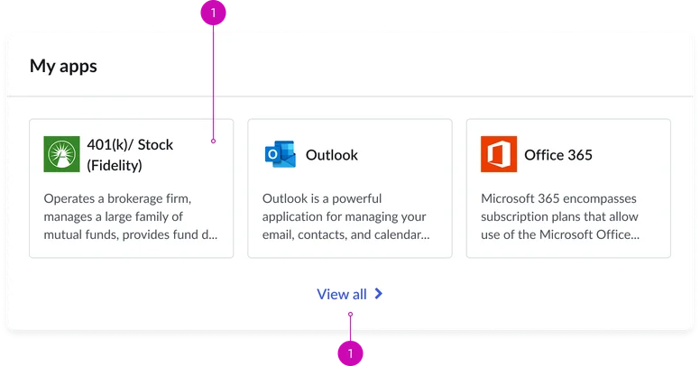
- Widget header (optional): A title and/or description for the entire app launcher section.
- Cards container: The responsive grid that holds the individual application tiles.
- View all link: Links to a dedicated page for all applications and services.
Card
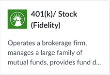
- Card: An individual clickable component representing a link to an application.
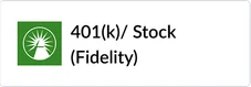
- Icon: A visually distinct icon representing the destination (often utilizing the Glyph icon component).
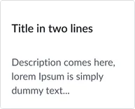
- Title: The main, concise label for the destination.
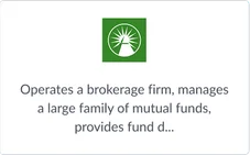
- Description: A brief, supporting sentence explaining the tile's purpose.
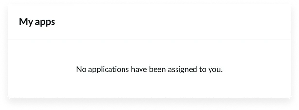
Empty state
Icon, title, and description
Icon and title

Icon only
Icon and description
Title and description
Title only
Instance options
Presentation
| Field | Description |
|---|---|
| Title of widget | Text that displays in the widget header |
| Application count | Number of the applications you want to display on the widget (up to 6 apps). Note: Default load shows up to six loaders. |
| Card display view | View preference of the card display. It can be displayed in the follow configurations:
|
###Other options
| Field | Description |
|---|---|
| Load configuration | Order in which the page and widgets data loads. Select one of the following options:
|
| Show empty state | Determine whether to show the widget when there is no content to display. |
| Widget behavior during high load | Option to show the view from the available options:
|
Usability
This widget complies with all internationalization and accessibility requirements.
Internationalization
Accessibility
Learn how to access the actionable elements of the widget through keyboard interactions and screen readers.
Widget tab order
Keyboard interactions
You can access the actionable elements of the App launcher with these keyboard interactions:
- Tab: Moves focus to the next interactive element within the widget (e.g. the next link in the list)
- Shift + tab: Moves focus to the previous interactive element within the widget (e.g. the previous link in the list)
- Enter/spacebar: Activates the focused element
- Escape (esc): Blur focus of element