Usage
Use the Actions widget when you need to present a group of related actions that enable users to complete a specific task or navigate to related content. Keep the following suggestions in mind:
- Prioritize primary action: Designate the primary action with prominent visual cues (e.g., a primary button style) to guide users towards the most important tasks. There should only be one primary button per given context area.
- Group actions logically: Organize related actions within the widget to streamline user workflows. Use the Order field on each action to group actions based on context or functionality, enhancing discoverability.
- Use clear language: Use concise and descriptive labels for all actions. Avoid jargon and technical terms. Follow our guidelines on Writing with words.
- Keep the user workflow in mind: Position the Actions widget strategically to align with the user's expected workflow. For example, you could place it near related information or at the point of action.
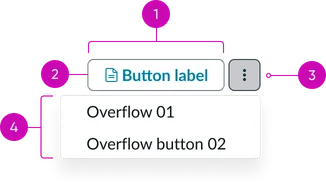
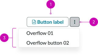
- Action button: One button is supported by the component, coupled with an overflow menu.
- Action icon (optional): An optional icon can be displayed with the primary button.
- Actions overview menu button: Overflow button that when activated reveals the overflow menu.
- Overflow menu: Actions that flow into the form menu when the container is too small to render all action buttons. Dropdown panel containing less frequently used actions; used as an overflow for actions when the container is resized.
Instance options
There is only one instance option because actions need to be set up via the actions framework.
Data
| Field | Description |
|---|---|
| Action group | Select the actions group table from which the widget is formed. |
Usability
The Actions widget complies with all internationalization and accessibility requirements.
Internationalization
Accessibility
Learn how to access the actionable elements of the actions widget through keyboard interactions and screen readers.
Keyboard interactions
You can access the actionable elements of the actions widget with these keyboard interactions:
- Tab: Navigates between the on screen items
- Shift + tab: Moves focus in reverse order
- Enter/spacebar: Activates a selected button
- Arrow keys: Navigates within the widget, between button and overflow navigation dropdown
- Escape (esc): Closes the menu